


Blog for University of the Creative Arts Illustration BA
Part Three of the Key steps in Illustration Brief.


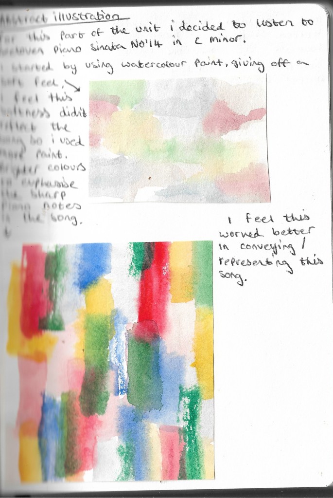

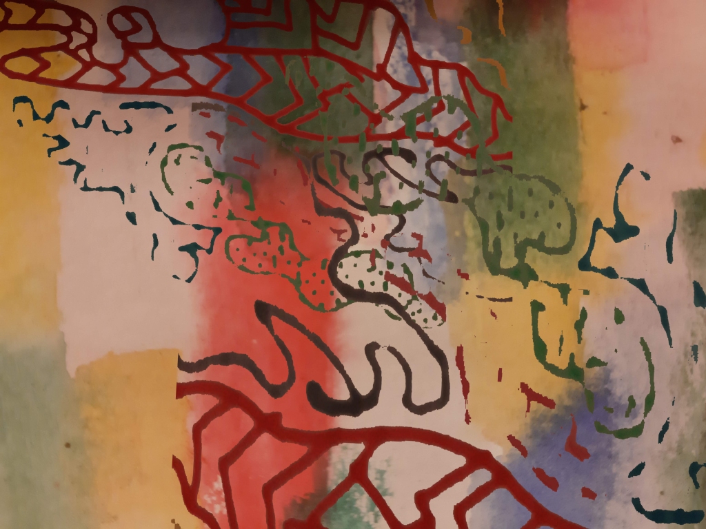
linking these two images together i feel works well, having a part of the abstract hand drawn pattern editied in photoshop taking away the background gave off a rough jagged look to the pattern along with the background i feel the contrast between these two images work well together, the colours from the pattern being clearer and brighter that that in the background i feel gives off a good abstract image that represents this piece of music, the sharp notes from the piano much alike the sharp colour in the foreground and the tone this gives off to the rest of the image i feel works well and that this image would also work well as a single cover for this song, which i have created and can be seen below.


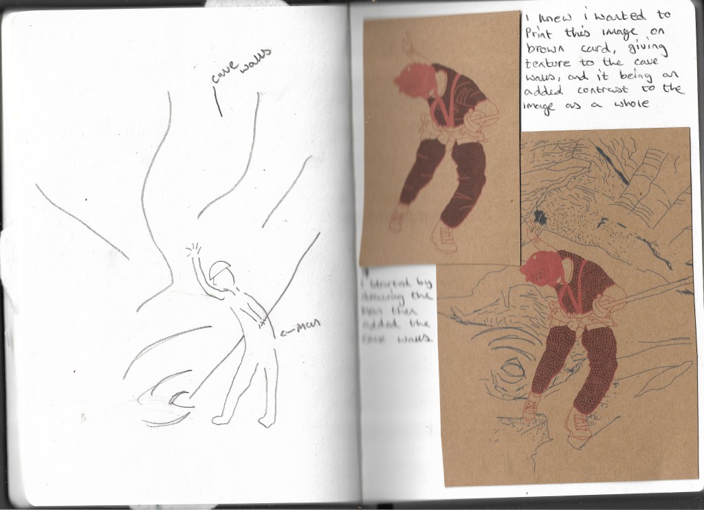


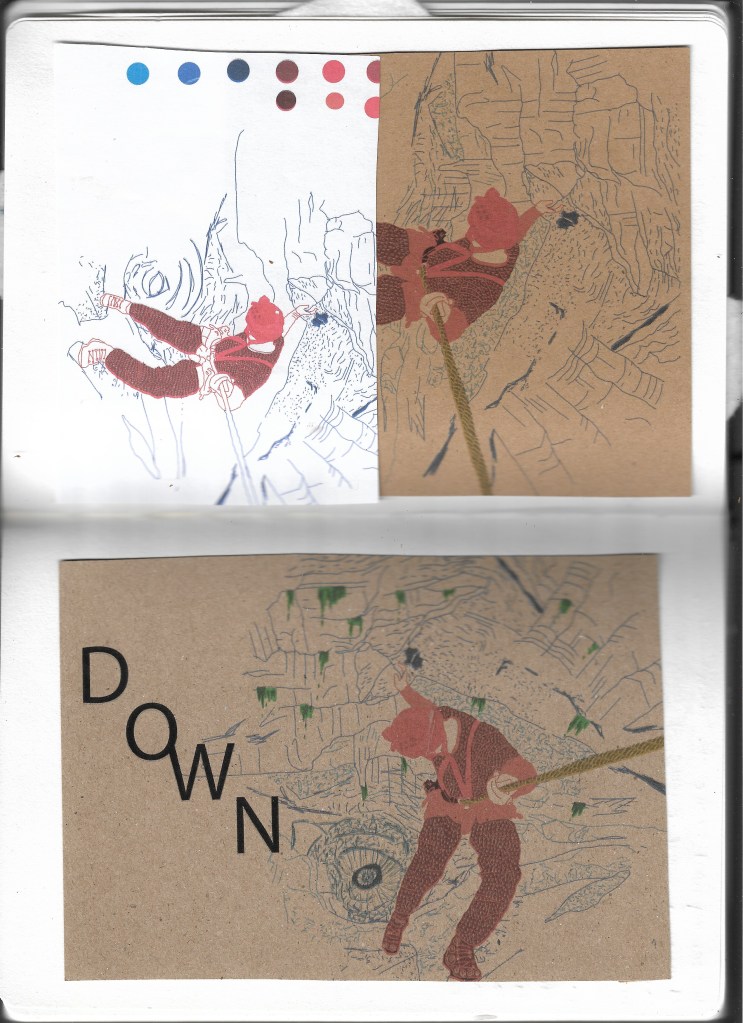

I feel that overall this image works well as a poster, the typeface i feel works well, linking the “O” and “W” gives off the effect of bring attached, in the case of the illustration this is the man and the rope, i feel overall thi sillustration works well when printed onto the brown card as this gives off the feel of tecture to the walls of the cave, having a warm and cold colour pallette contrasting the man and the cave walls behind him, i feel the use of single line work for the walls work well as the man being in colour with patterns on his clothes of arrows pointing down leads the eye to the center of the cave which is darker than the rest of the image.