After reading the extract from “The Daffodil Affair” I answered the questions given in the brief that can be seen below:
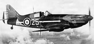
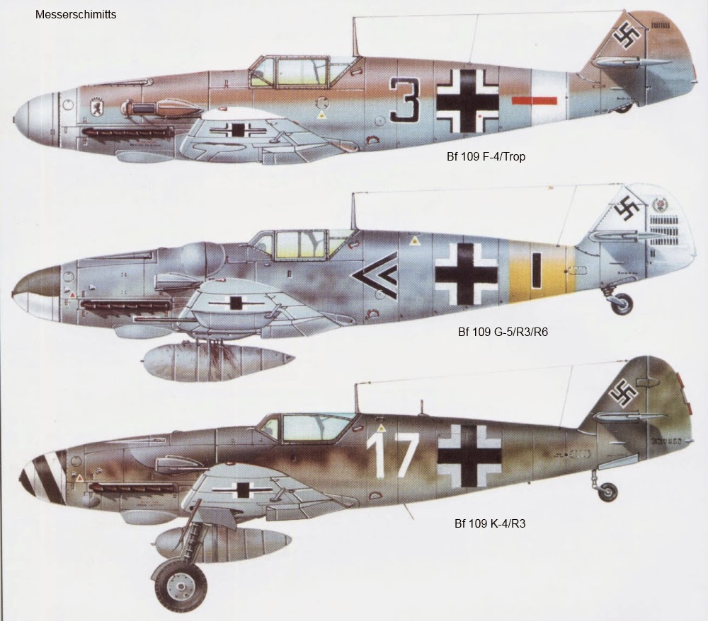
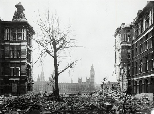
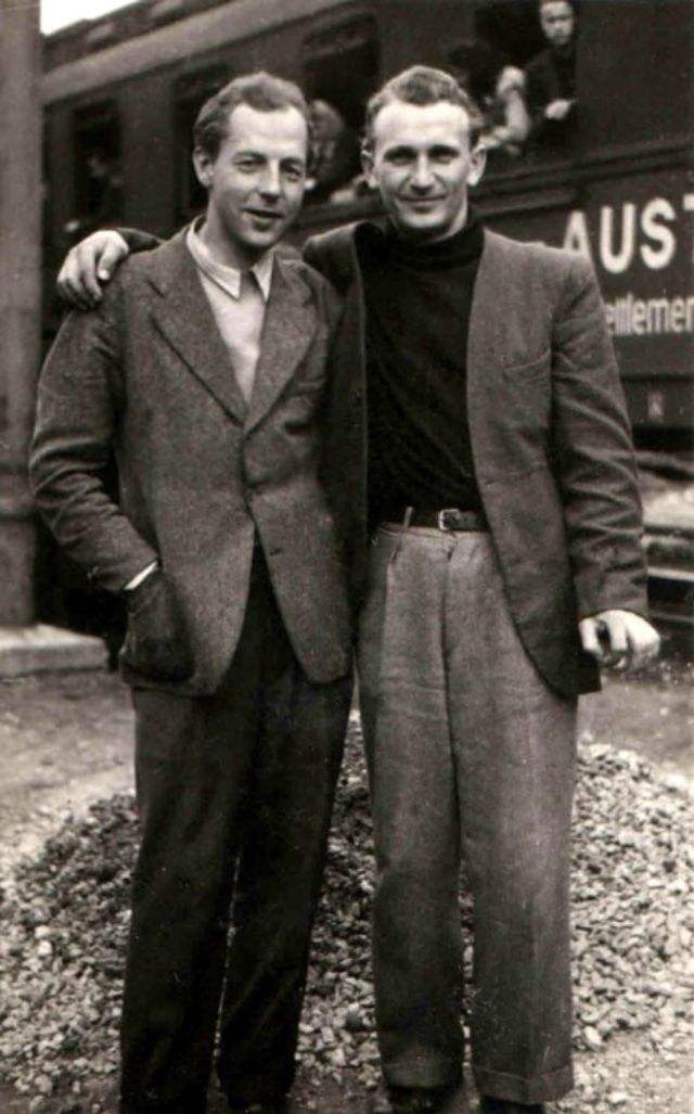
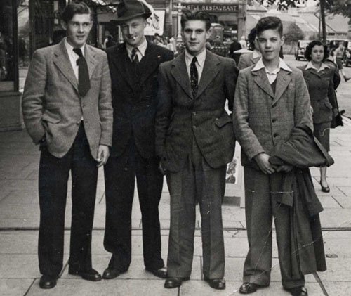
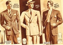
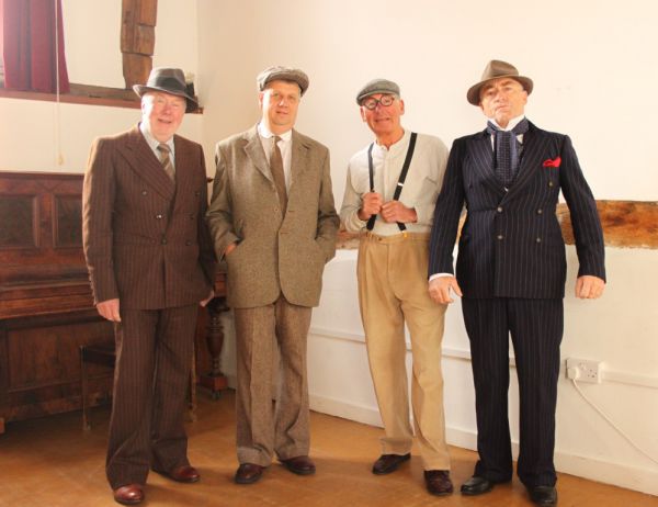
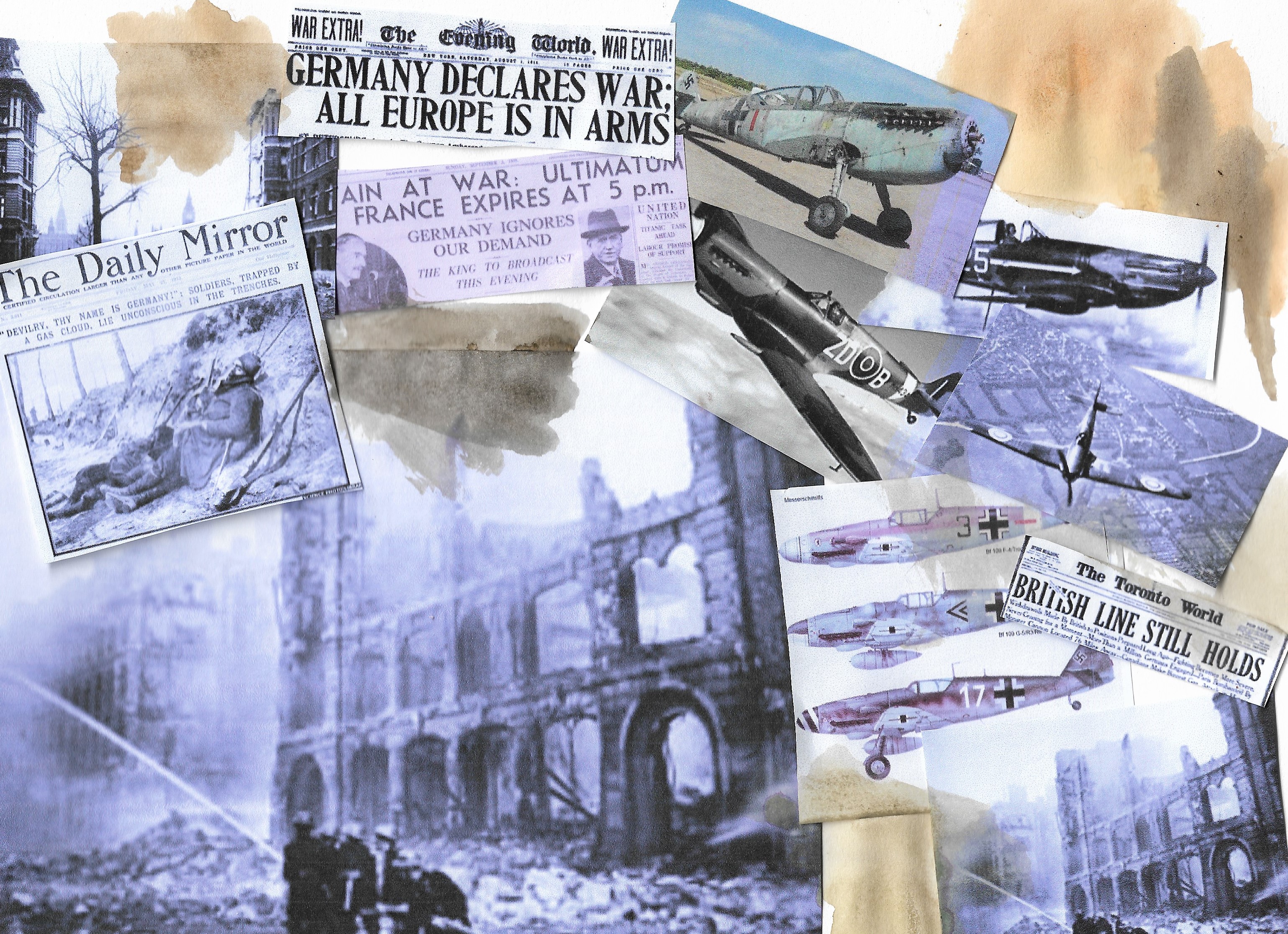
From here I decided to collect some visual references to this, which can all be seen below:
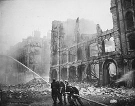
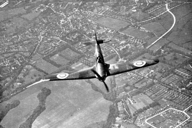
Hawker Hurricane in flight, Battle of Britain, World War II, 1940. A Hawker Hurricane of Fighter Command on its way to intercept German bombers as they crossed the south coast of England. Fought between 10 July and 31 October 1940, the Battle of Britain was the first major battle to be won in the air. The RAF’s victory in the battle effectively prevented the Germans from attempting an invasion. (Photo by Ann Ronan Pictures/Print Collector/Getty Images) 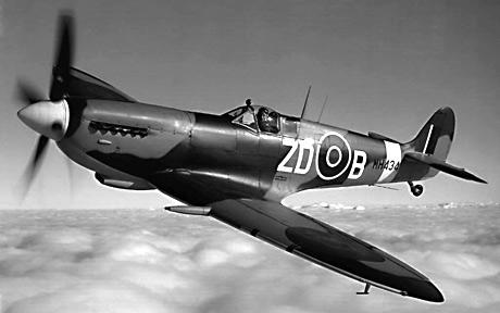
After researching and creating my moodboard I drew up 2 concepts using adobe illustrate on my phone, as using my finger on the phones screen gave an effect that I wouldn’t usually see using a laptop or pencil. Here are the 2 concepts created on my phone:After researching and making a moodboard i drew up 2 concepts using the adobe illustrate application on my mobile phone, just as a different way of drawing these concepts using just my finger on the mobile phone screen gave off an effect i wouldn’t get by using my laptop or a pencil. Here are the 2 concepts created on my phone:

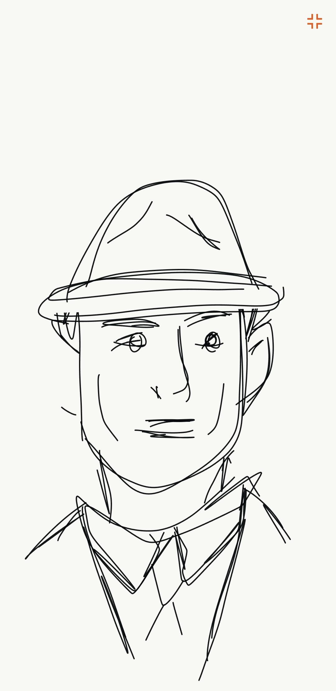
I felt these concepts worked well, and that this was the portrait I wanted to go for, Imagining the main character to be wearing a suit and a hat, suggesting from Scotland yard and because this clothing was the main attire that males wore during the war as seen in images above.
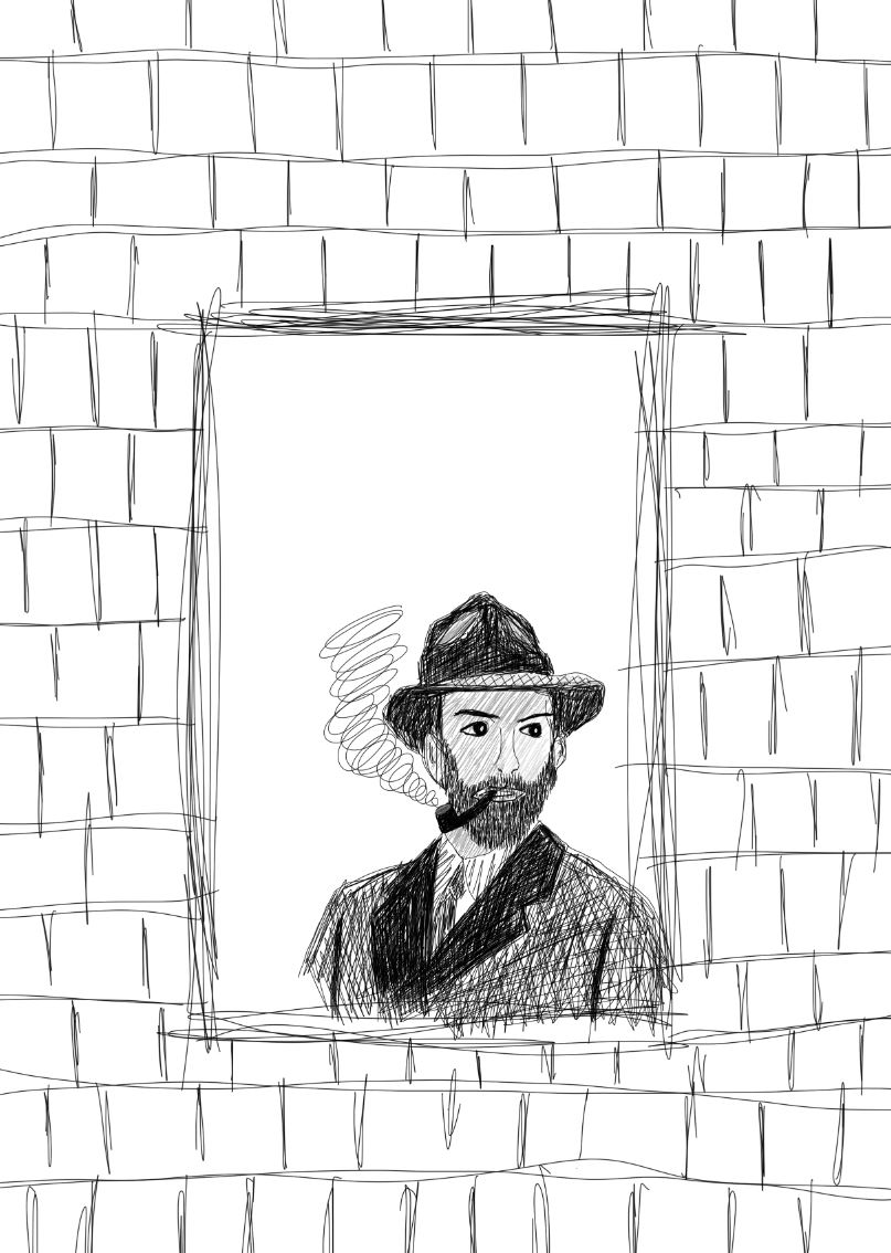
For this piece I wanted to use my surface pro to draw on using photoshop, with an idea for the main character in mind, much alike the concept drawing I began to draw in photoshop. I wanted to use black and grey for this piece to give a wartime feel as there were little to no colour cameras or television at the time, here is my process for drawing the main character:
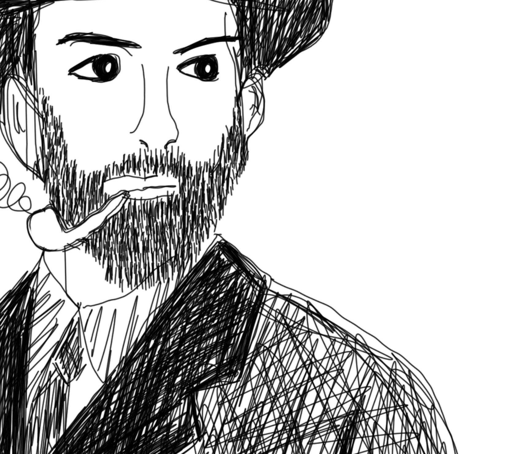
As I went along, I decided to add a beard and a pipe as it became more of what I was envisioning for the main character.

Adding grey into the image gave more detail to the mans face and hat rather than leaving it white.
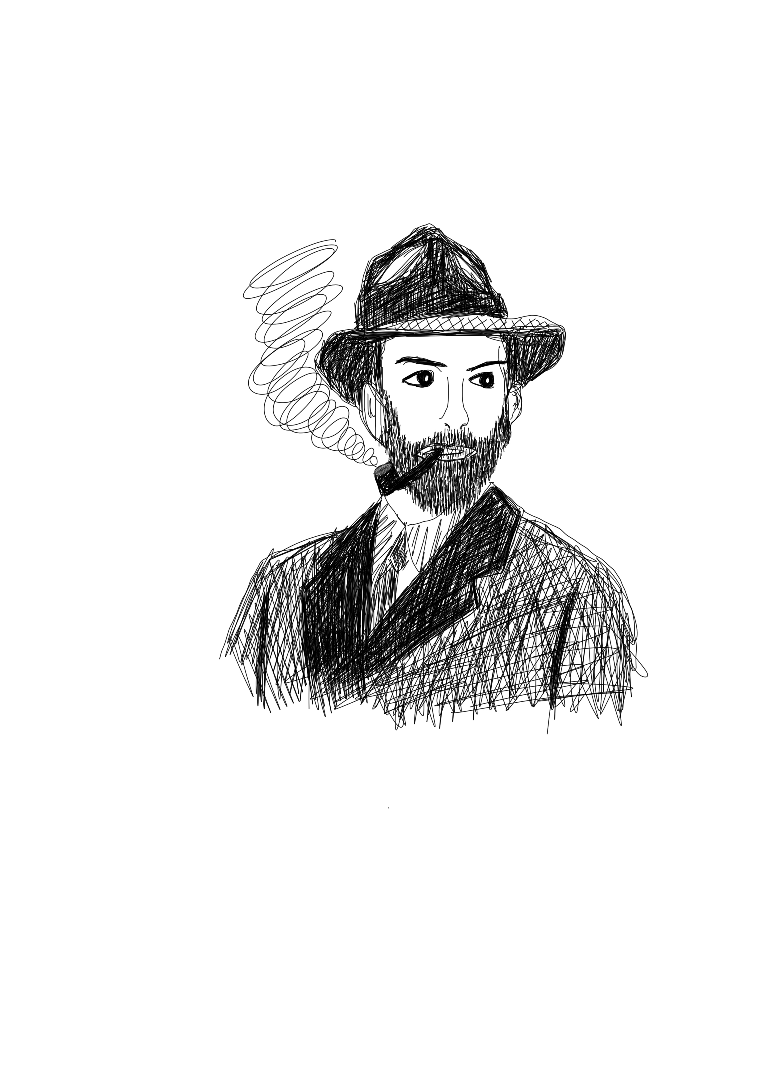
From there I decided to draw the man at a window as described in the brief’s passage.
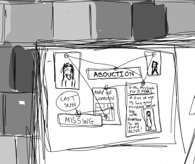
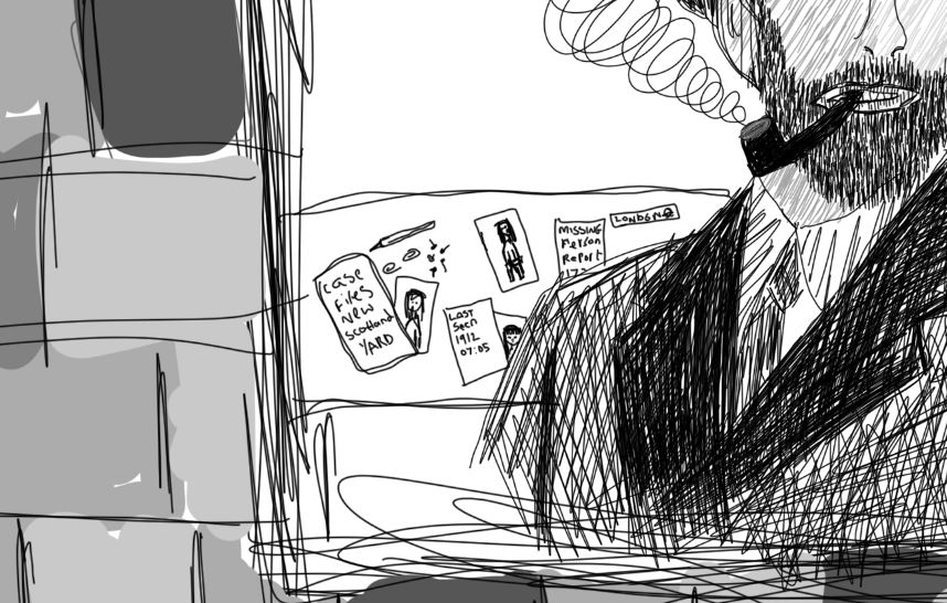
As the man was working on an abduction case, I chose to add a board showing case progress behind the man with maps and images of the missing girls all tied together using pins and string as seen in old detective cases. I also decided to include the desk as mentioned in the passage and I felt this all worked well to tie up the image showing what was described in the extract.
From there I moved onto filling in the brick’s colour as can be seen below:
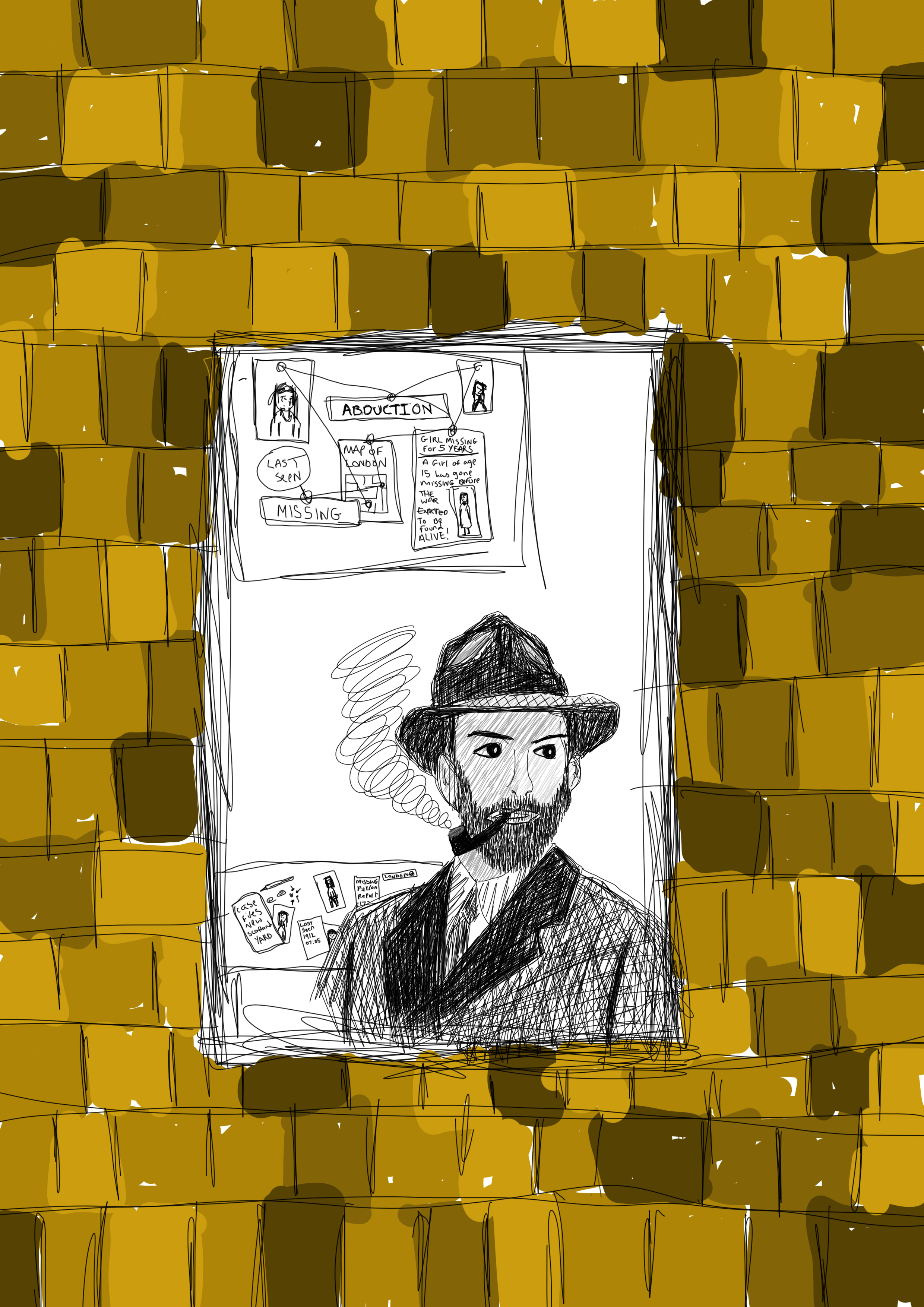
i wanted the brick to be in black and grey to match the man in the window, so i decided to use the black and white edit option in photoshop to do this. I feel the use of black and grey works better than the use of colour due to the time zone that the extract mentions it being wartime I always think of black and white images rather than coloured as all of the photographs from this time were black and white. Here is the finished piece:
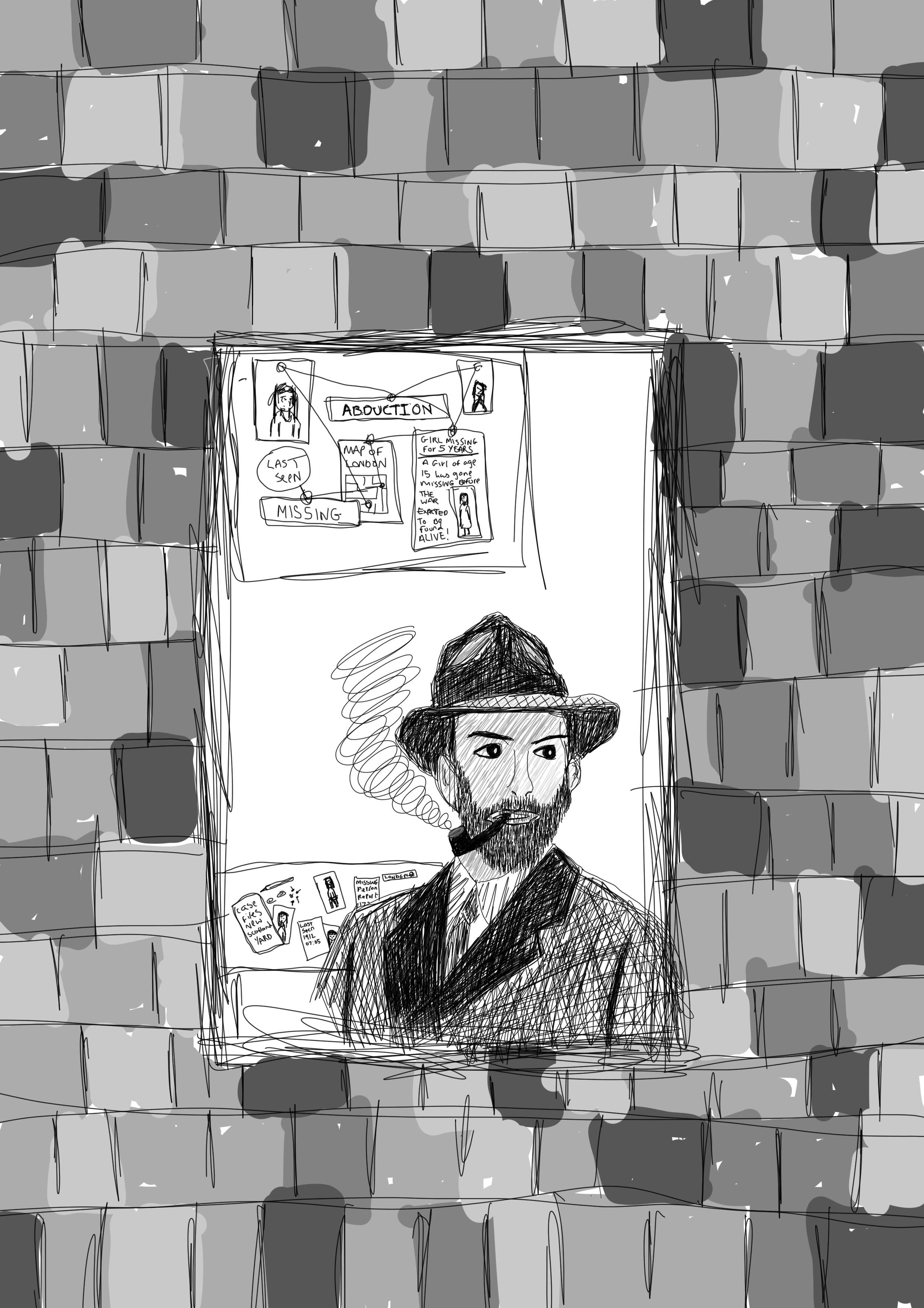
The use of digital illustration worked well for this piece, although i haven’t done many digital drawings i feel that this use of medium is a good choice as it is easy to manipulate an image and if you make a mistake you can undo it unlike if you were to use a more traditional medium you wouldnt get the same effect the lines are more uniform and you can zoom in on certian parts such as the abduction drawings and newspaper clipping that i had created to add more intricate details and text to these images which i feel adds to the detail of the piece that works well in responce to this part of the unit giving a real feel of the section of the story that is discribed in the breif, therefore i feel that this final piece works well as a whole in telling the story itself in one final illustration image.
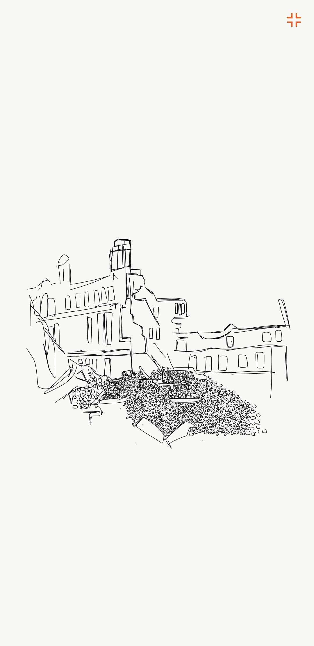
After creating the man along with him standing in the window I looked back upon the references I found, i wanted to do another drawing of the man in a physical war location, with knocked down building and bomber planes in the sky, I started by drawing a bombed building using the adobe draw application on my mobile phone, here is my process:
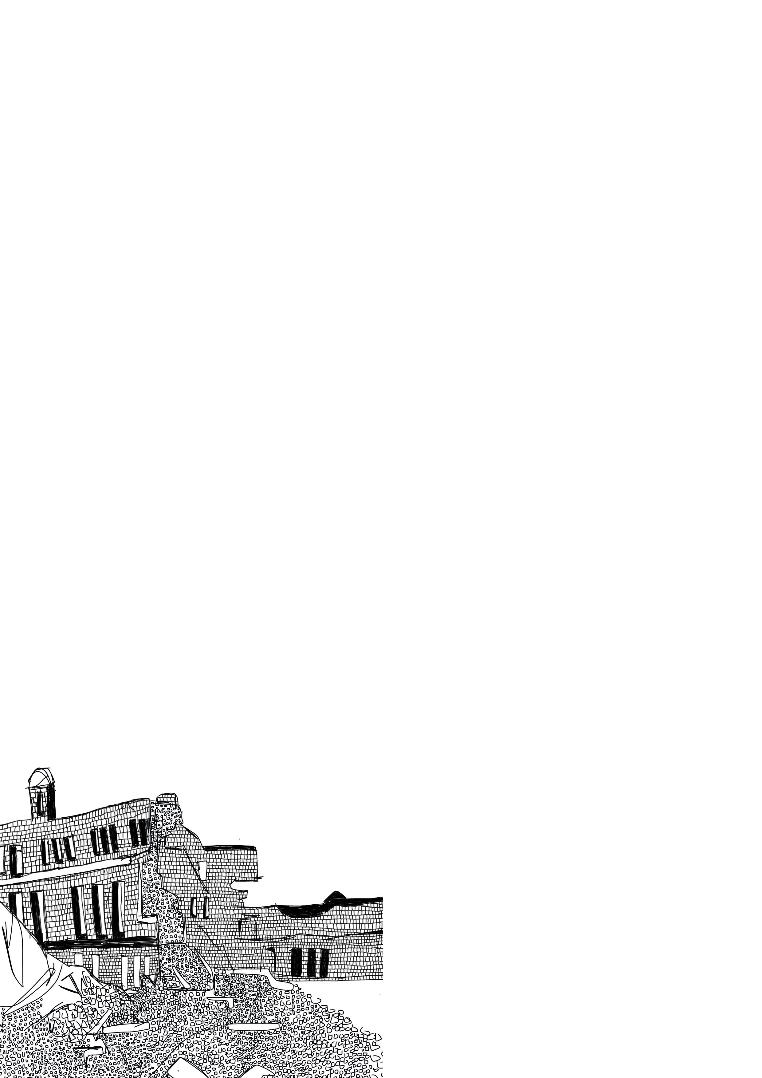
After creating this illustration I saved the file as a PNG and put the image into photoshop and began to add brick details into the white bits of the building again to add more depth and detail to this illustration, here is the final illustration of the bombed building:
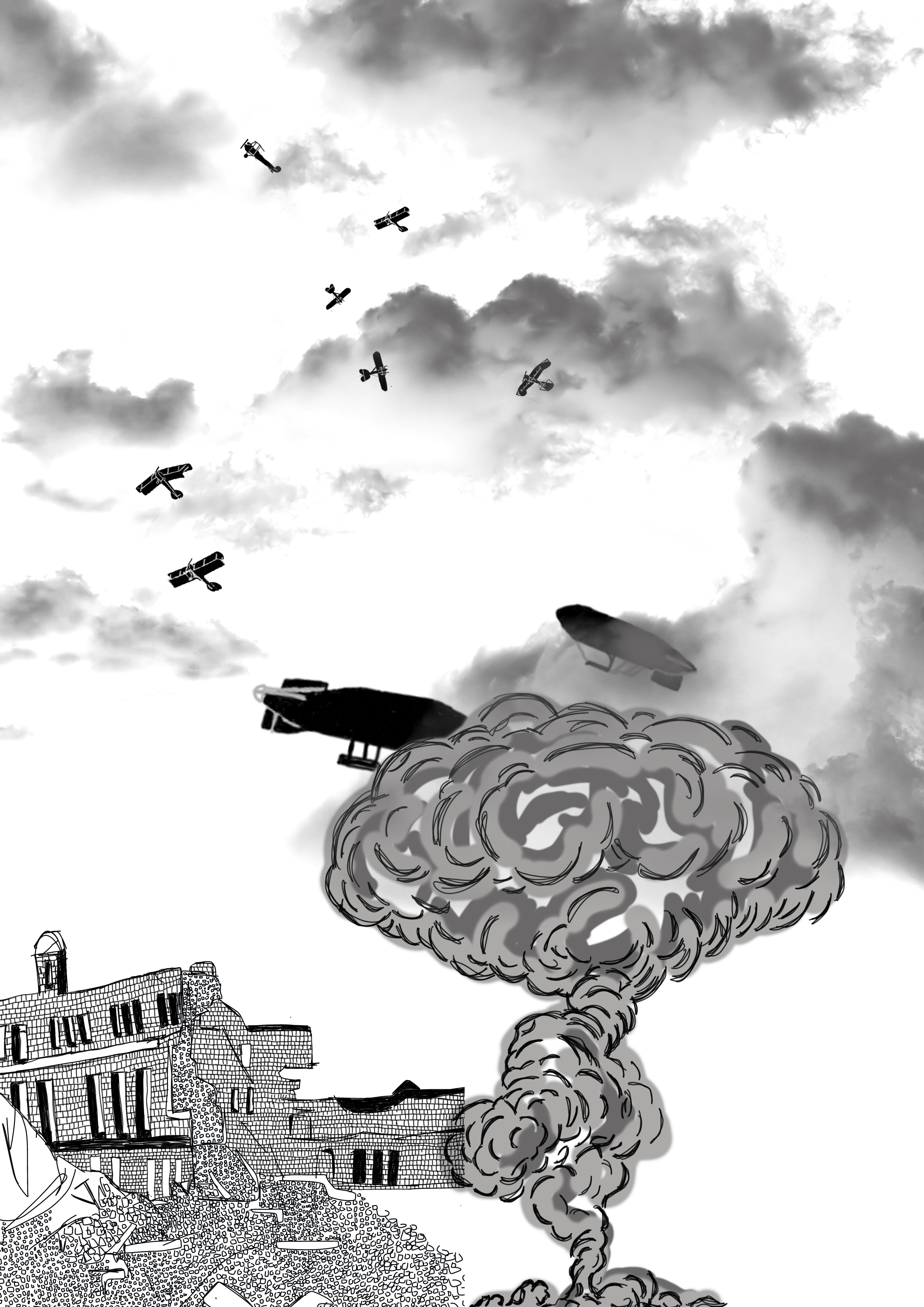
Next I wanted to add planes to the sky bomber planes from Germany and Britain, as this location is set in Britain I decided to have british fighter jets fighting off German warplanes along with british zepellins in the sky. Below is the image of the planes added to the illustration which I drew again using photoshop.

After this i wanted to add a bomb being dropped on the city so i decided to draw a smoke cloud next to the building and covering the zepellins slightly so show a large explotion adding the war effect to the illustration as well as adding glouds to the top of the illustration to show the skyline and the horizon line, i created the clouds using a brush tool found online, i decided to use fgrey clouds to give a darker feel to the final image as can be seen below:
Finally adding the man i had first created in photoshop to the bottom right of the image:
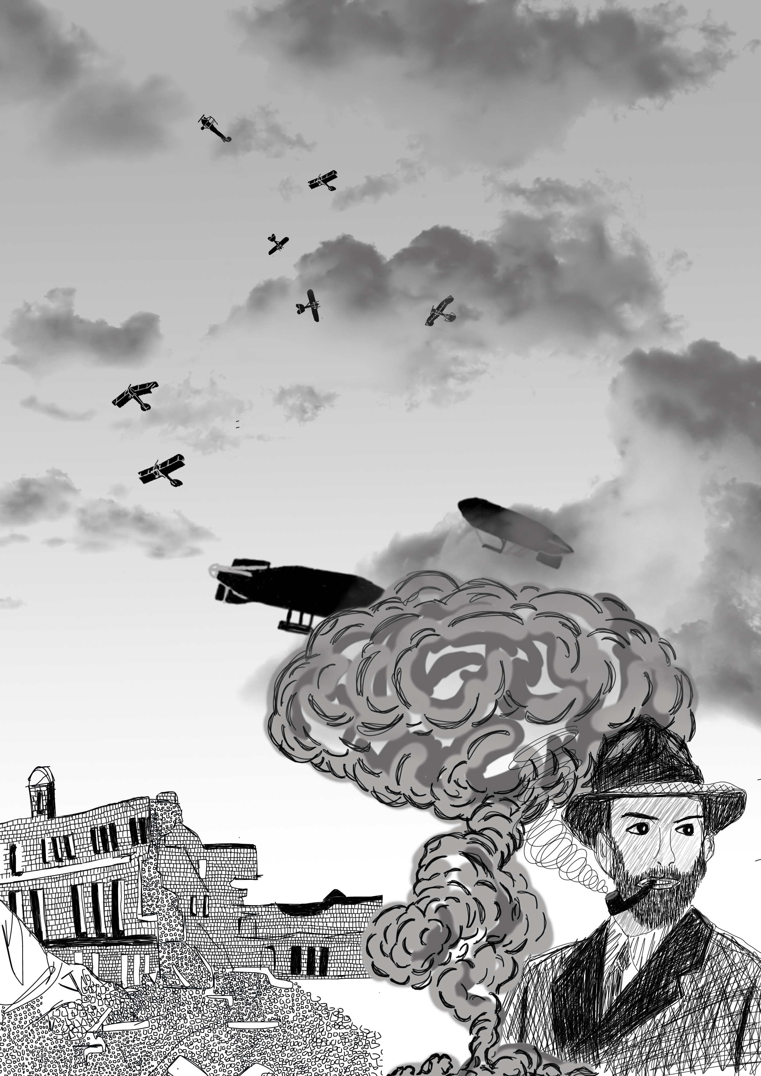
I decided to add a fade to the image having the top grey and fading to white nearer the horizon, i felt again that this gave the image depth. Having the man in the corner showing his location, i feel as a whole that this final illustration works well in conveying the idea of a detective in wartime london, i feel that if i did this image again i would have had the mans whole body caryinga breifcase or holding casefiles of abduction cases to really show that the man is a detective in wartime london, overall i feel the combined styles through using the photoshop platform to create this piece is beneficial and works well as you can easily manipulate the image to give more depth and higher detail than that of any other medium, maybe trying to do this image as an acrylic painting could be something for me to expand on and try or even as a watercolour image combining styles to create one whole piece.
