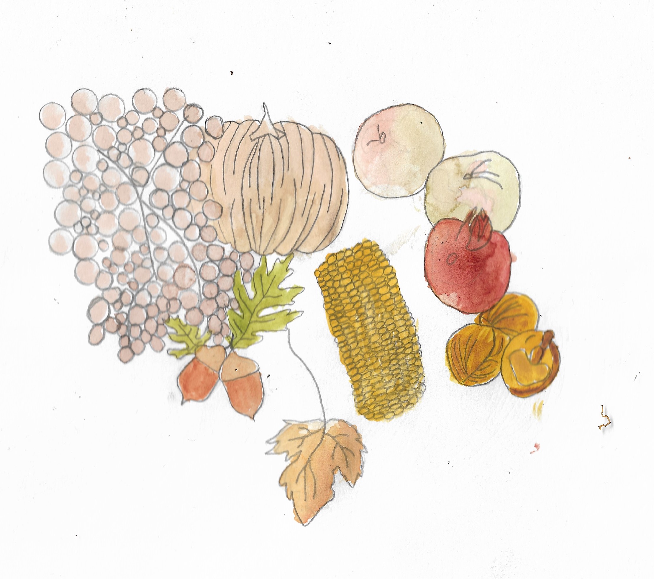
I started by creating an illustration of Autum Fruit and Vegetables which can be seen below:
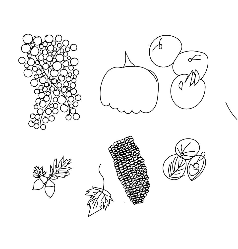
i decided to draw the same fruit and vegetables but in adobe illustrator:
next i put these images into photoshop and added colour to them:
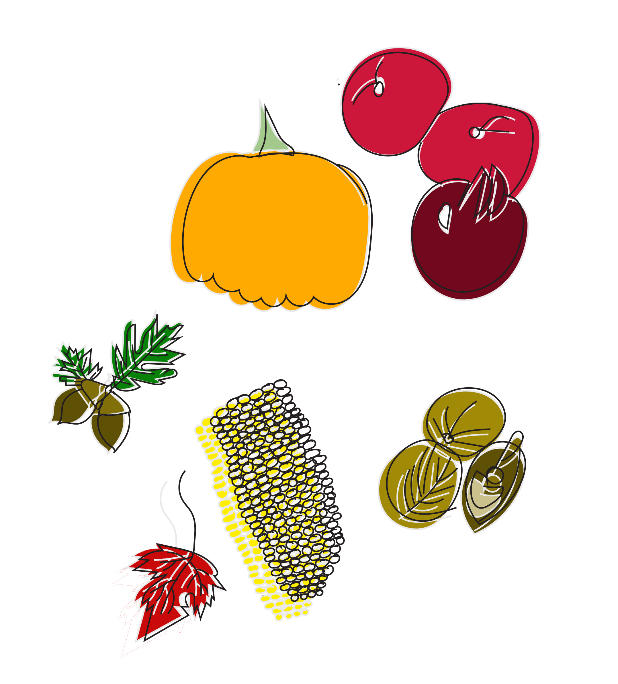
i feel this worked better than the watercolour illustration as the fruit and vegetables look more appetising. I feel the use of block colour works well with this piece. I positioned the colour slightly outside of the black linework that gave depth to the whole piece.
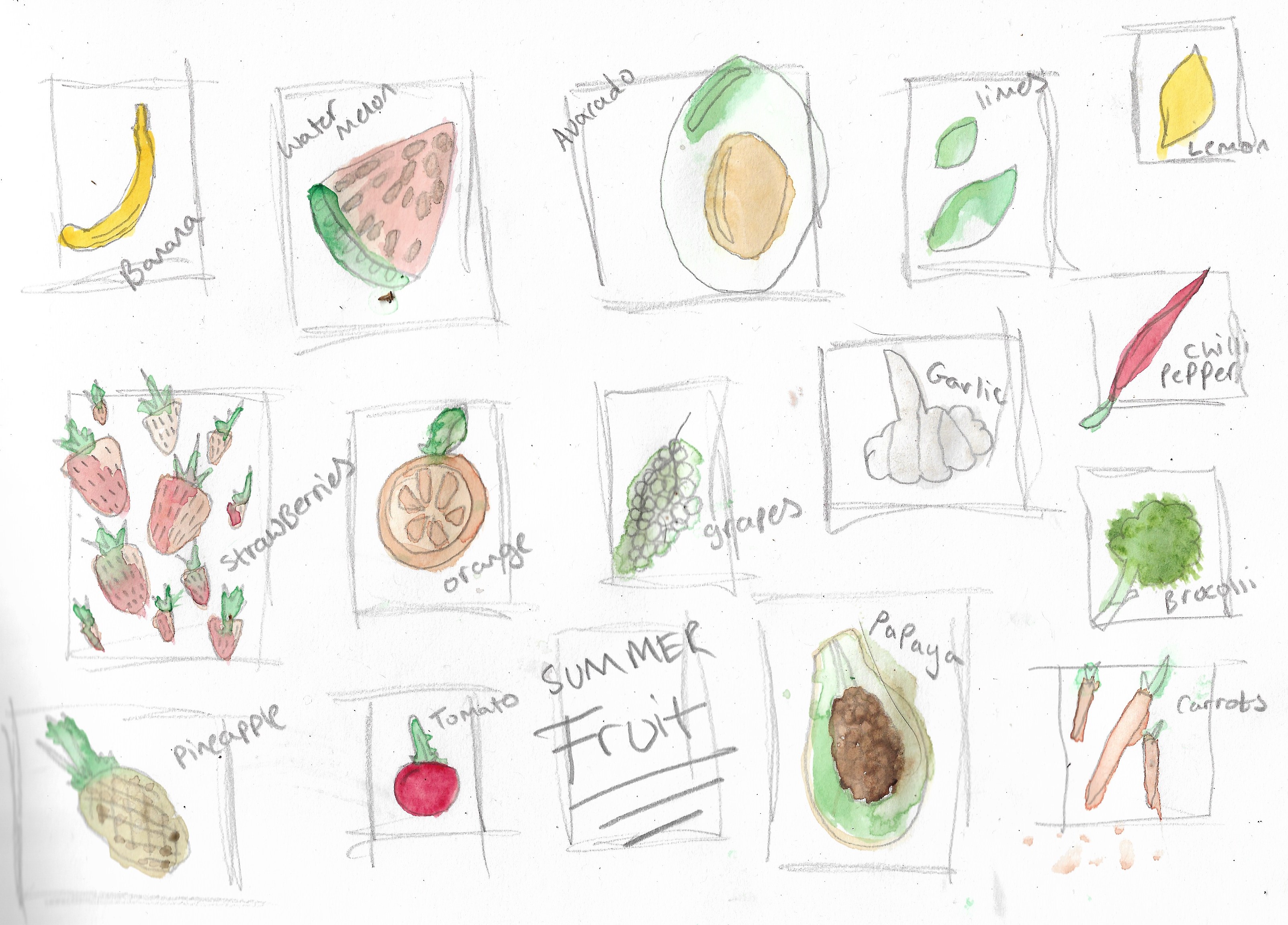
after creating this piece i decided to draw summer fruits using watercolour to draw a selection of fruit and vegetables, this helped me in choosing what fruit and vegetables i wanted to draw for a summer selection of fruits and vegetables below is my illustrations of this summer selection:
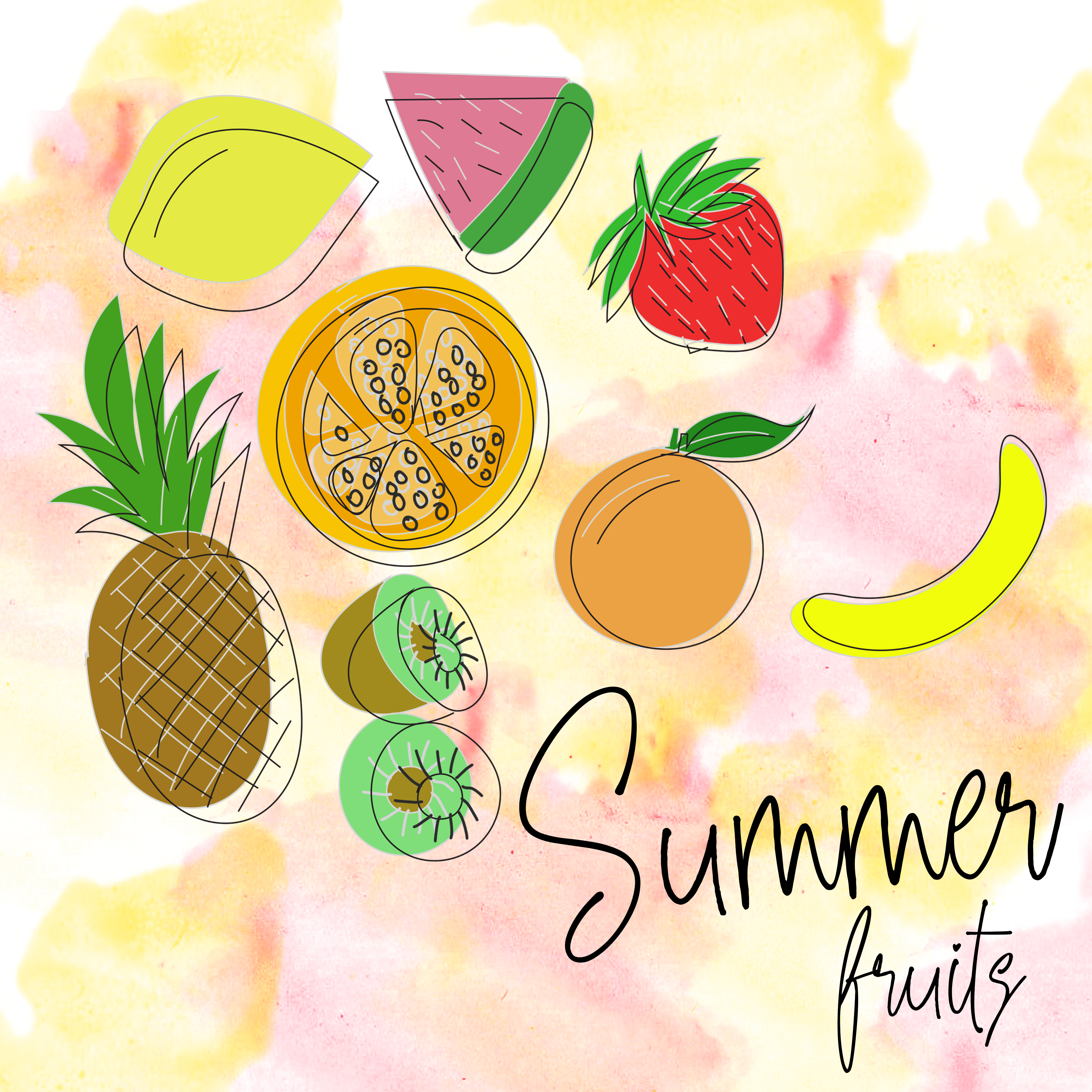
Next i started to draw summer fruits this time again using adobe illustrator to give the same feel and appearance as the autumn fruit and vegetables:

After creating this summer fruits drawing using illustrator and photoshop i decided to add text to the image and to see what it would look like on packaging along with adding a waterclour background to give the fruit more of a pop although i feel this didn’t work as well when converting the image onto packaging:
after creating this piece i didnt want to use plastic food packaging for fruit as fruit has no packaging instead i found a box containing apples as a place to store them when picking them up from a shop instead of putting them in a plastic bag, here are the results of what i have created:

I feel this summer fruits packaging works well on these boxes i had found, showing a variety of food on the box where you could possibly use this on the side of paper bags for the fruit instead of using the paper bags currently supplied by main supermarkets.
