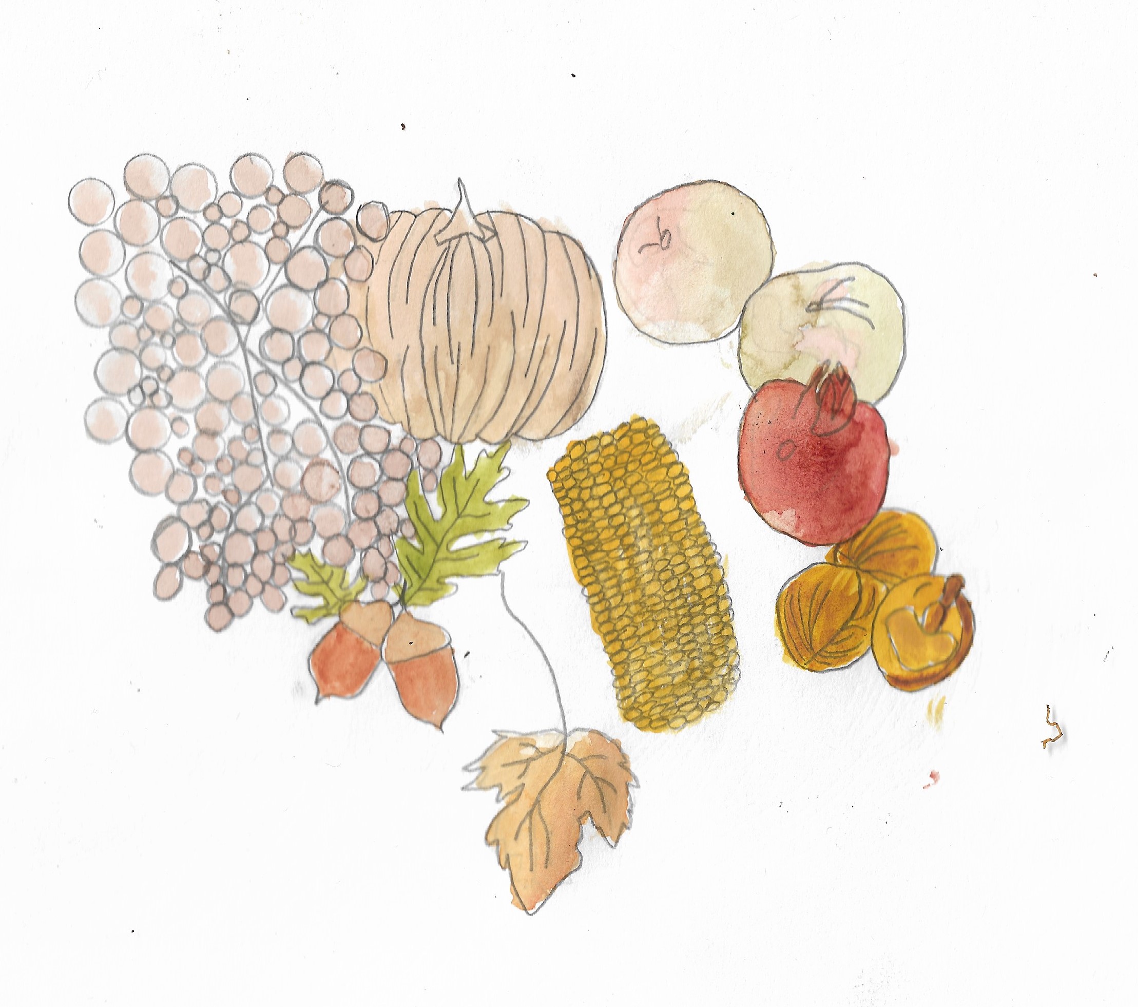
I started by creating an illustration of Autum Fruit and Vegetables which can be seen below:
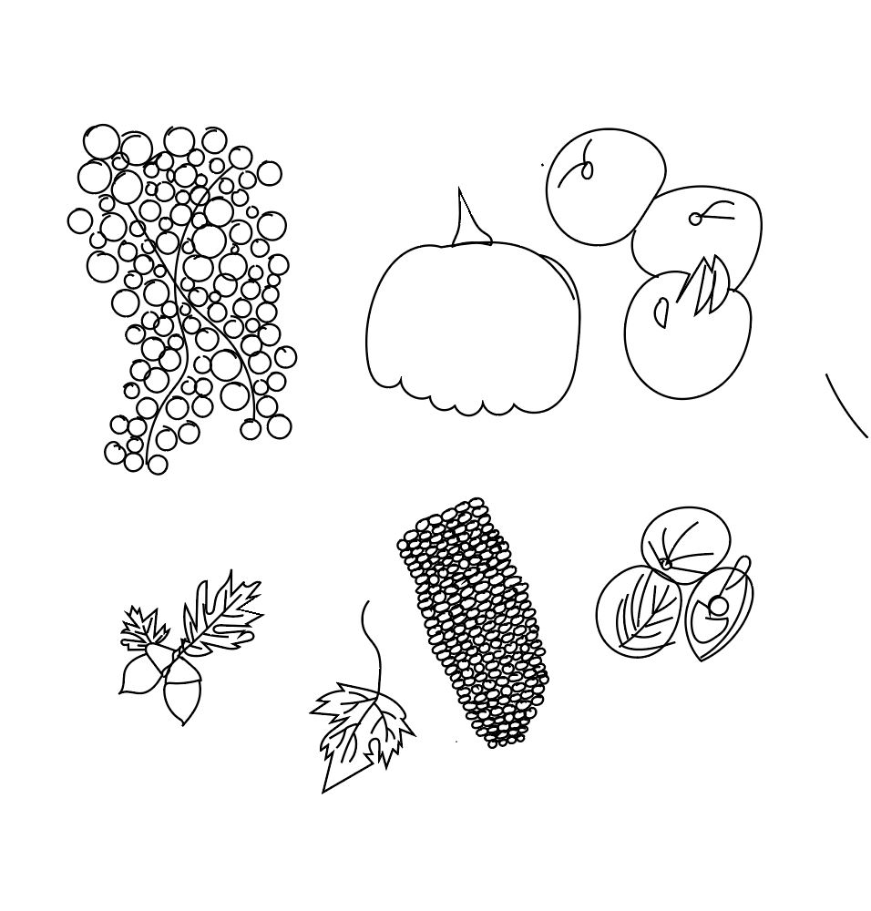
i decided to draw the same fruit and vegetables but in adobe illustrator:
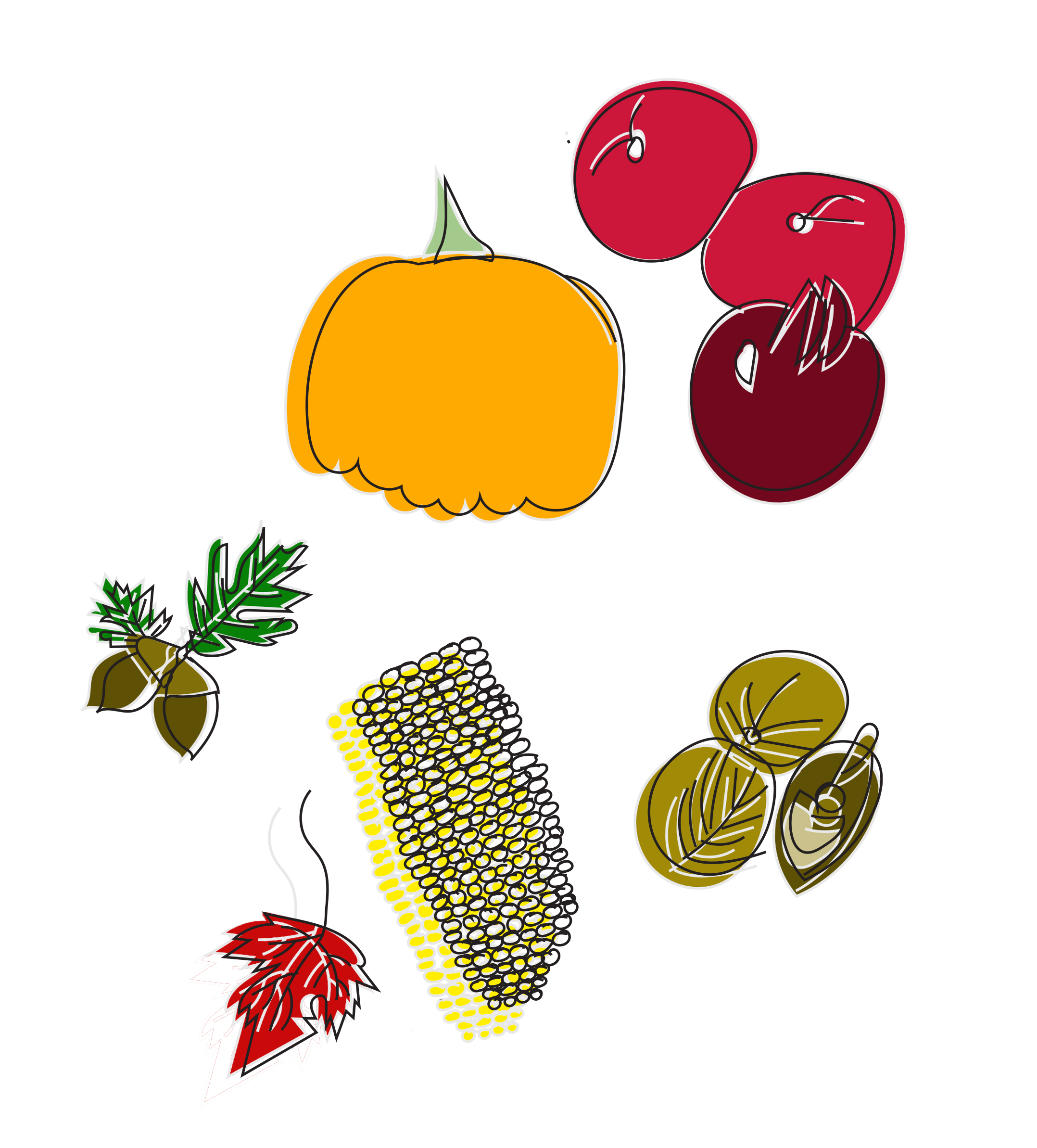
next i put these images into photoshop and added colour to them:
i feel this worked better than the watercolour illustration as the fruit and vegetables look more appetising. I feel the use of block colour works well with this piece. I positioned the colour slightly outside of the black linework that gave depth to the whole piece.
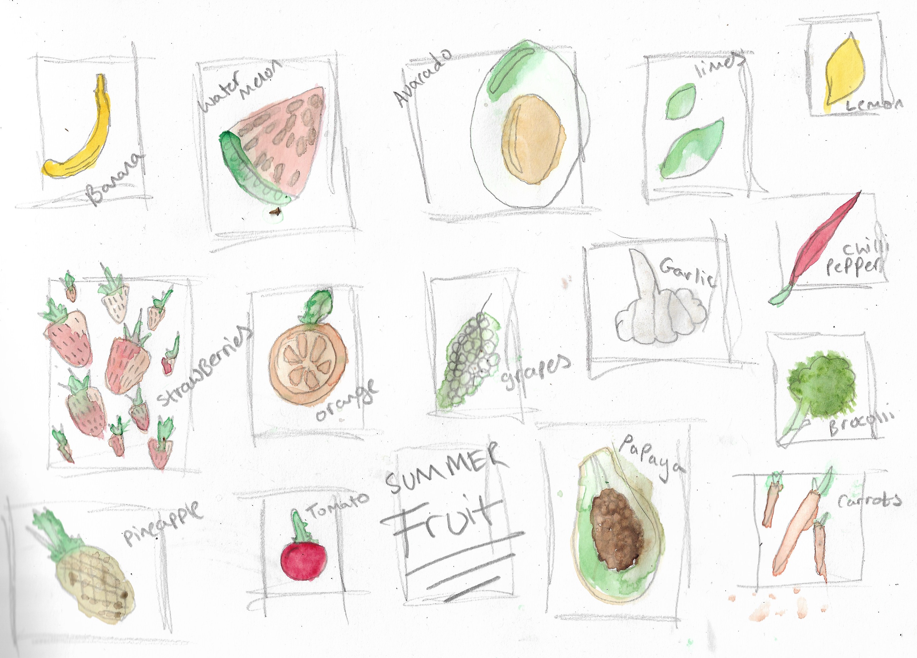
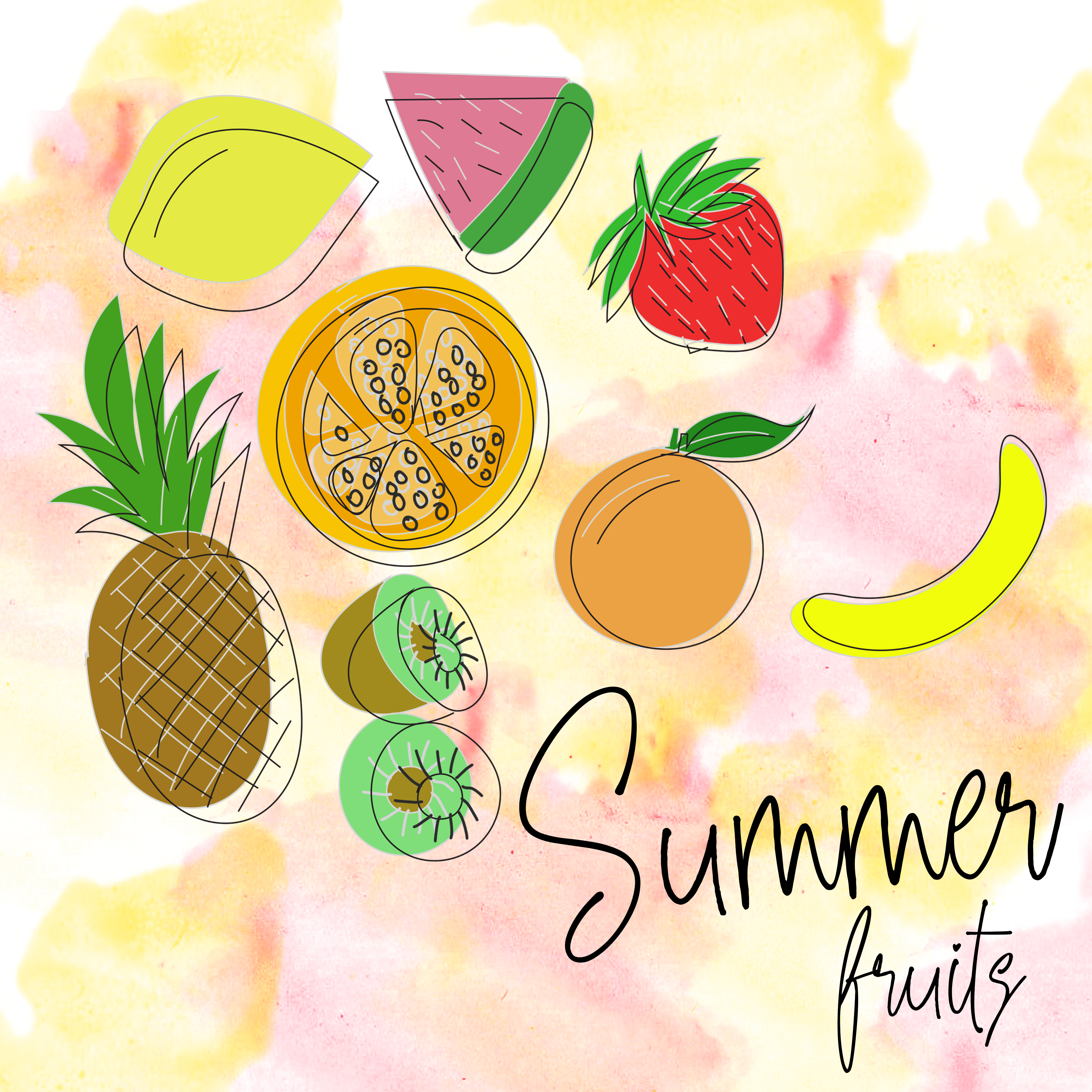
after creating this piece i decided to draw summer fruits using watercolour to draw a selection of fruit and vegetables, this helped me in choosing what fruit and vegetables i wanted to draw for a summer selection of fruits and vegetables below is my illustrations of this summer selection:
Next i started to draw summer fruits this time again using adobe illustrator to give the same feel and appearance as the autumn fruit and vegetables:
After creating this summer fruits drawing using illustrator and photoshop i decided to add text to the image and to see what it would look like on packaging along with adding a waterclour background to give the fruit more of a pop although i feel this didn’t work as well when converting the image onto packaging:
after creating this piece i didnt want to use plastic food packaging for fruit as fruit has no packaging instead i found a box containing apples as a place to store them when picking them up from a shop instead of putting them in a plastic bag, here are the results of what i have created:
I feel this summer fruits packaging works well on these boxes i had found, showing a variety of food on the box where you could possibly use this on the side of paper bags for the fruit instead of using the paper bags currently supplied by main supermarkets.
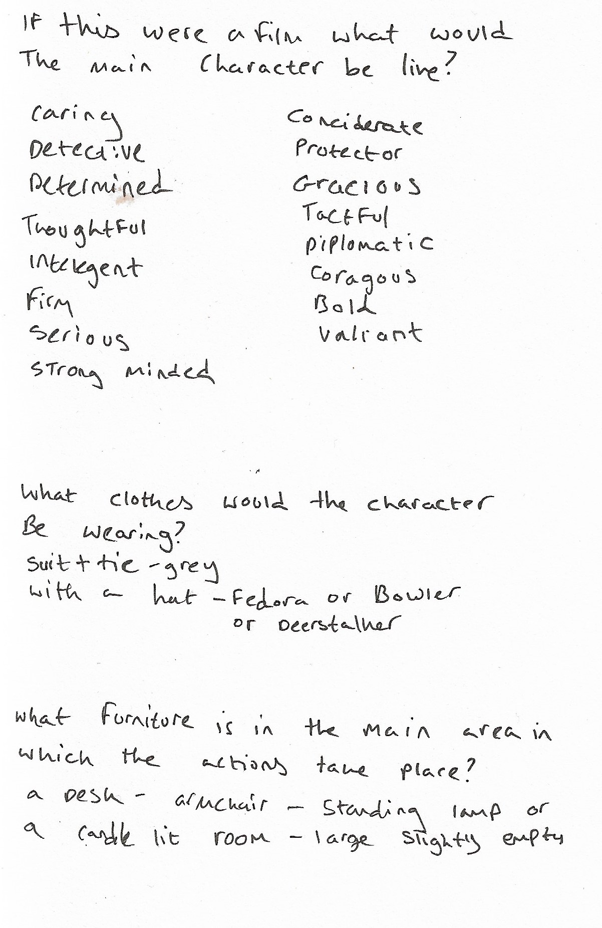
After reading the extract from “The Daffodil Affair” I answered the questions given in the brief that can be seen below:
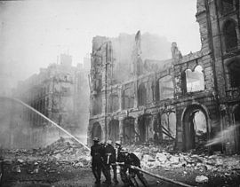
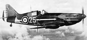
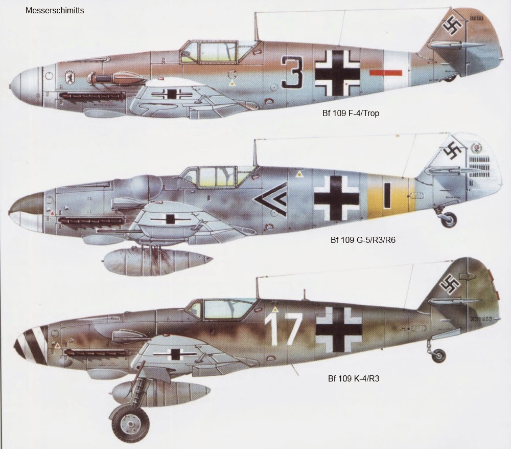
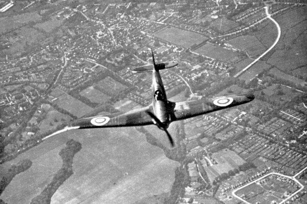
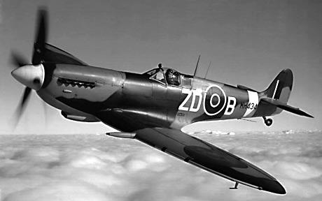
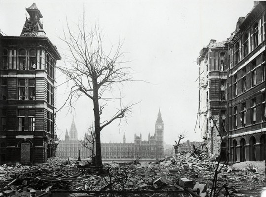
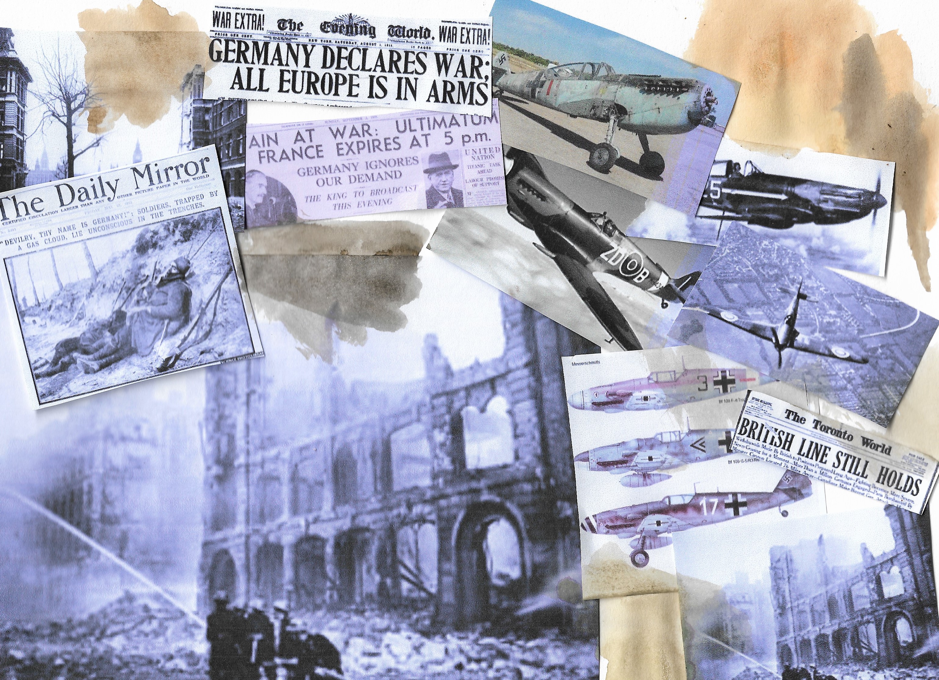
From here I decided to collect some visual references to this, which can all be seen below:
Hawker Hurricane in flight, Battle of Britain, World War II, 1940. A Hawker Hurricane of Fighter Command on its way to intercept German bombers as they crossed the south coast of England. Fought between 10 July and 31 October 1940, the Battle of Britain was the first major battle to be won in the air. The RAF’s victory in the battle effectively prevented the Germans from attempting an invasion. (Photo by Ann Ronan Pictures/Print Collector/Getty Images)
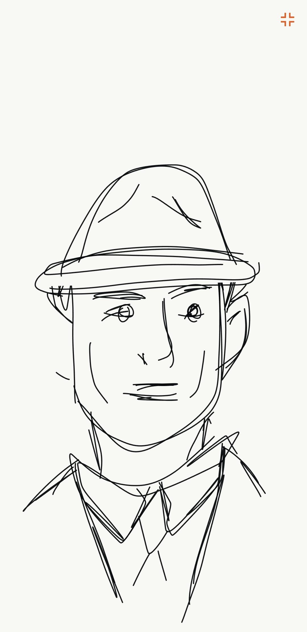
After researching and creating my moodboard I drew up 2 concepts using adobe illustrate on my phone, as using my finger on the phones screen gave an effect that I wouldn’t usually see using a laptop or pencil. Here are the 2 concepts created on my phone:After researching and making a moodboard i drew up 2 concepts using the adobe illustrate application on my mobile phone, just as a different way of drawing these concepts using just my finger on the mobile phone screen gave off an effect i wouldn’t get by using my laptop or a pencil. Here are the 2 concepts created on my phone:
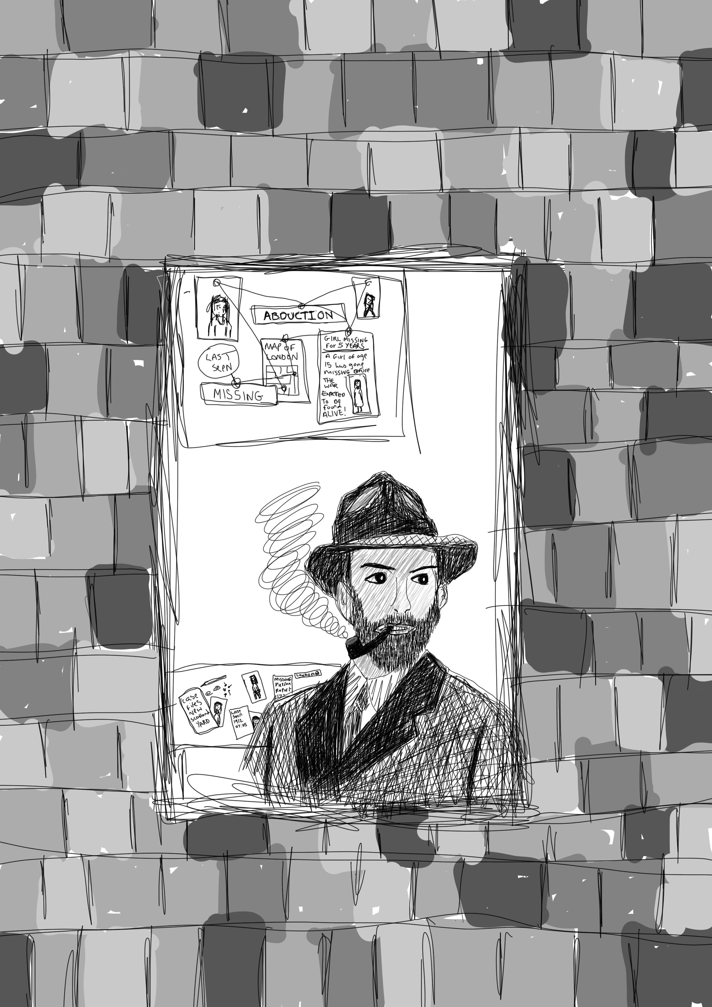
I felt these concepts worked well, and that this was the portrait I wanted to go for, Imagining the main character to be wearing a suit and a hat, suggesting from Scotland yard and because this clothing was the main attire that males wore during the war as seen in images above.
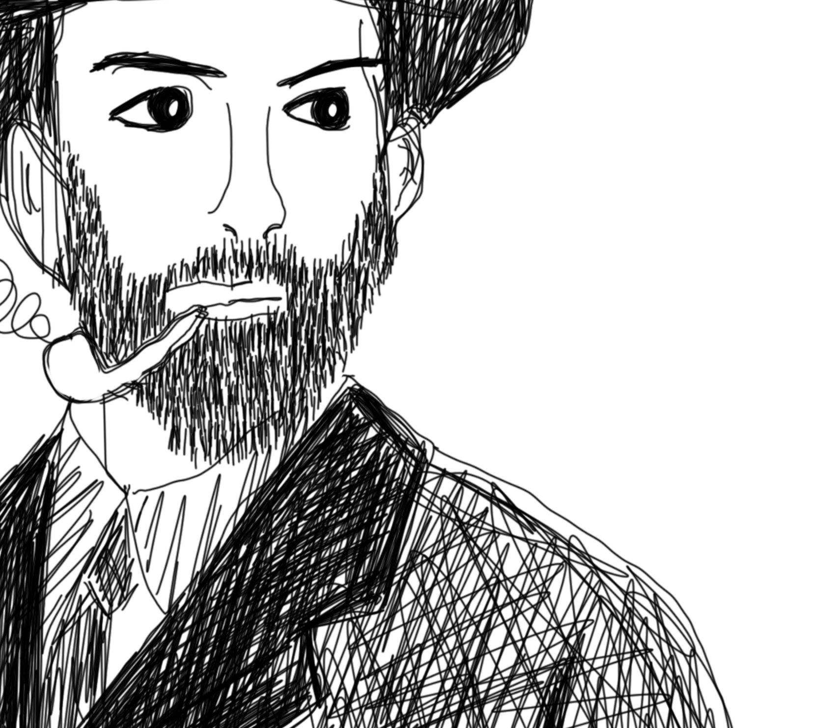
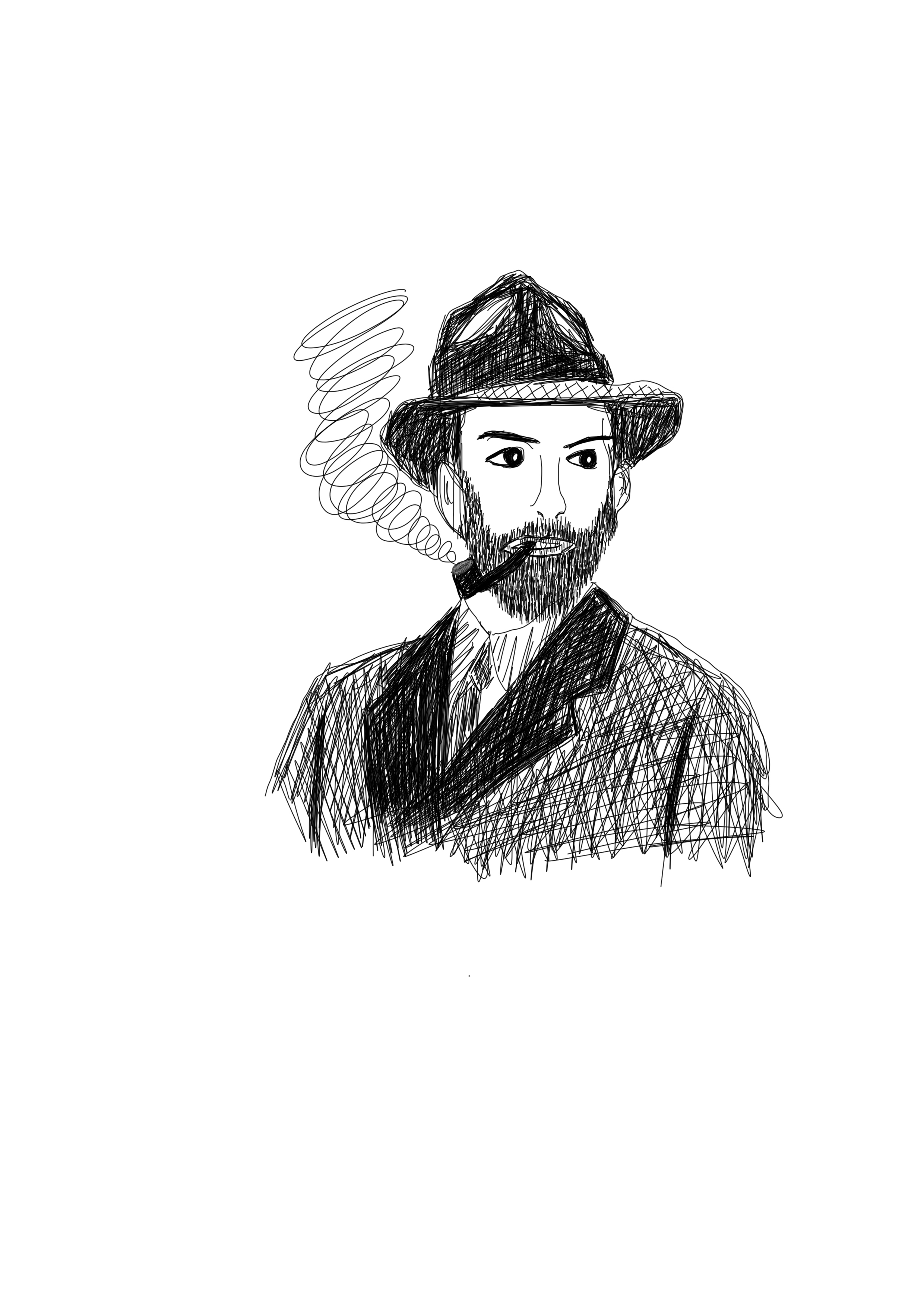
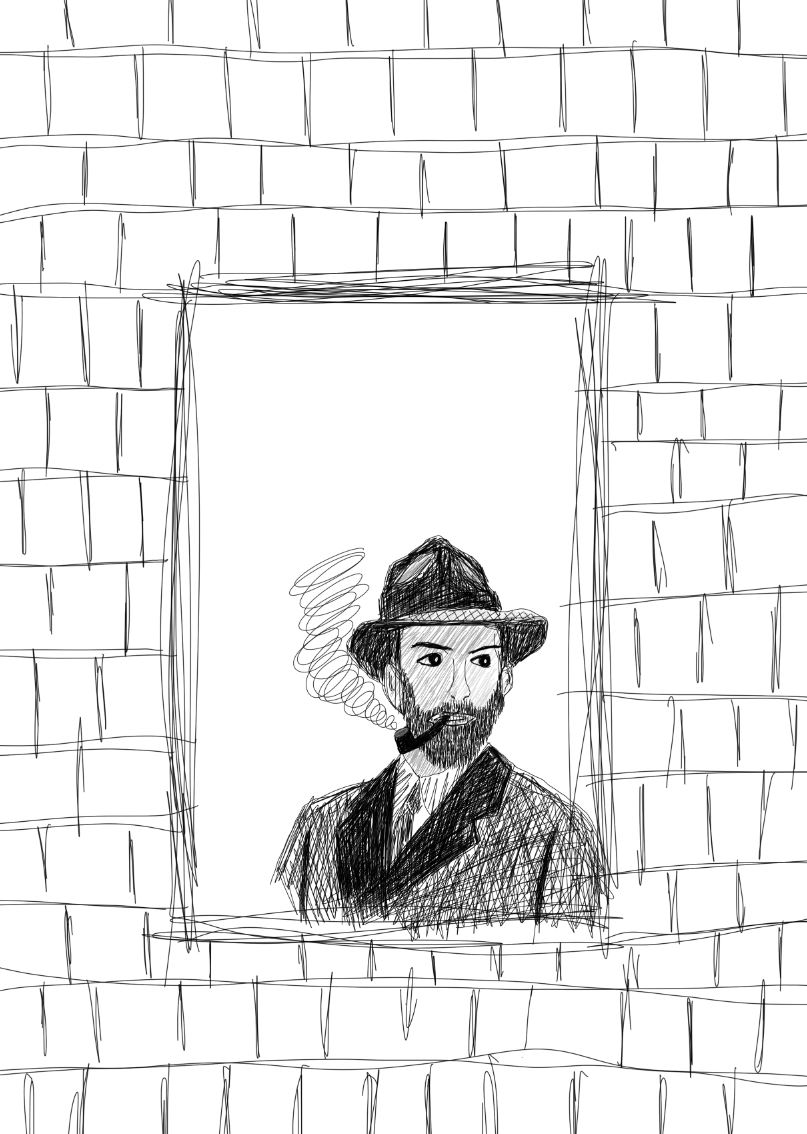
For this piece I wanted to use my surface pro to draw on using photoshop, with an idea for the main character in mind, much alike the concept drawing I began to draw in photoshop. I wanted to use black and grey for this piece to give a wartime feel as there were little to no colour cameras or television at the time, here is my process for drawing the main character:
As I went along, I decided to add a beard and a pipe as it became more of what I was envisioning for the main character.
Adding grey into the image gave more detail to the mans face and hat rather than leaving it white.
From there I decided to draw the man at a window as described in the brief’s passage.
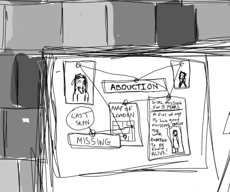
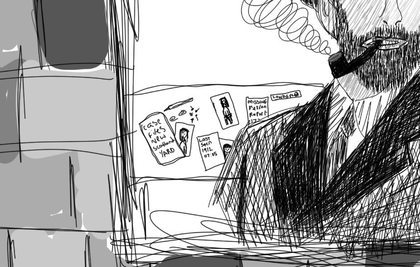
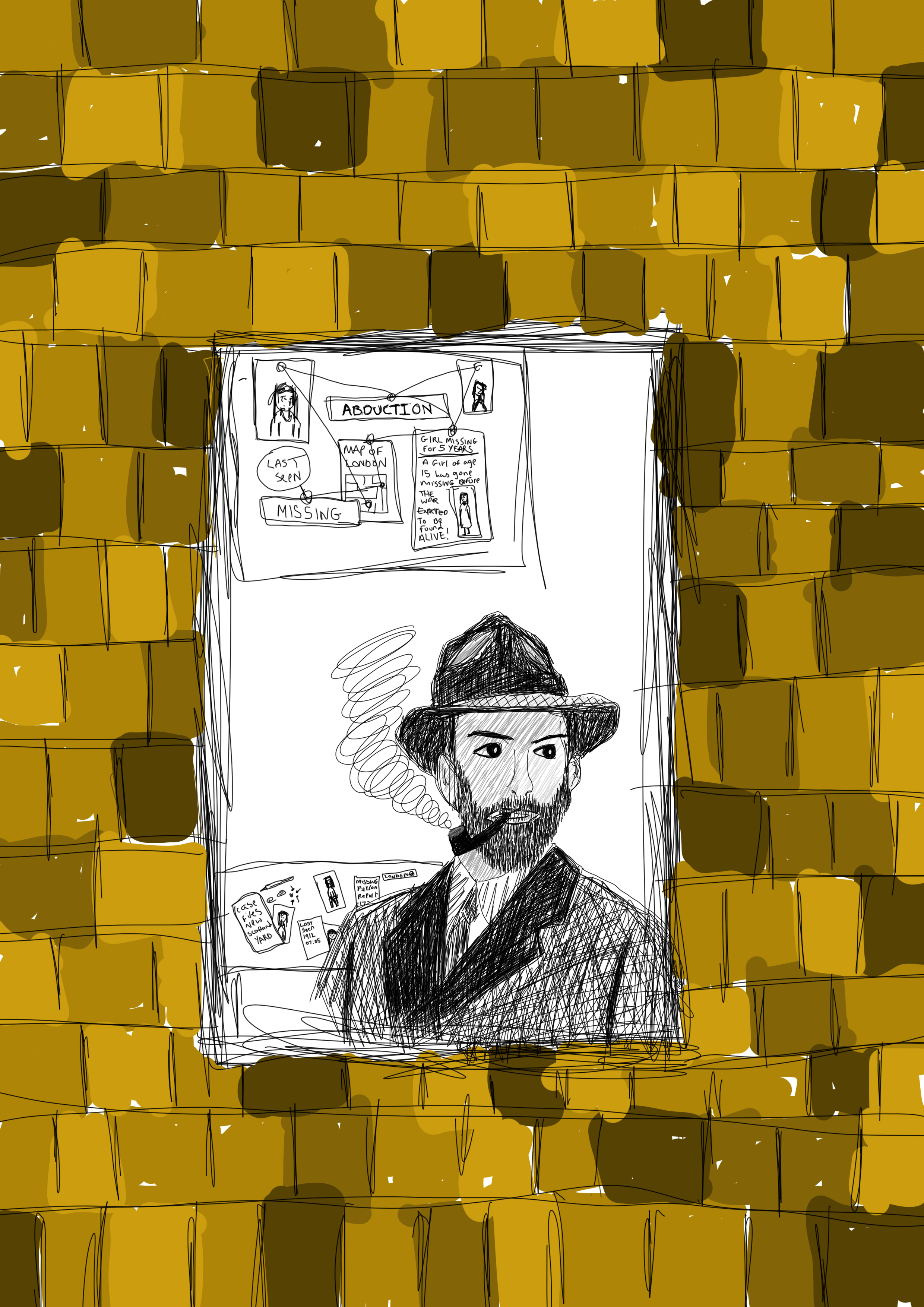
As the man was working on an abduction case, I chose to add a board showing case progress behind the man with maps and images of the missing girls all tied together using pins and string as seen in old detective cases. I also decided to include the desk as mentioned in the passage and I felt this all worked well to tie up the image showing what was described in the extract.
From there I moved onto filling in the brick’s colour as can be seen below:
i wanted the brick to be in black and grey to match the man in the window, so i decided to use the black and white edit option in photoshop to do this. I feel the use of black and grey works better than the use of colour due to the time zone that the extract mentions it being wartime I always think of black and white images rather than coloured as all of the photographs from this time were black and white. Here is the finished piece:
The use of digital illustration worked well for this piece, although i haven’t done many digital drawings i feel that this use of medium is a good choice as it is easy to manipulate an image and if you make a mistake you can undo it unlike if you were to use a more traditional medium you wouldnt get the same effect the lines are more uniform and you can zoom in on certian parts such as the abduction drawings and newspaper clipping that i had created to add more intricate details and text to these images which i feel adds to the detail of the piece that works well in responce to this part of the unit giving a real feel of the section of the story that is discribed in the breif, therefore i feel that this final piece works well as a whole in telling the story itself in one final illustration image.
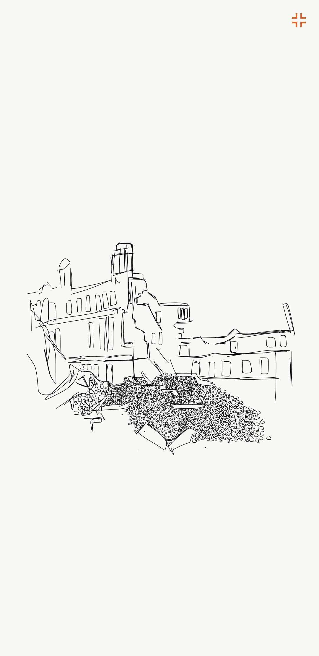
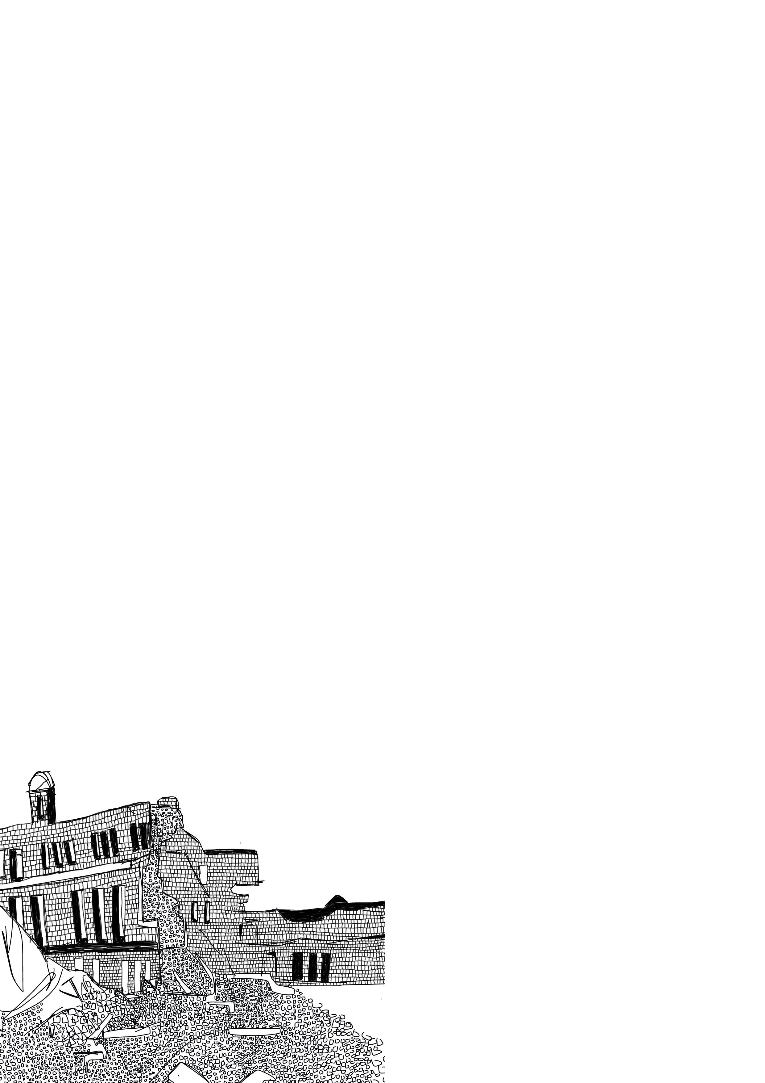
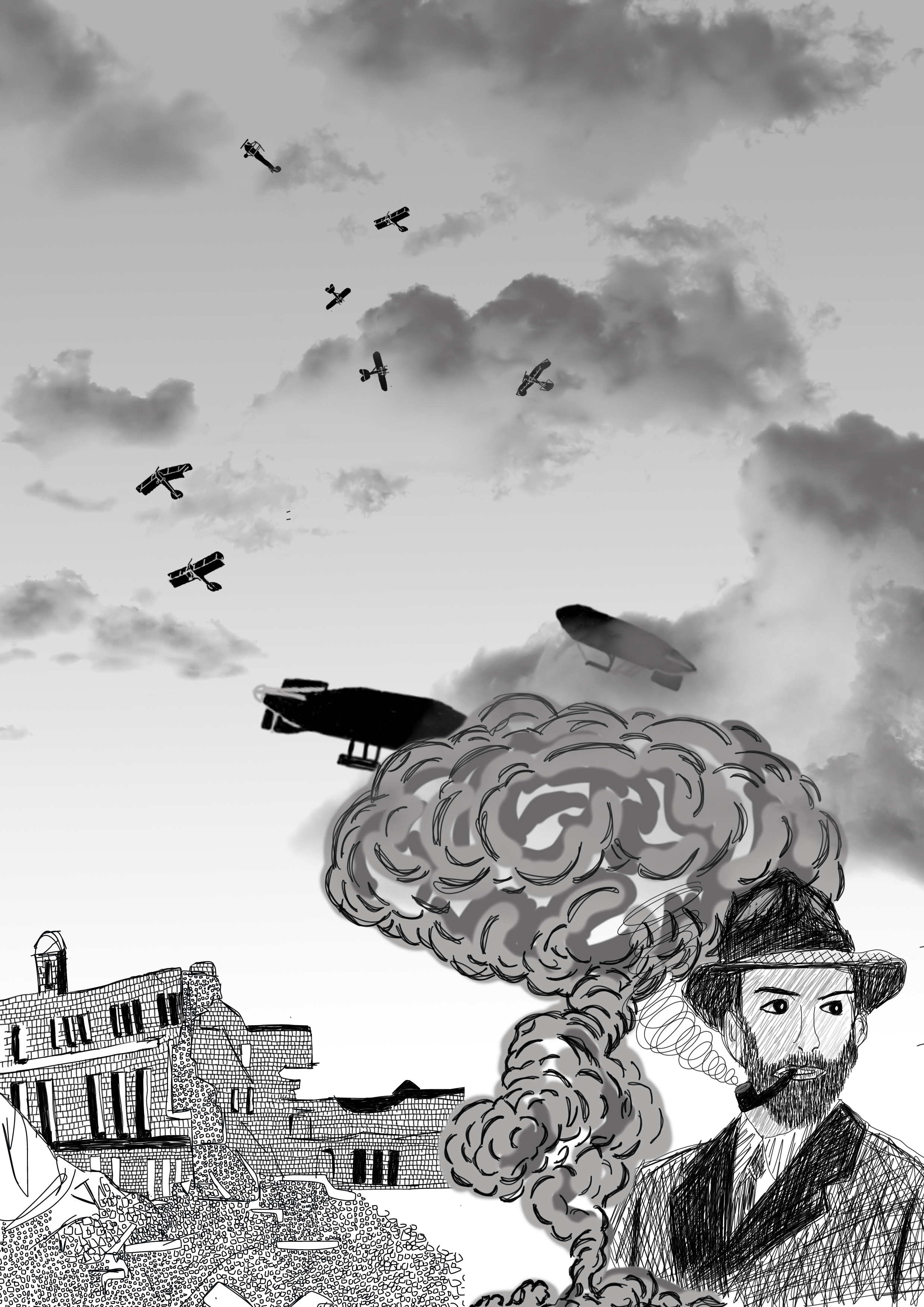
After creating the man along with him standing in the window I looked back upon the references I found, i wanted to do another drawing of the man in a physical war location, with knocked down building and bomber planes in the sky, I started by drawing a bombed building using the adobe draw application on my mobile phone, here is my process:
After creating this illustration I saved the file as a PNG and put the image into photoshop and began to add brick details into the white bits of the building again to add more depth and detail to this illustration, here is the final illustration of the bombed building:
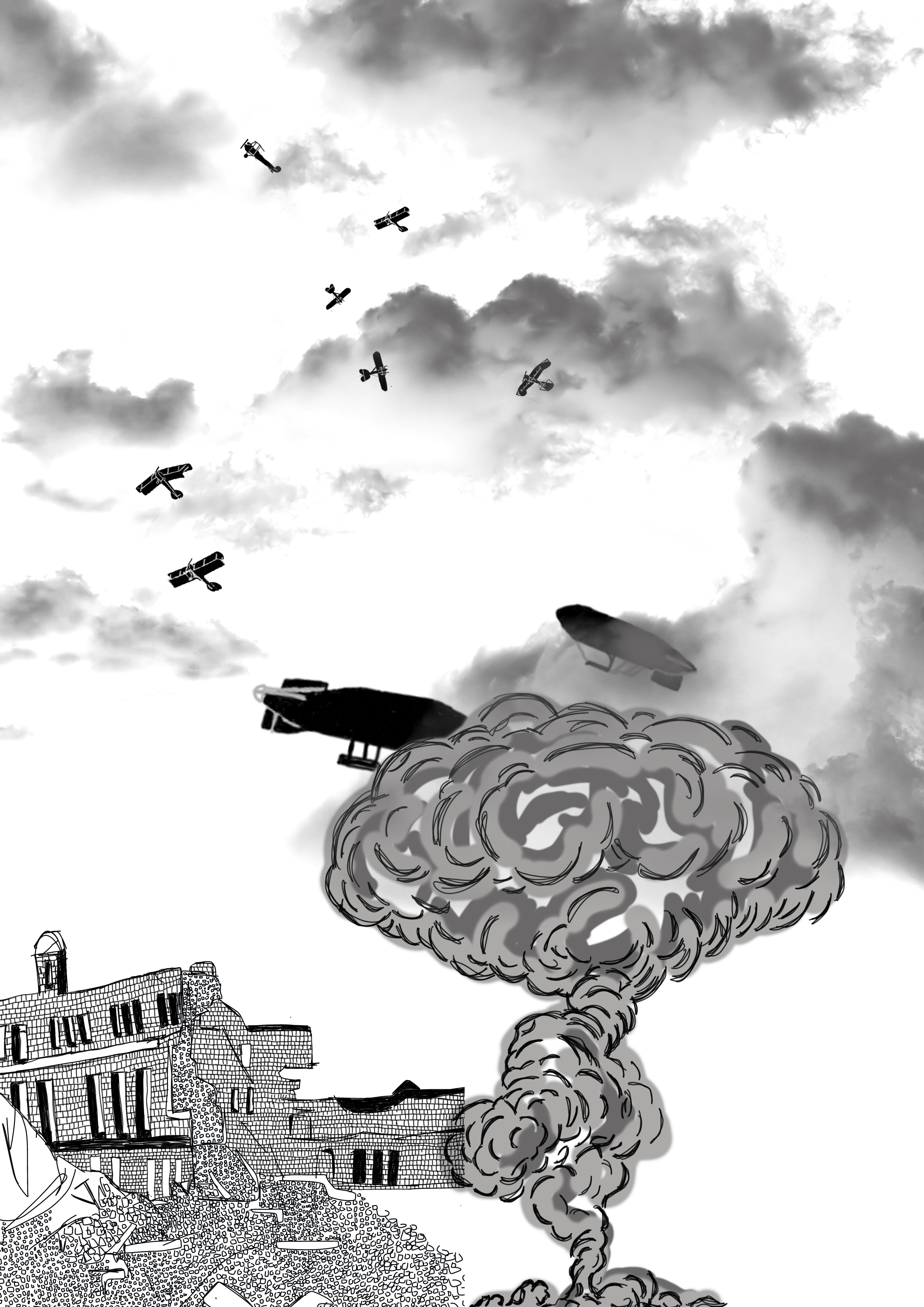
Next I wanted to add planes to the sky bomber planes from Germany and Britain, as this location is set in Britain I decided to have british fighter jets fighting off German warplanes along with british zepellins in the sky. Below is the image of the planes added to the illustration which I drew again using photoshop.
After this i wanted to add a bomb being dropped on the city so i decided to draw a smoke cloud next to the building and covering the zepellins slightly so show a large explotion adding the war effect to the illustration as well as adding glouds to the top of the illustration to show the skyline and the horizon line, i created the clouds using a brush tool found online, i decided to use fgrey clouds to give a darker feel to the final image as can be seen below:
Finally adding the man i had first created in photoshop to the bottom right of the image:
I decided to add a fade to the image having the top grey and fading to white nearer the horizon, i felt again that this gave the image depth. Having the man in the corner showing his location, i feel as a whole that this final illustration works well in conveying the idea of a detective in wartime london, i feel that if i did this image again i would have had the mans whole body caryinga breifcase or holding casefiles of abduction cases to really show that the man is a detective in wartime london, overall i feel the combined styles through using the photoshop platform to create this piece is beneficial and works well as you can easily manipulate the image to give more depth and higher detail than that of any other medium, maybe trying to do this image as an acrylic painting could be something for me to expand on and try or even as a watercolour image combining styles to create one whole piece.
I decided to draw up concepts for all of the visual metaphores given for this task, here is the concepts for all of them as quick pencil sketches:
out of all of these concepts the Reaching Retirment stuck out the most for me, i had an idea to which i created a concept in photoshop of one idea that i had of an elderley man reaching the finishline of a marathon with the words retirment written above him and a crowd around him cheering him on, this would show him reaching the finish line along with an elderly lady runing just as a concept to see what it would look like with an elderly man and an elderly woman in marathon gear including a number on her tshirt, below is the concept:
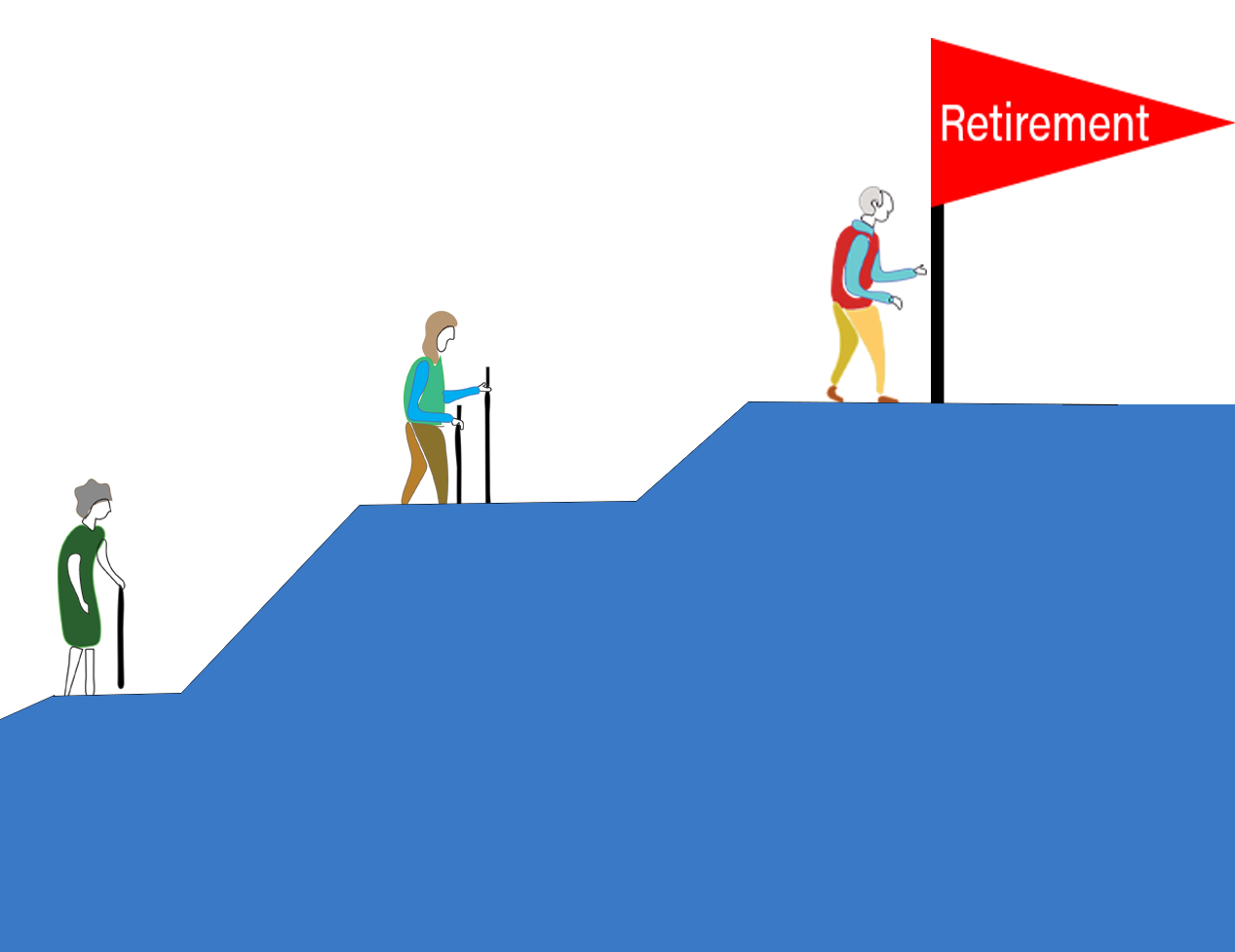
i thought this was a good concept idea yet i had another idea in mind that i felt would have worked better than this one so i decided to draw a new concept of this idea that i had about elderly people climbing a mountain with a flag that reads retirment physically reaching the peak of retirment and it being an uphill battle, climbing a mountin is hard and takes time and persiverance i felt that this mountain idea would work better, here is the concept drawings:
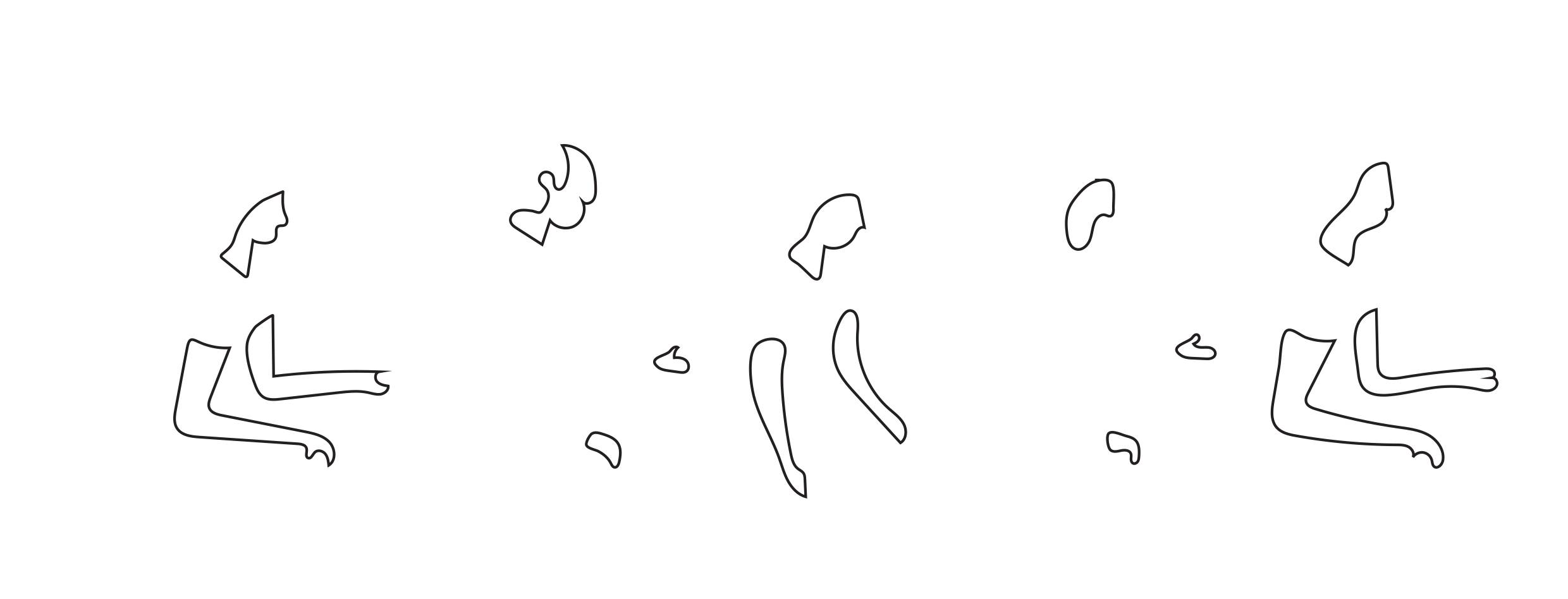
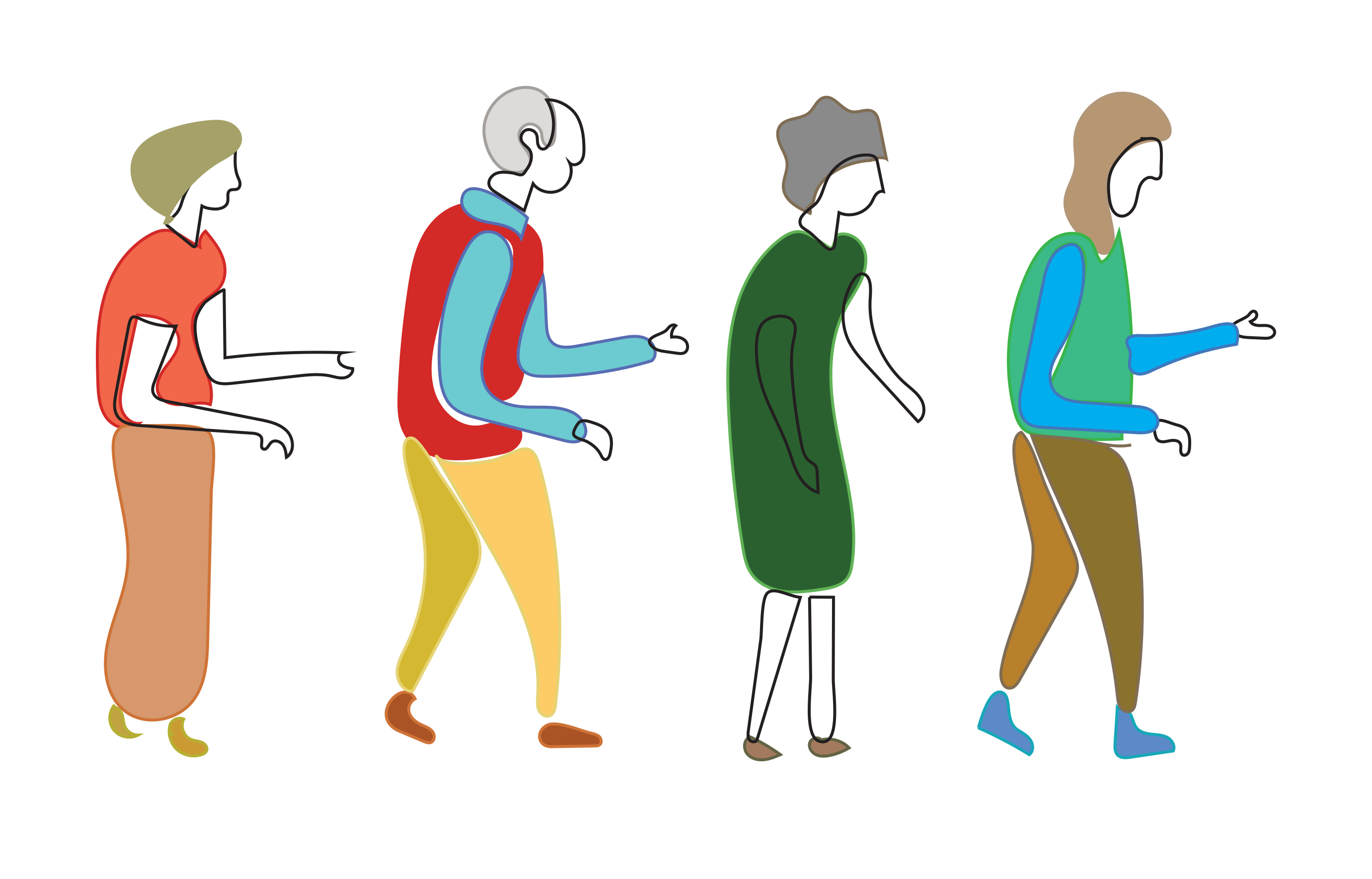
next i decided to work on drawing the figures which i wanted to do in adobe illustrator, i wanted to have bold outlines for the people as seen in the top left of the image above, i started to create the outlines of the people and then added the clothing that can be seen below:
After creating the people i then put them into photoshop and started to create what would be the final images, first i decided to use a block of colour for the mountain and showing all four people climbing a large mountain that can be seen again below:
i like the way the people are being seen climbing and that the mountain has a high peak, i made the people nearer the bottom of the mountain larger than those at the top to show depth in this illustration which i feel works well although i think that the flag at the top could have been bigger and focusing more on that person at the top reaching the retirment flag, i like this piece being in portrait and feel that it works well in showing th euphill climb to retirment maybe adding the people actually climbing with climing gear is an idea i could have expanded on.
After creating this image from the concepts i had drawn i decided to create the concept at the bottom of the concept page with more narrow lines rather than a block of colour to represent the mountain and a larger focus on the flag, this time i would create the piece horizontally as can be seen below:
i feel that thi spiece works well, the lines give off a more jagged and jared feel to the piece as a whole though i feel that the figures dont sit quite as well as that of the other image created, i like the effect that the lines give off yet maybe the lines being thicker would work better to match that of the elderly people in the image.
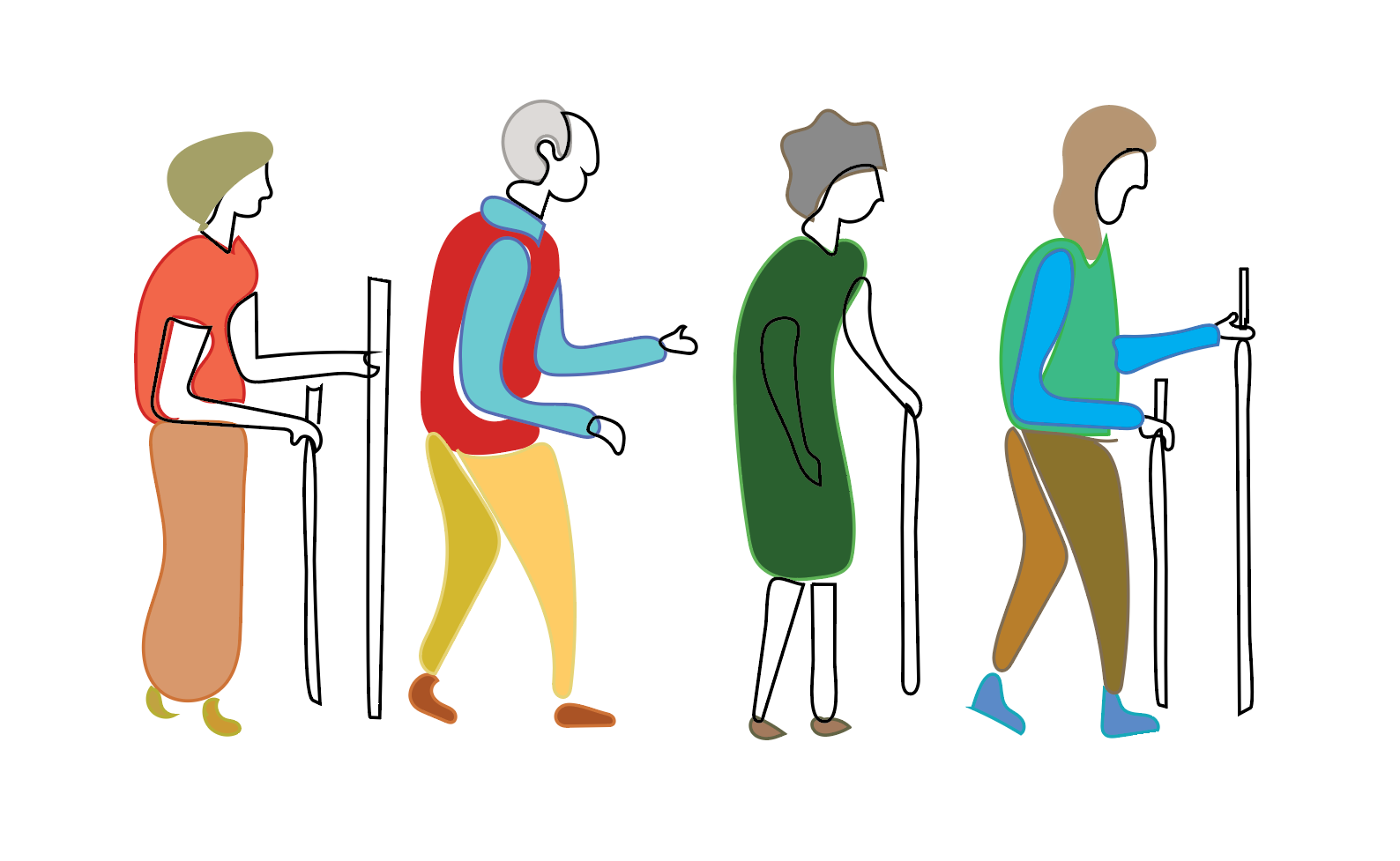
I then decided to go back to the first image created with the block colour and see if i could encorporate that block colour to the final image i would be creating, by using photoshop i decided to have more of a focus on the retirment flag and the people reaching the flag by including climbing gear to show the commitment and reach to retirment, i feel that this would work well as the block colour i feel works best and by not including all of the people as i feel that the people have been a main focus rather than that of reaching retirment that should be celebrated and shown more in the illustration i am creating, my process can be seen below:
after adding the walking sticks i then put the image into photoshop and created a mountain along with a retirment flag and a man reaching the retirment flag which can be seen below:
I decided to zoom in on the flag and add a bit extra to the end of the image giving more distance between the flag and the end of the image, here is the final piece:
I feel this final image works well in portraying the reaching retirment task, having a mountain to climb and featuring 3 elderly people and one man reaching the retirment flag gives off what is asked for, i feel that the illustrations of the elderly people work well i like the composition of them on their own as well as in the final image, the use of block colour for the mountain i feel works better than that of the image with just lines much alike the illustrations of the elderly people i think that this fits well along with the flag all being similar and tieing into the illustration as a whole, The flag being a main focal point as being the end goal of reaching retirement.
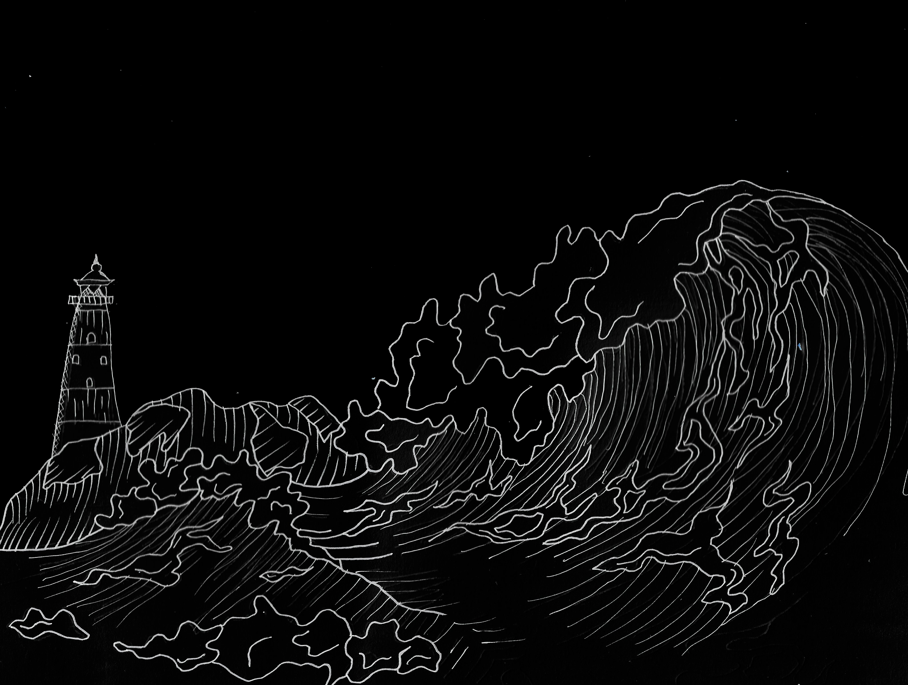
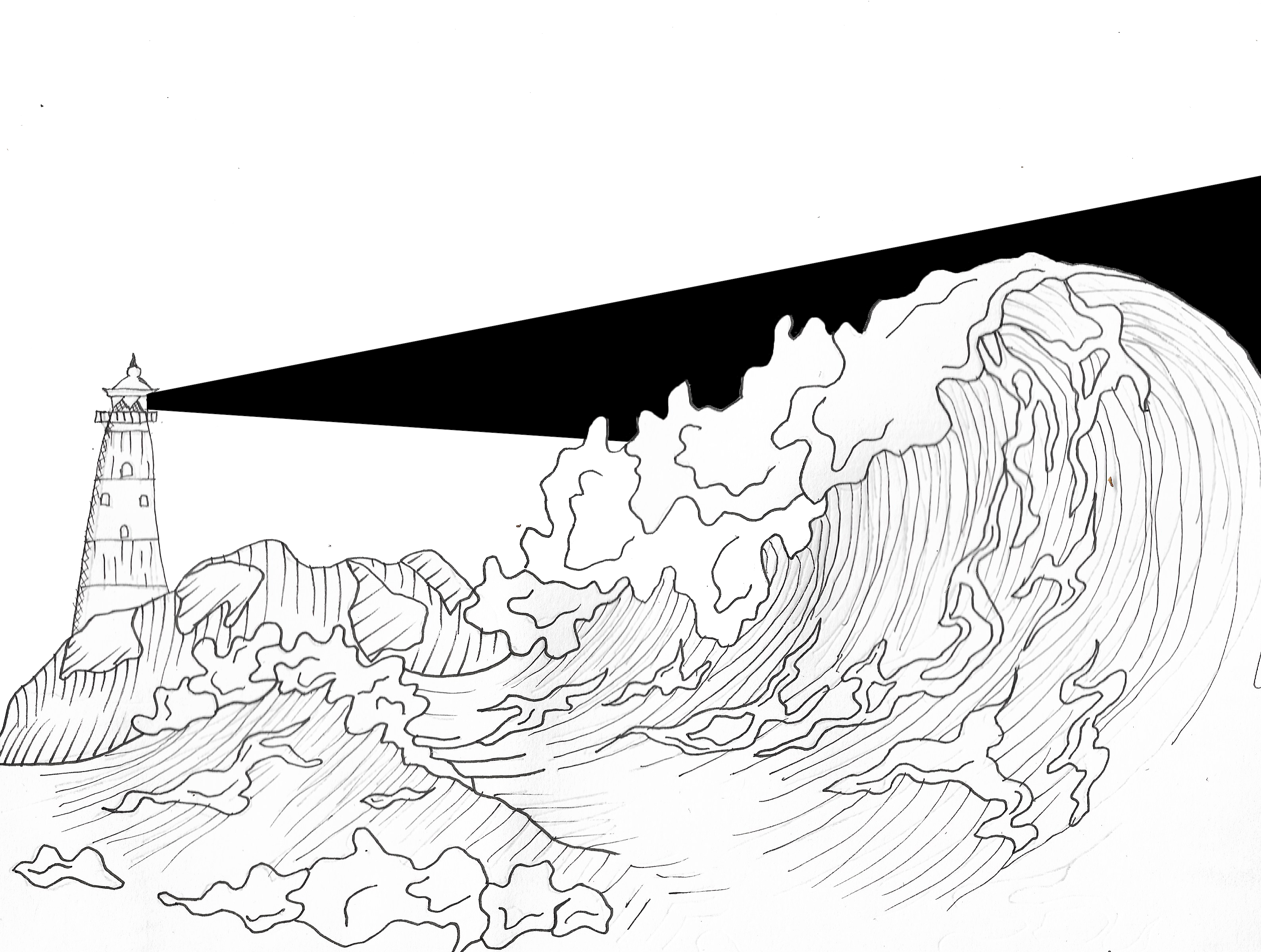
From the list given I decided I would like to draw the sea, I wanted to draw the sea with a mountain like cliff face which broke at the top with a lighthouse, with the focus being the waves in the sea I believe this would give a nice backdrop and give the viewer a idea that it was the sea. For this drawing I decided to use a fineliner of different thicknesses to give off a set of different marks to show depth to the illustration.
i then scanned the image in and inverted it in photoshop and here are the results of this:
From there I decided I would like to add a ray of light from the lighthouse to add an effect that it is a rough sea, from here I added the ray of light and inverted the images to see what the different effects looked like to see as if there were light coming from the lighthouse and going across the sky above the sea:
After looking at how the beam of light worked on the image I decided to line up the beam with the sea and waves so that it wasn’t covering them and it worked around the waves.
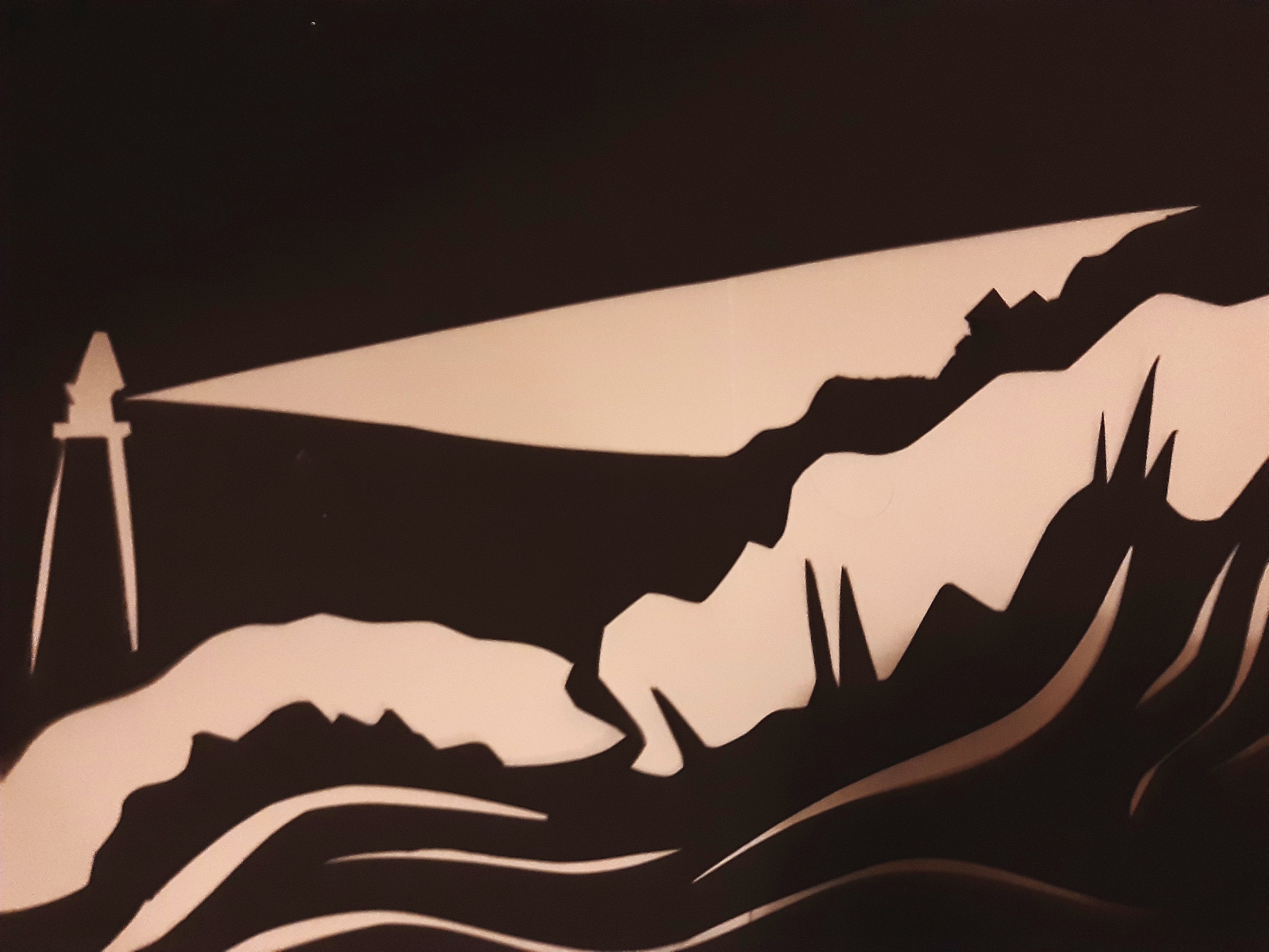
When creating this piece, I decided to tweak the image to have less detail as this was hard to do with just a knife, I felt that this overall piece worked well yet I feel it worked out better in the drawings than as the cut-out due to the small amount of detail I was able to put into the piece using a Stanley knife, the possibility of using a smaller crafting knife would of worked better to add more detail to the piece however sadly I didn’t have one available to use.
For this section of the project I decided to draw a mason jar with paintbrushes in while also including a variety of different mediums to do this. Below is a photograph taken of the mason jar with paintbrushes in which I am using for inspiration:
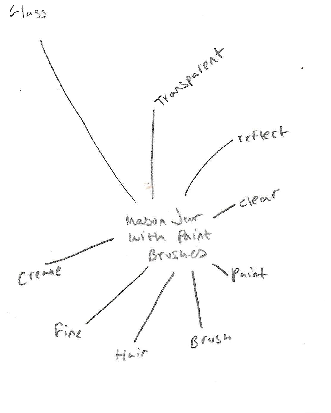
here is a spider diagram of words related to my object:
Next I decided to add a moodboard which could give me some inspiration on different texture styles and drawing styles I could use:
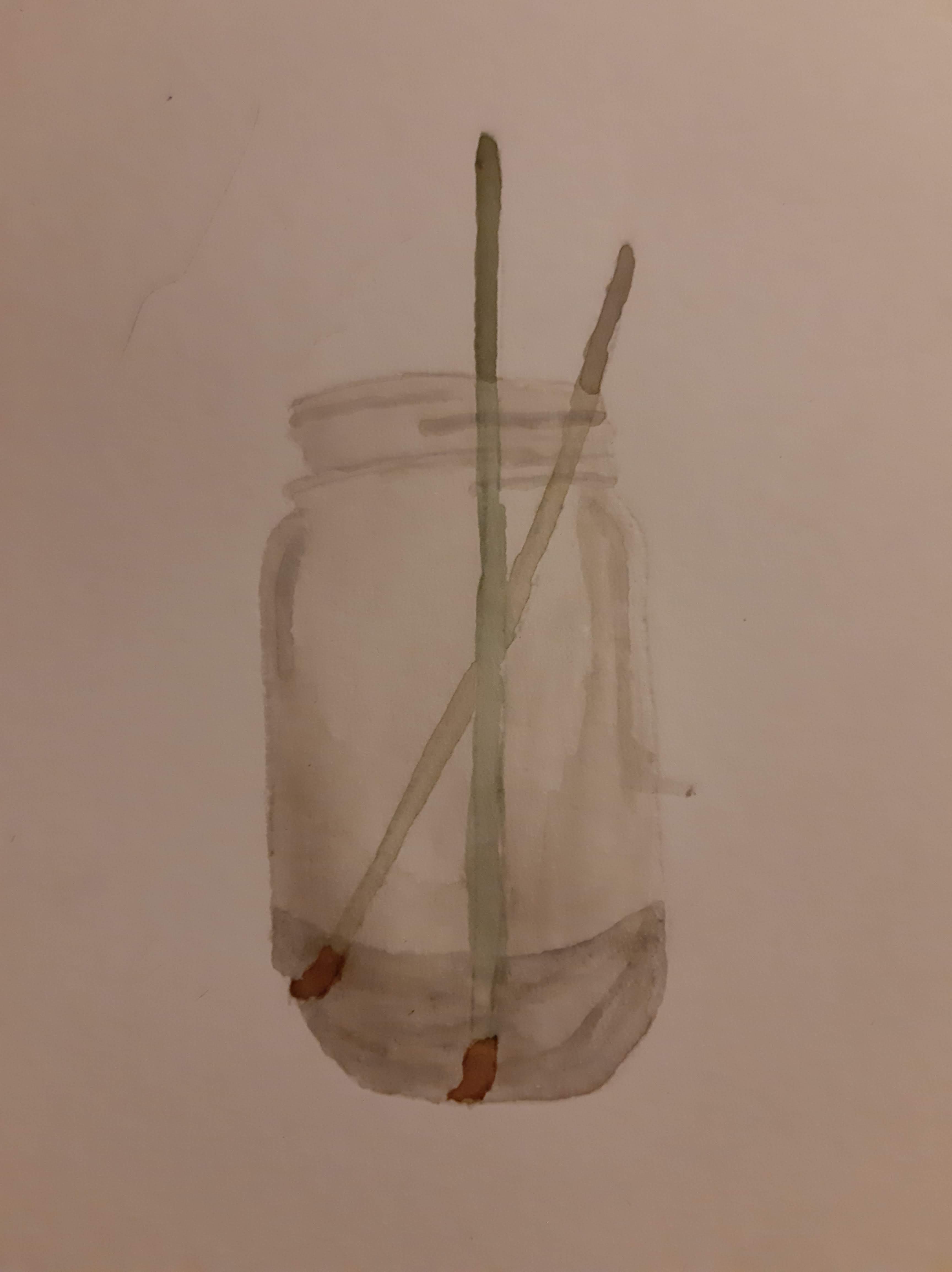
I originally began by using watercolour as the main medium, I wanted to see if I could show some reflection in the glass and on the paintbrushes to add a more 3d effect:
Next, I decided to try and use a pencilled sketch and fineliner sketch alongside using watercolour to see if I could get the desired effect from the first test image:i then decided to use pencil along with watercolour and fineliner to see if i could get a similar effect as the first test of this image:
I felt that these images worked well but it didn’t give a good enough effect as the watercolour alone, so next I decided to try a digital sketch using the same jar and brushes, the results can be seen below:
Once I had completed this sketch, I believed it had worked out better than all the rest as you can really see the jar, and the paint brushes being flipped around giving more of a focus on them as well as the jar itself. Next, I decided to fill in the drawing with colour using the fill tools found on photoshop to see what effects I could bring out while also using the opacity tools as well:
I felt that this piece worked well as it gave off the aspect of the glass which I wanted to capture, however I felt that I still wanted to use watercolour to give a better texture to the glass being a wet media. I thought that would be a good idea to try, so I printed the original image off and decided to add watercolours from there, here are those results:
I felt that this was a good image to be the final piece as I felt that this worked out the best. As you can see the texture of the glass along with the paintbrushes worked well when I used watercolour and I felt that it was the best for this type of image. If I was to work on this image again I would like to focus more on the glass itself like in the first image, and to try and paint the glass with no drawing border much alike the first image made from watercolour, however I feel the black outline on this piece works well to give off a feel of knowing where the glass is and the different textures in the glass with the rough lines.
For this part of the project i decided to choose glasses from the list usinga variety of mediums including pencil, fineliner, watercolour and digitally drawn images created on photoshop.
By physically observing along with looking at images found online here are some glasses i have drawn:
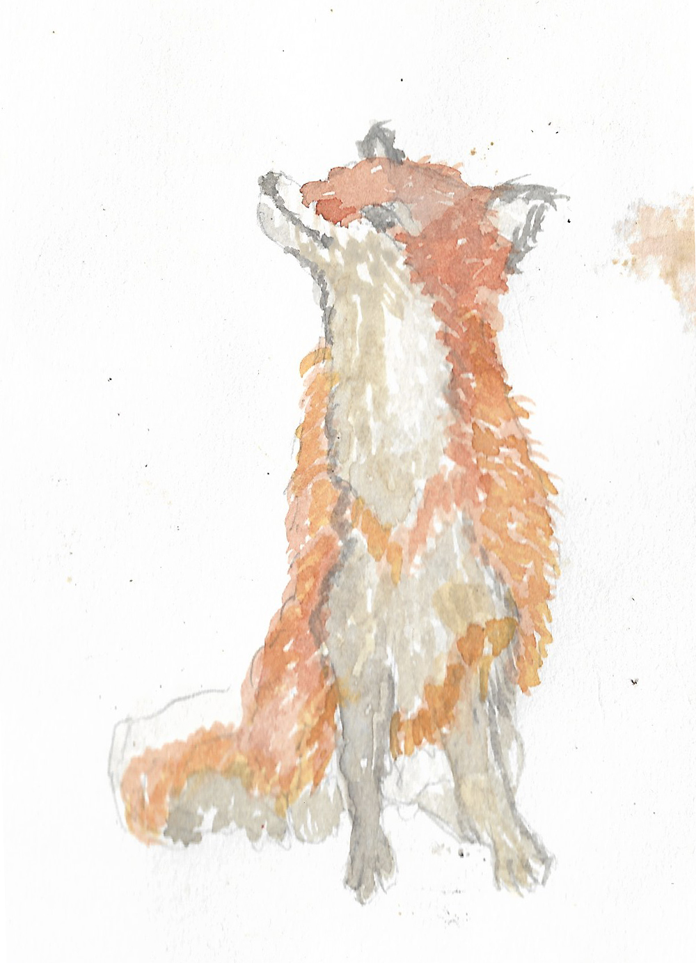
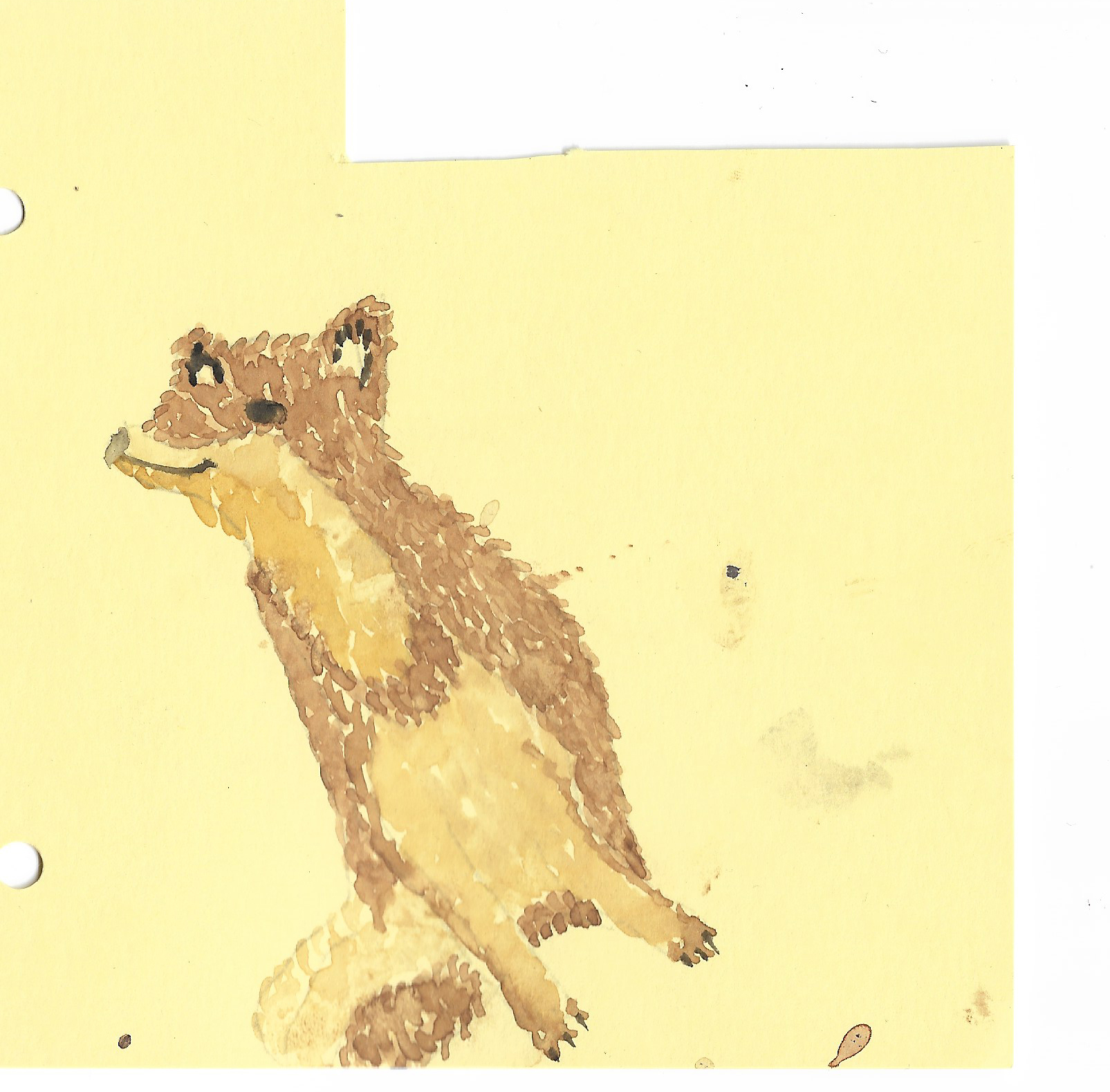
For this section of the brief I decided I would try painting a fox using watercolours. I wanted to test how the use of watercolour would be on a different medium and to also see how different types of paper would affect the paints.
Below you can see the first painting of the Fox I did on watercolour paper:
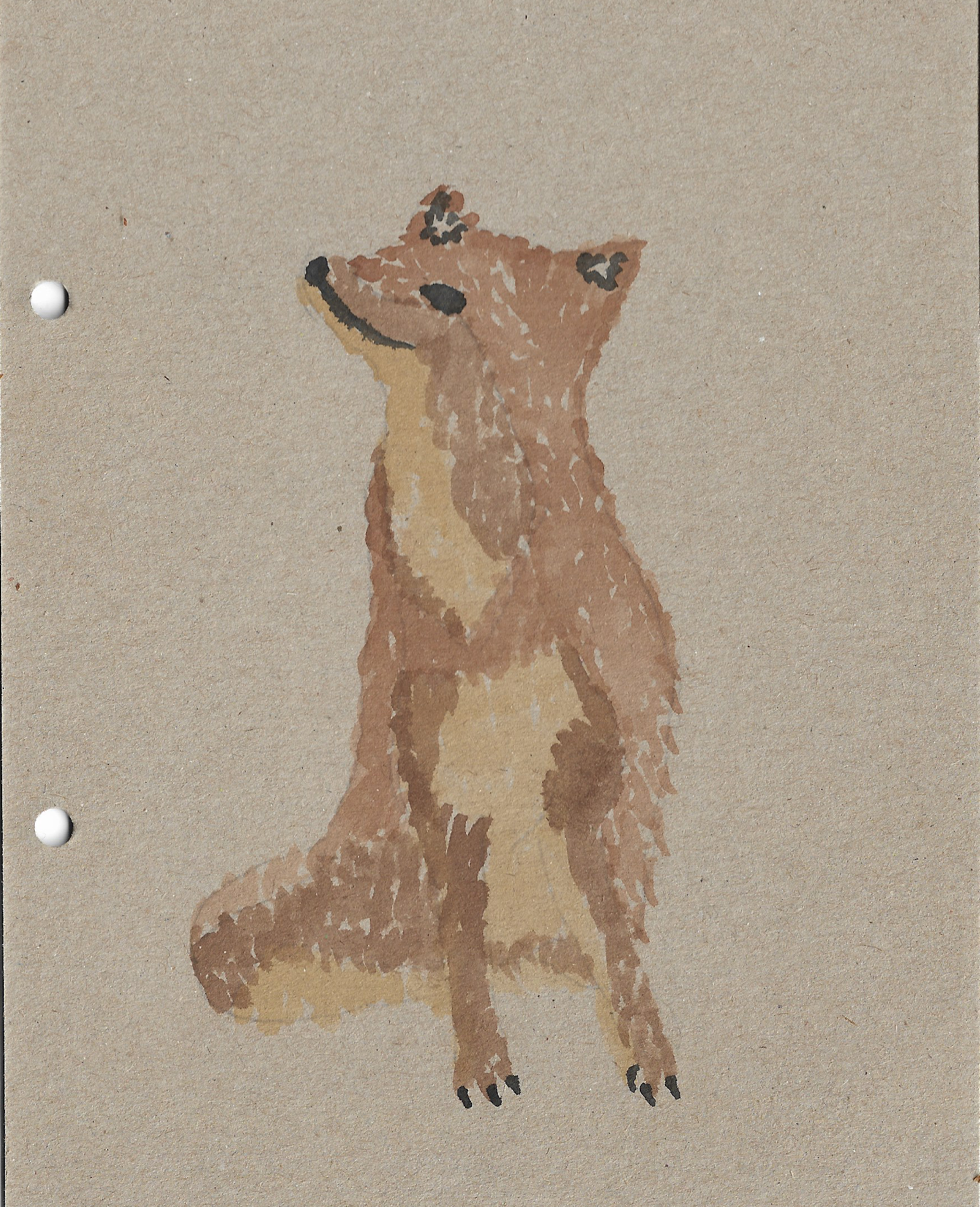
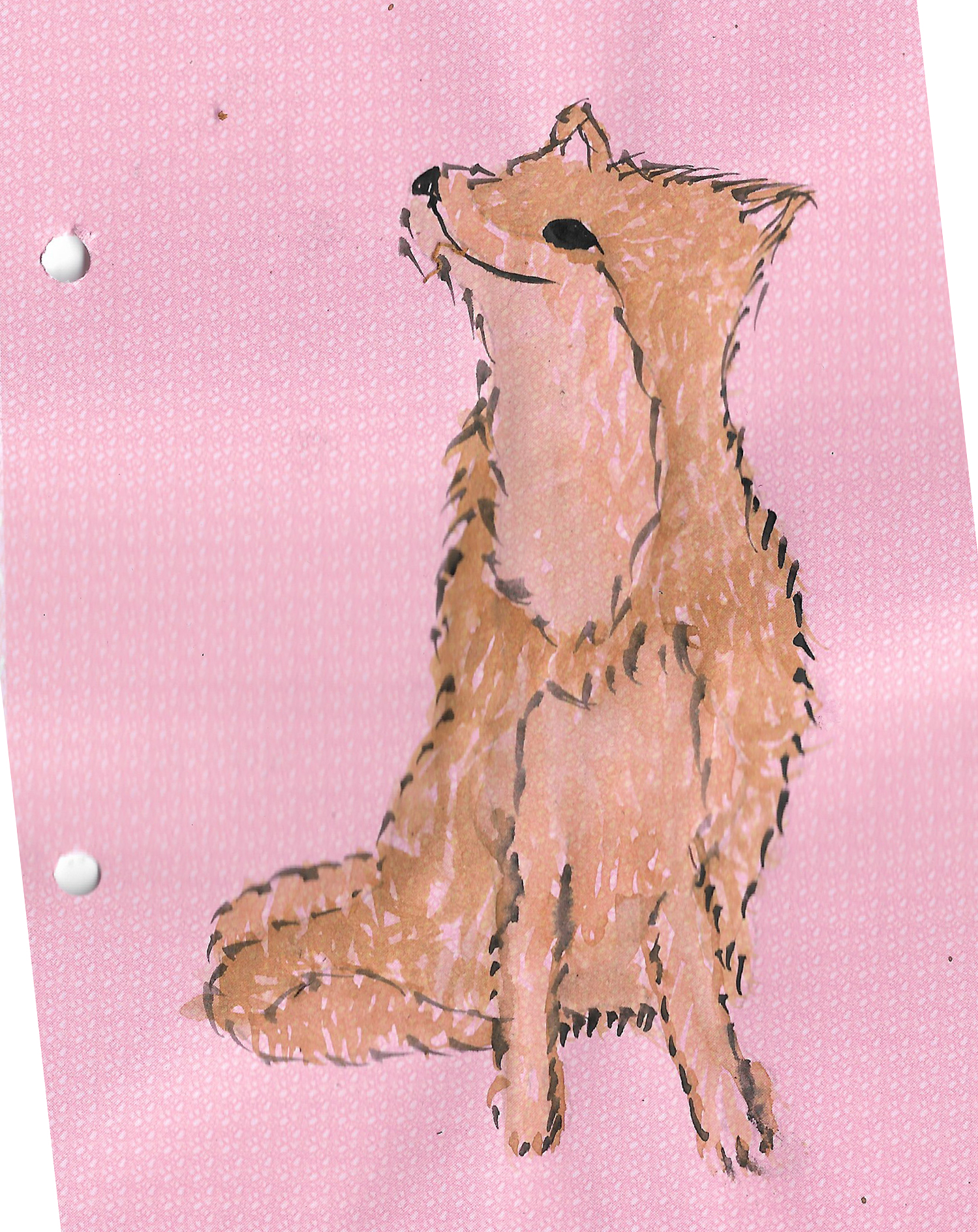
I then used a variety of different types of paper including cardboard, yellow card, pink patterned paper and cartridge paper, I feel these all worked well, and I found that the cardboard absorbed the watercolours quickly which stopped them running, This gave a nicer effect to the painting. On the cut off yellow card I decided to draw a smaller version of the ox using the same colours as the original I feel this type of card had worked well again however it did smudge slightly but I was still able to layer the paints once each layer dried.
On the pink patterned paper, I decided to paint the fox larger again, while painting on this paper I found that the paint smudged slightly but again I was still able to layer the paints like previously allowing each layer to dry first. To finish off I decided to finish the fox with a black outline to allow it to stand out more from the previous paintings. I feel that the watercolour worked well on this paper however I thought that with enough layers I would have been able to stop the colour of the paper leaking through the painted sections however in lighter patches on the fox the page’s colour still leaked through, although I still feel this worked well and added a nice effect to the painting.
Finally, I painted the fox on the cartridge paper and much alike the pink patterned paper the watercolour held well with this type of paper, making it easy to get any marks which I wanted to achieve and also allowing it to dry relatively quickly stopping smudging as well.
I feel that using watercolour was a good choice of medium as it gives off different textures and with a relatively quick drying time it allowed for a relatively quick job which worked well overall.
World war 2 ended in 1945, This was 9 years prior to the ending of rationing within the UK and using ration books for food and clothing was used until 1954.
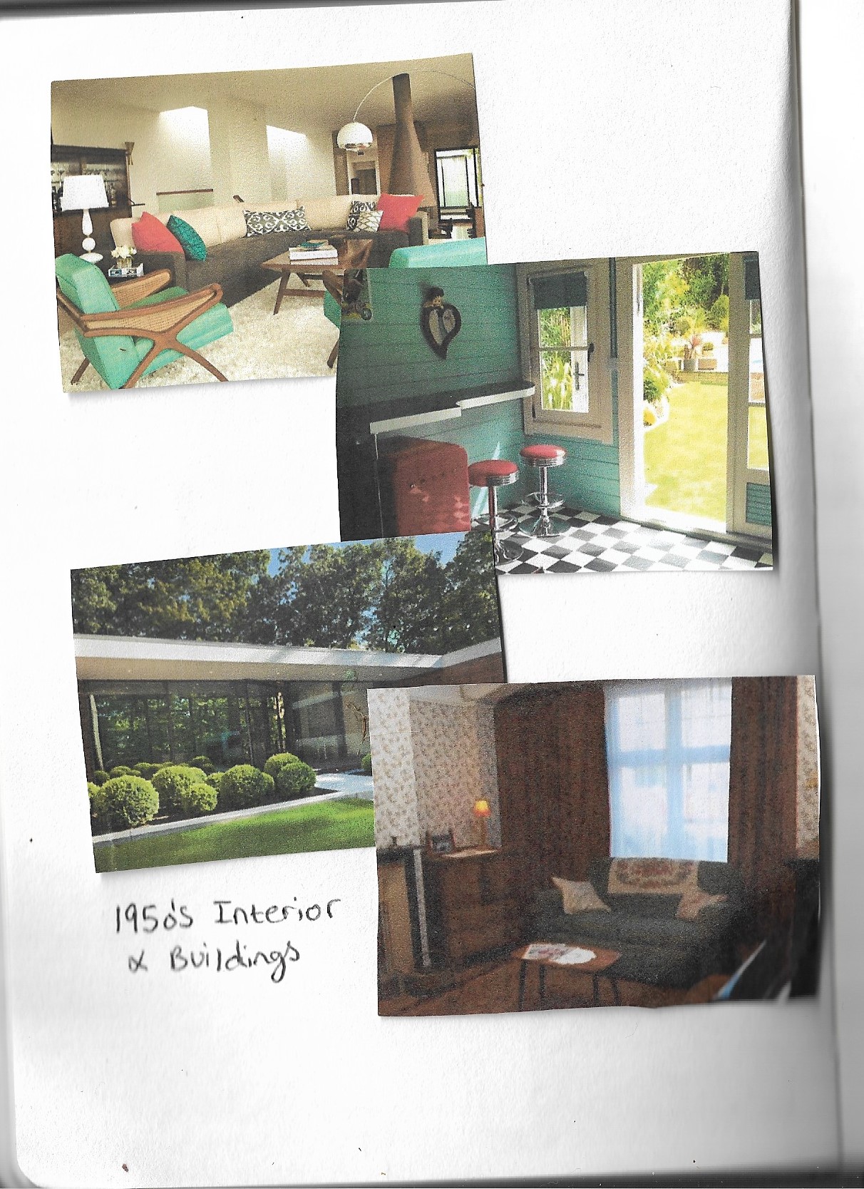
Looking at information from the 1950’s I found that there were many aspects which differed from today’s era, for example clothing was found to have many patterns and bright colours in the 1950’s and this also leaked into the interior design whereas in today’s era it is more of a plain style type. Many different pieces of clothing had patterns entwined along with tweed plaid clothing, men’s clothing, such as suits and long skirts for women were a main focus of the 1950’s.
In this era there is a standard for the patterns used, this standard seems to be more fun and energetic which is seen in both advertising and architecture. During the 20th century people were very hands on and encouraged for the right and wrong for the typical housewife role for women through advertisements of them cleaning or planting plants and basic gardenwork which depicted what a typical 50’s woman should look like with it also looking like it was a “man’s world” with women doing all the housework, cooking and looking after the children while the male’s spend all of their time earning the money.
Below is an image I made which depicts a typical 1950’s male, alongside a jukebox from the 1950’s and wearing the appropriate attire of the decade. For the image I used watercolour as I felt this worked best for the style of illustration, although I liked these pieces I feel that I could have improved the illustration by possibly adding a woman with the man or by doing an illustration of a woman alone, however I really liked how the jukebox turned out in the end.
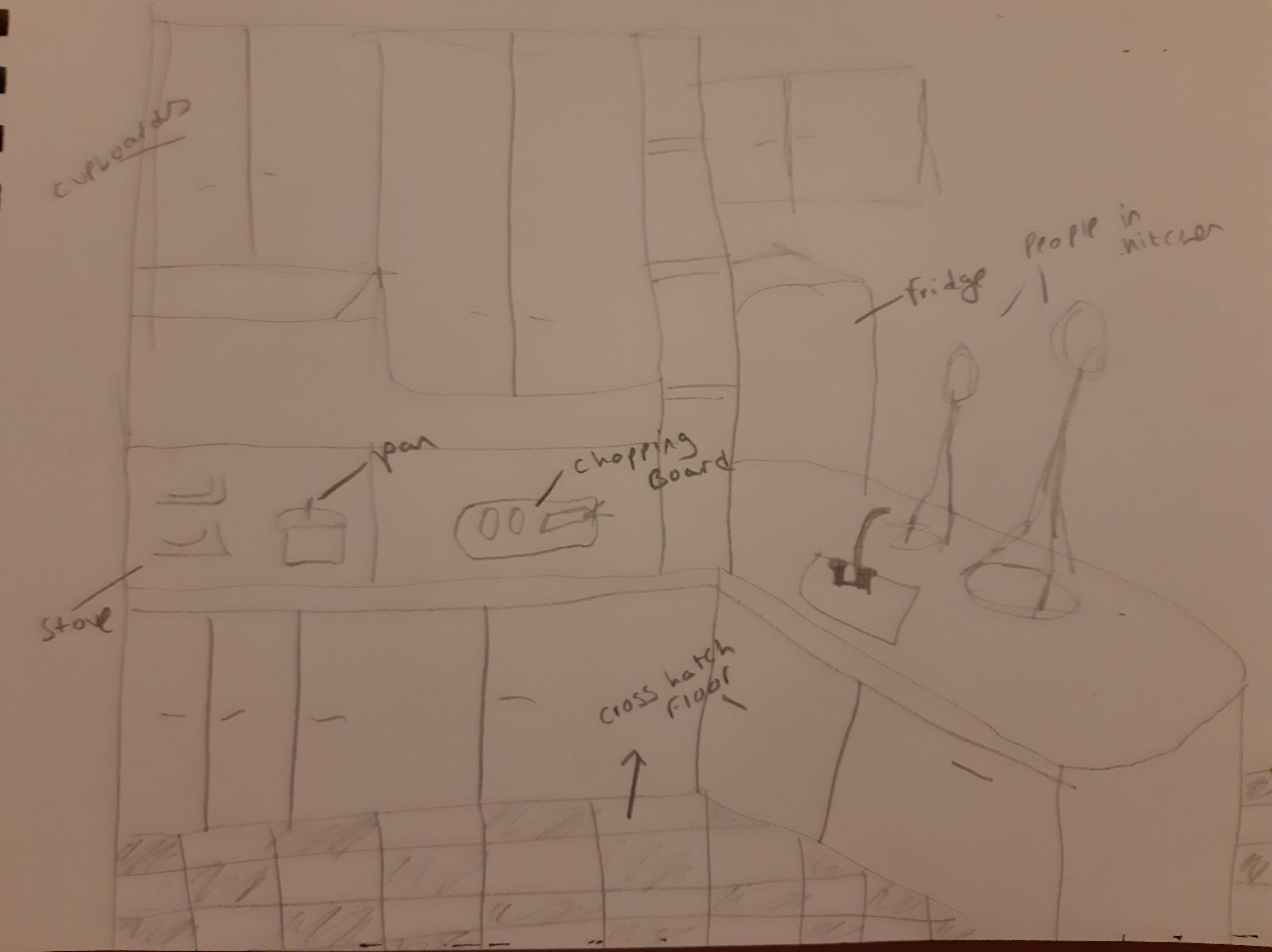
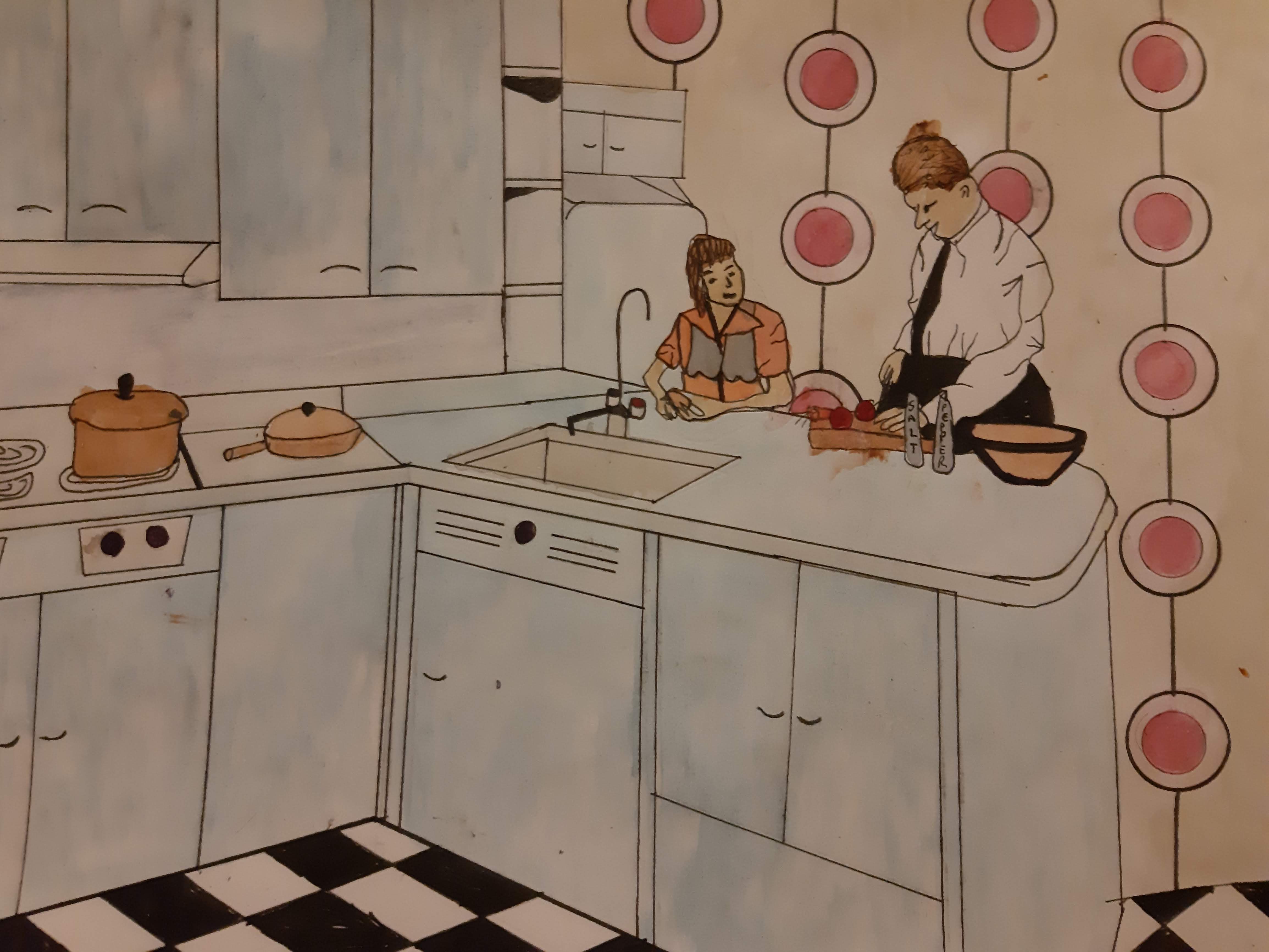
This concept was inspired by many different 50’s style patterns and designs. I chose a cross hatch flooring as this was popular during the 50’s along with the open planned kitchens with a breakfast bar. I also featured some typical cooking utensils such as pans cooking on the stoves and also a male and female preparing food in the kitchen
From here I Defined the concept more by redrawing it and filling it in with fineliner to add more detail:
To finish this piece, I decided I would use water colour to add a homely feel to the concept, I then also added a feel for textures by overlaying the paint using a lighter colour with more water and layering it on top:
I felt that over all this illustration worked well to create a 50’s style kitchen along side a 50’s style wallpaper in the background. Although I changed things from the concept by putting the pan in centre image rather than the chopping board and also adding the circle wallpaper behind the figures in the image allows for a more 3D and focused final result.
The colour scheme I used was chosen because it was a very popular choice in 50’s kitchens with blue being the main colour and with a support of red’s and whites. I decided to use a more of a crème colour on the wallpaper to allow for an offset from the res of the image and to allow for a more high-quality final image.
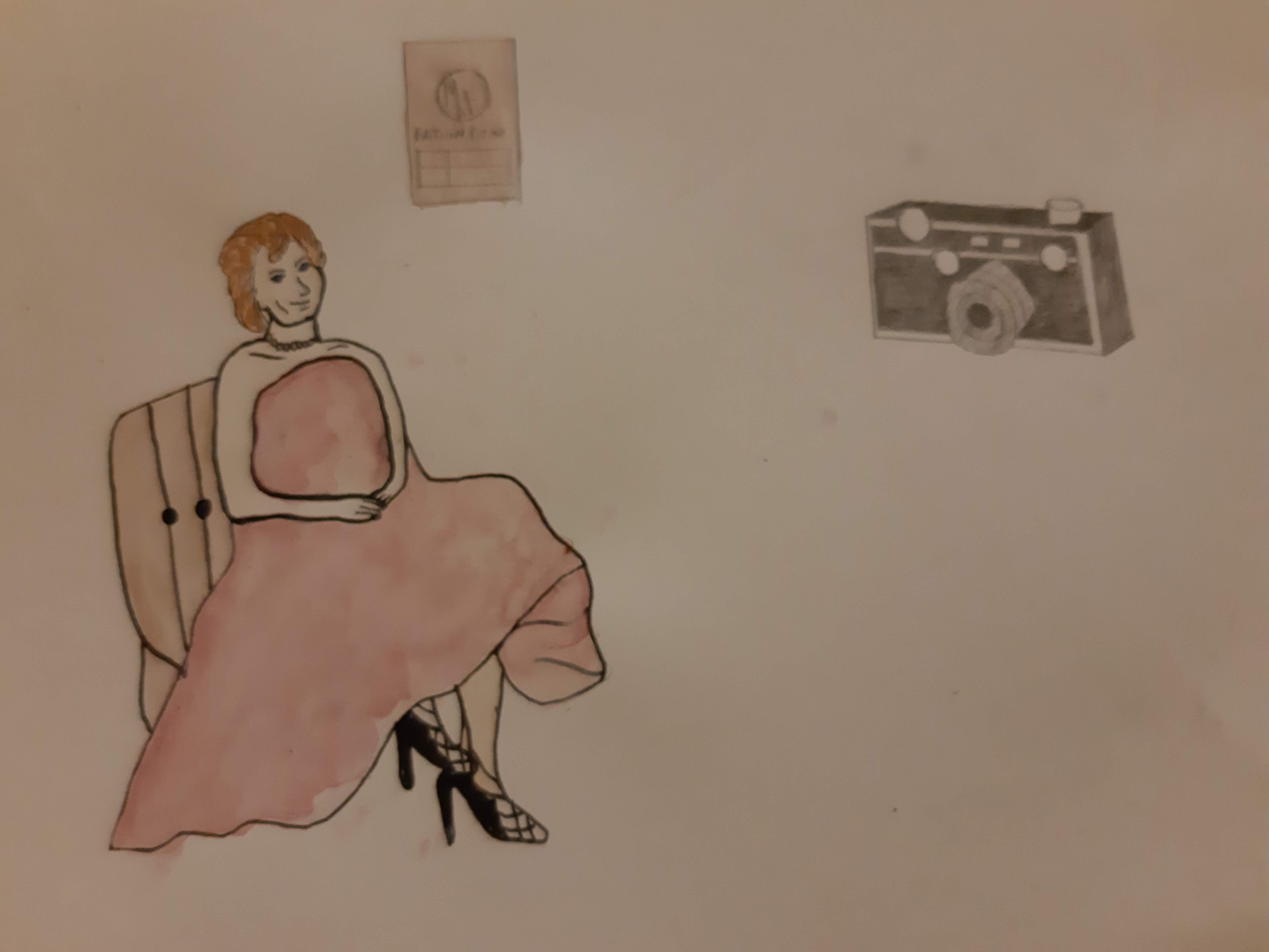
From here I began to start working on the final task piece, for this I had several ideas. To start with I decided I wanted to use a variety of medium and drawing styles within the illustration so I started by using a fineliner with then adding watercolour for colouring and pencil for shading as seen below:
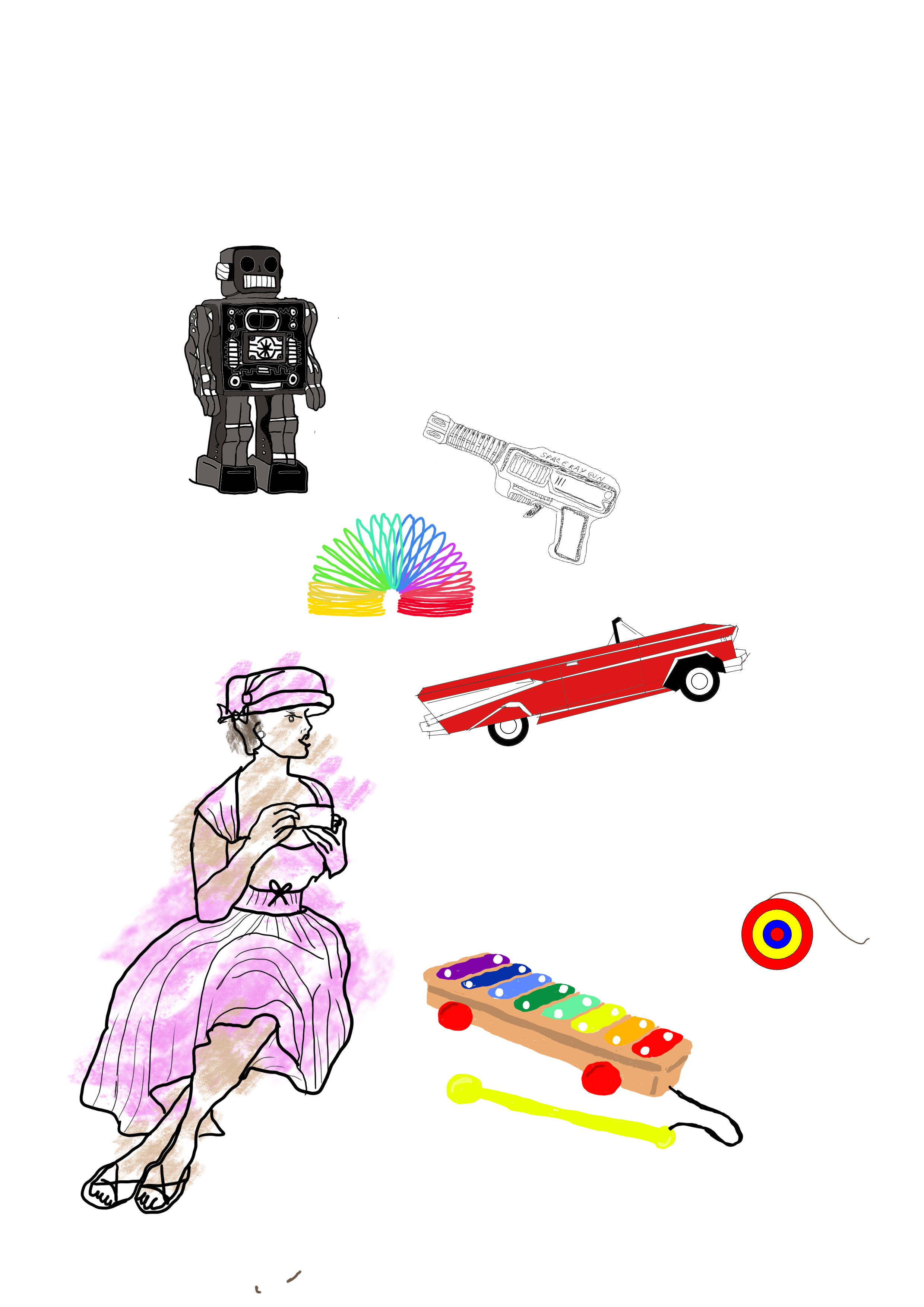
After starting to work on this drawing physically I decided I wanted to attempt this as a digital illustration using photoshop. From here I started to draw different artefacts and toys from the 1950’s era:
I began by drawing the lady sat down as the brief asked, then from there I started to work on the 50’s style car and robot toys, as these were popular from the era. From here I started to add more popular toys from the 1950’s and slowly added to the image, to finish it off I decided I would label the piece as 1950’s and to add a background of a 50’s style wallpaper to add some background to for against the foreground of the image and finish it off.
I began by drawing the lady sat down as the brief asked, then from there I started to work on the 50’s style car and robot toys, as these were popular from the era. From here I started to add more popular toys from the 1950’s and slowly added them to the image, to finish it off I decided I would label the piece as 1950’s and to add a background of a 50’s style wallpaper to add some background to for against the foreground of the image and finish it off.
By gathering main artefacts of this era i have been able to identify key elements from the 1950’s and convert them into a visual image, although mainly using toys along with inatimete objects including a car from the 1950’s and a microphone as music of this era was very destinctive, the combination of style and colour to give the image a pop poster feel.
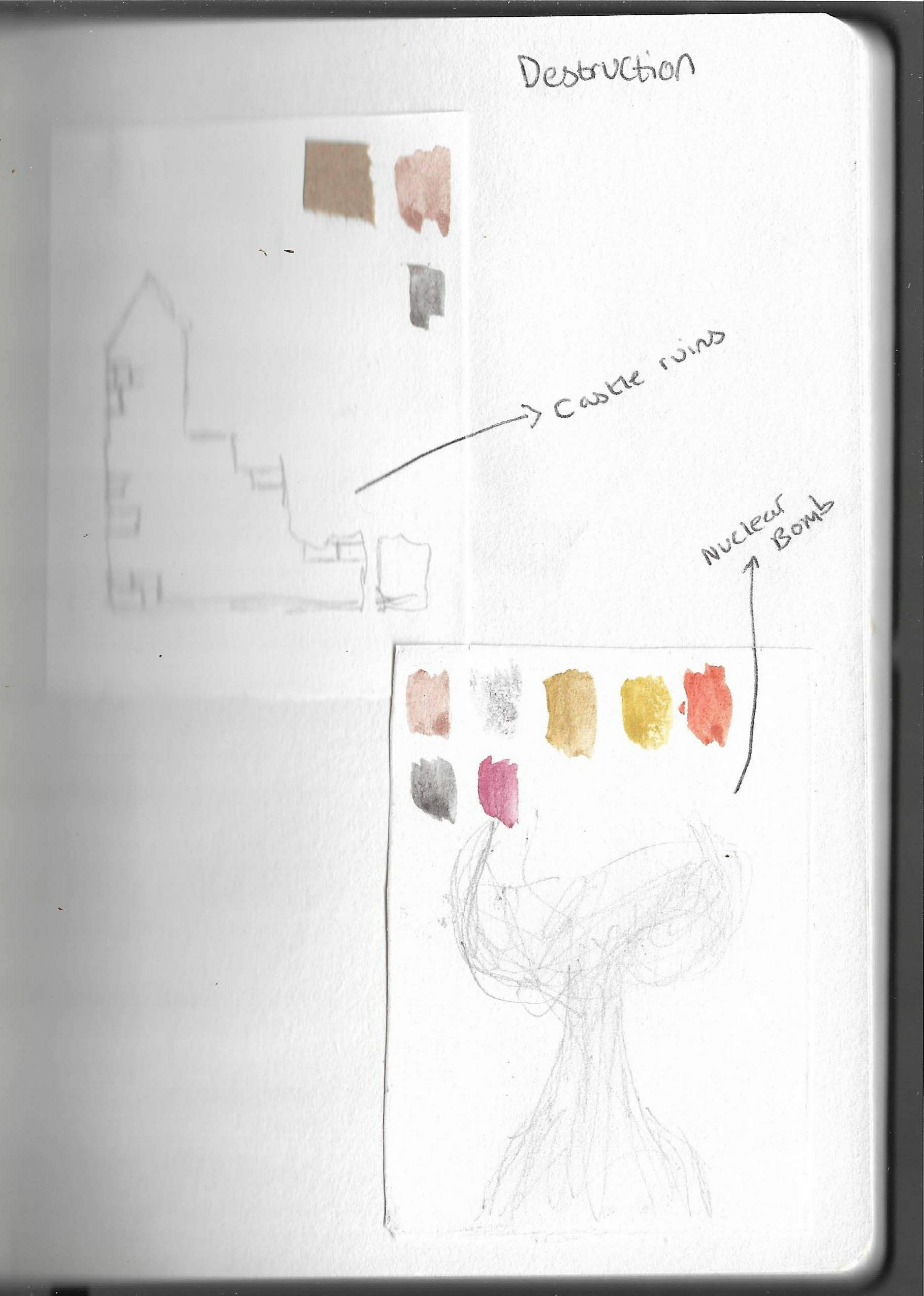
After turning the word destruction into sketches taken from inspiration of my mind’s eye, I began to work on my Moodboard for the same word “destruction.” As I continued with the same theme from the previous task, I gathered printed images that I found using Google and Pinterest and began to construct the moodboard. I also wanted to include cut outs from magazines and, also images which I had taken within ruins. Along with including paintings and splashes of “grey and browns” to give off a more artistic aproach and adding this into the moodboard
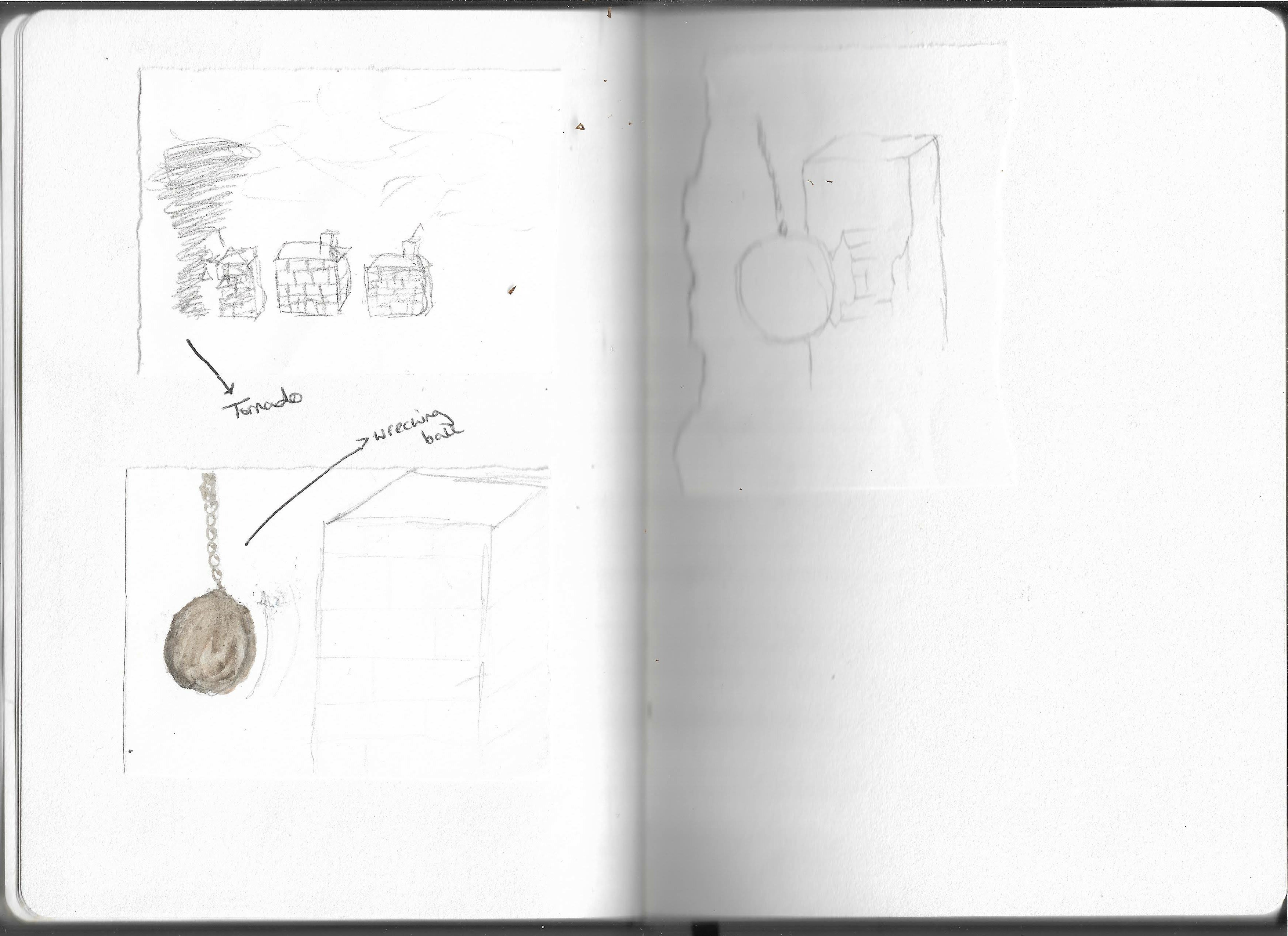
As I worked on this part of the brief, I decided to work with the word destruction. From here I managed to draw a few sketches of what came to my mind when picturing the word destruction as seen below.
.
Here are some spider diagrams of words found within the stories, I found that googling the words was useful when coming to figure out the meanings and objectives from these words. It also allowed me to find some similar words which could describe the same thing allowing for further inspiration for potential illustrations.
The word that I found the hardest to analyse was Anger, although I could think of several visual representations of this word, I found it difficult to come up with any other words to represent anger.
I have also added the words my partner thought of as can be seen in red.
This book is a Children’s A-Z series of stories aimed at parents, which they can read to children, or young children wanting to further their reading skills, the illustration on the cover assists with this as it is drawn in a very child friendly manner. On the front cover the illustration is created mostly from black and white using a mixture of dark green, light blue and golden yellow incorporated into a blanket, this would draw the eyes of anyone viewing this book which would draw interest towards the stories. As there are children are reading books on the blanket and also not taking notice of the larger animals and potential characters around them, this could suggest the idea that the book is aimed to be filled with bedtime stories or could be aimed at parents to suggest that the book can allow the child to develop their imagination as they read through the stories.
The illustration on the front cover has taken reference from the stories within the book, this can be used to illustrate some of the stories being read to children and, also to give inspiration for this piece of work. This then allows the stories within the book to come to life within the front cover using traditional media to create a homely feel for the stories inside.
The stylistic aspects of this piece will traditionally be hand drawn and will have a hand drawn effect to the final image created because of this the use of ink and pencil would be preferred for this piece.