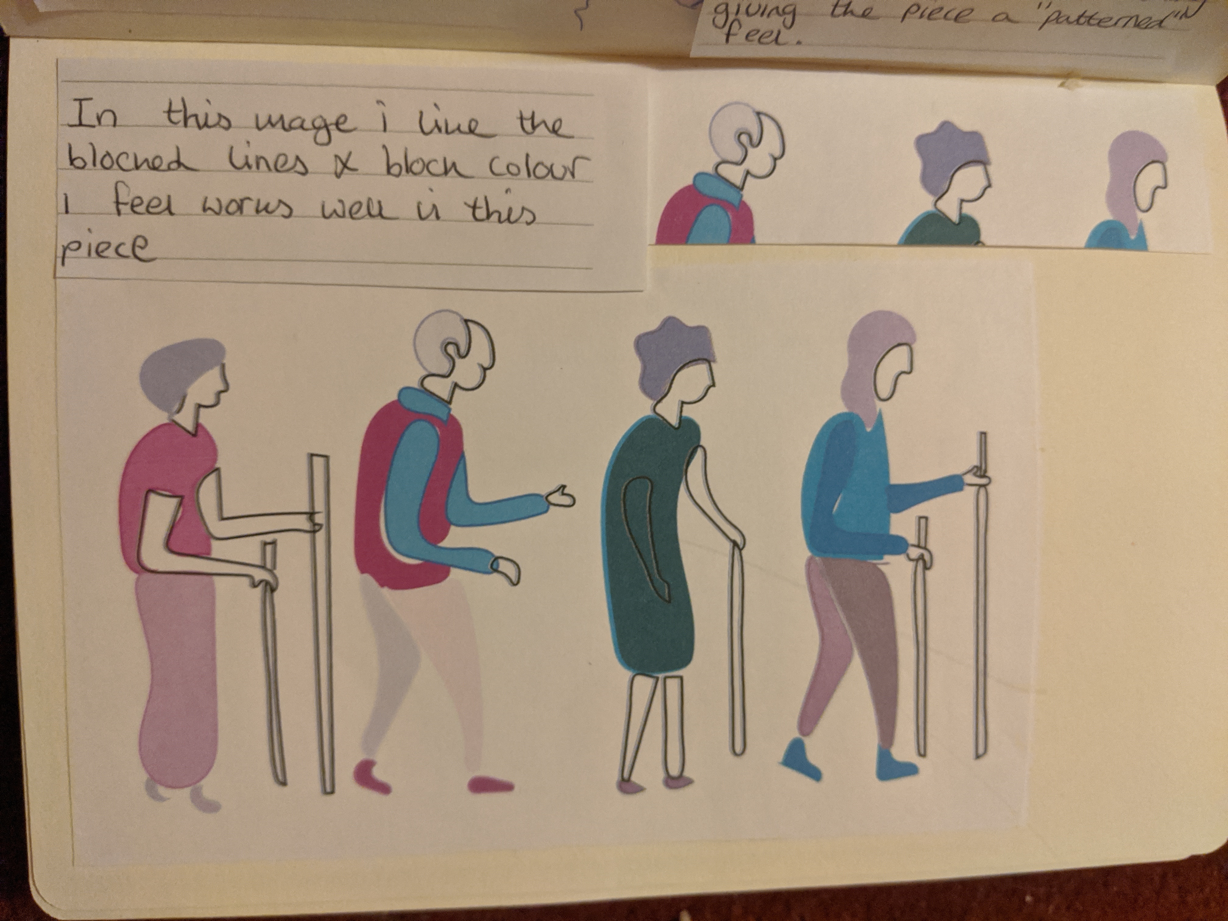
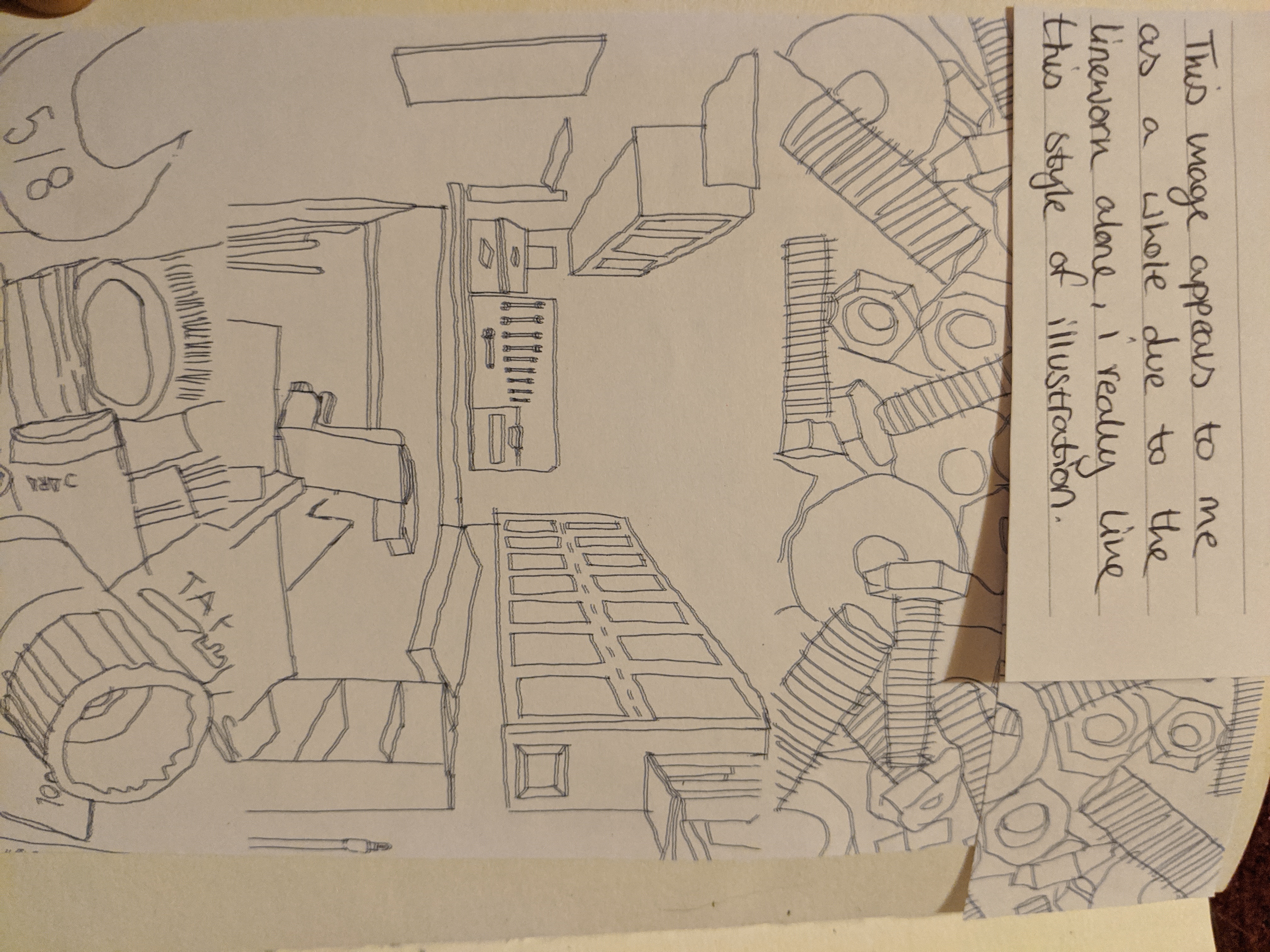
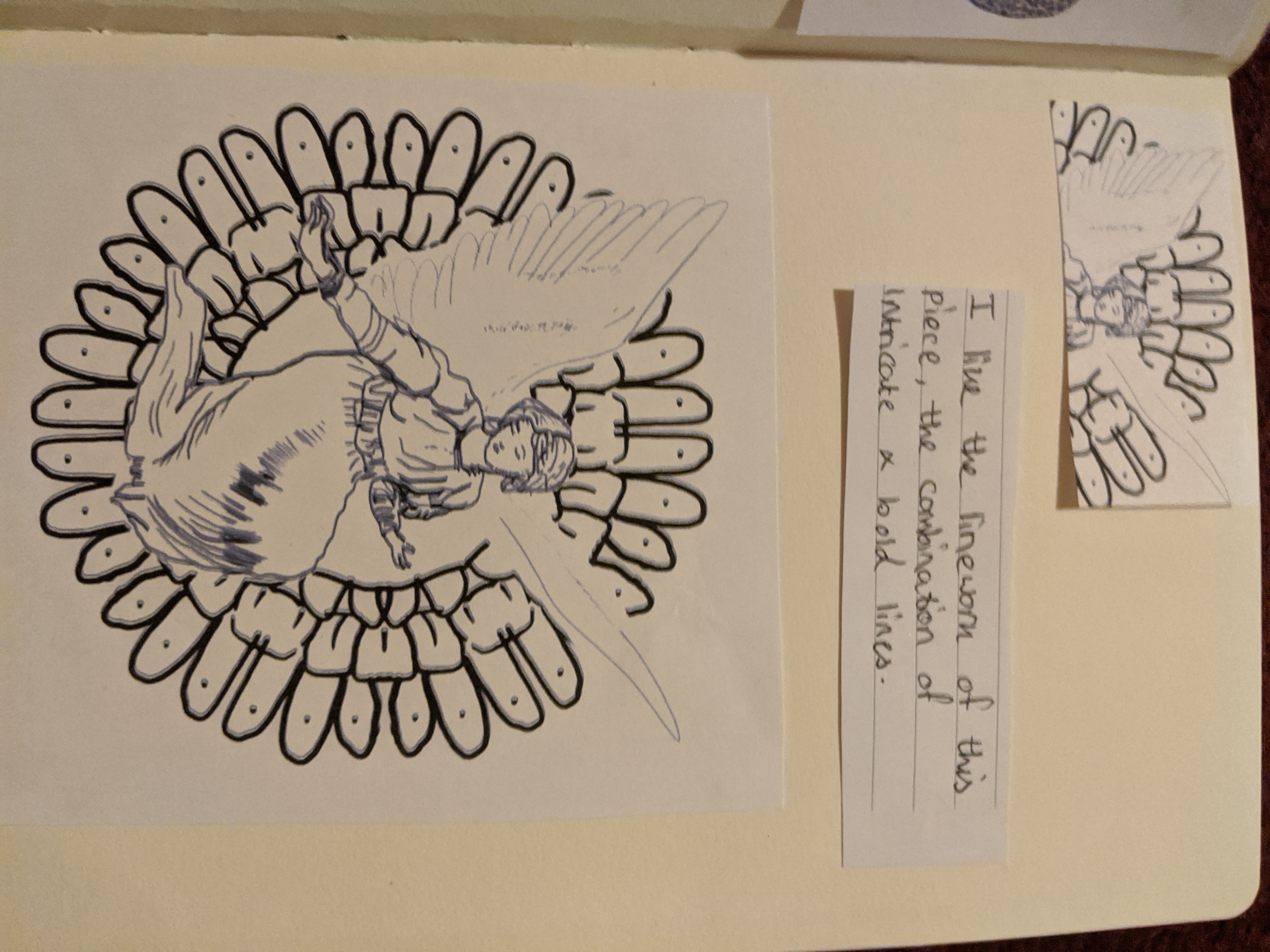
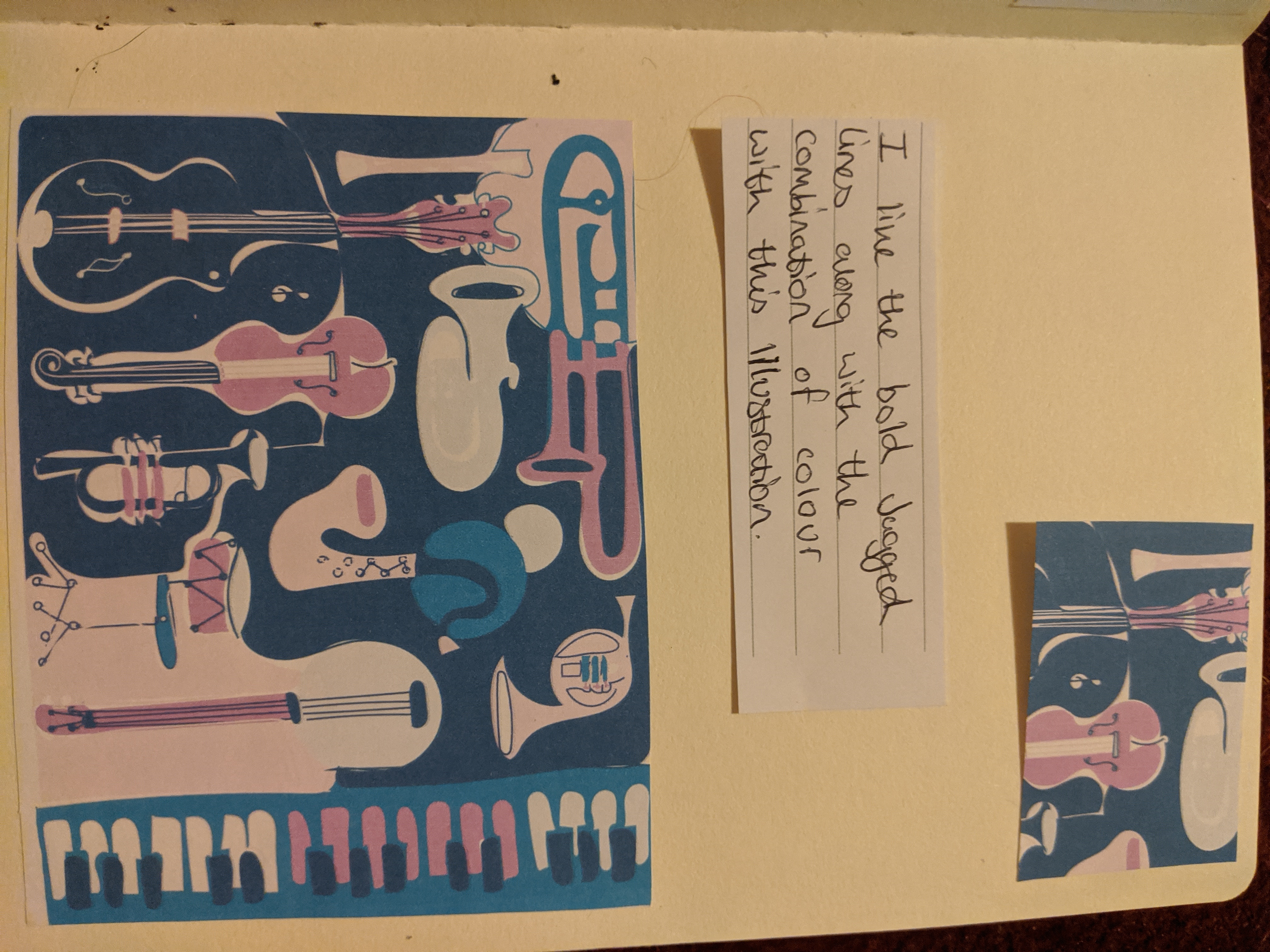
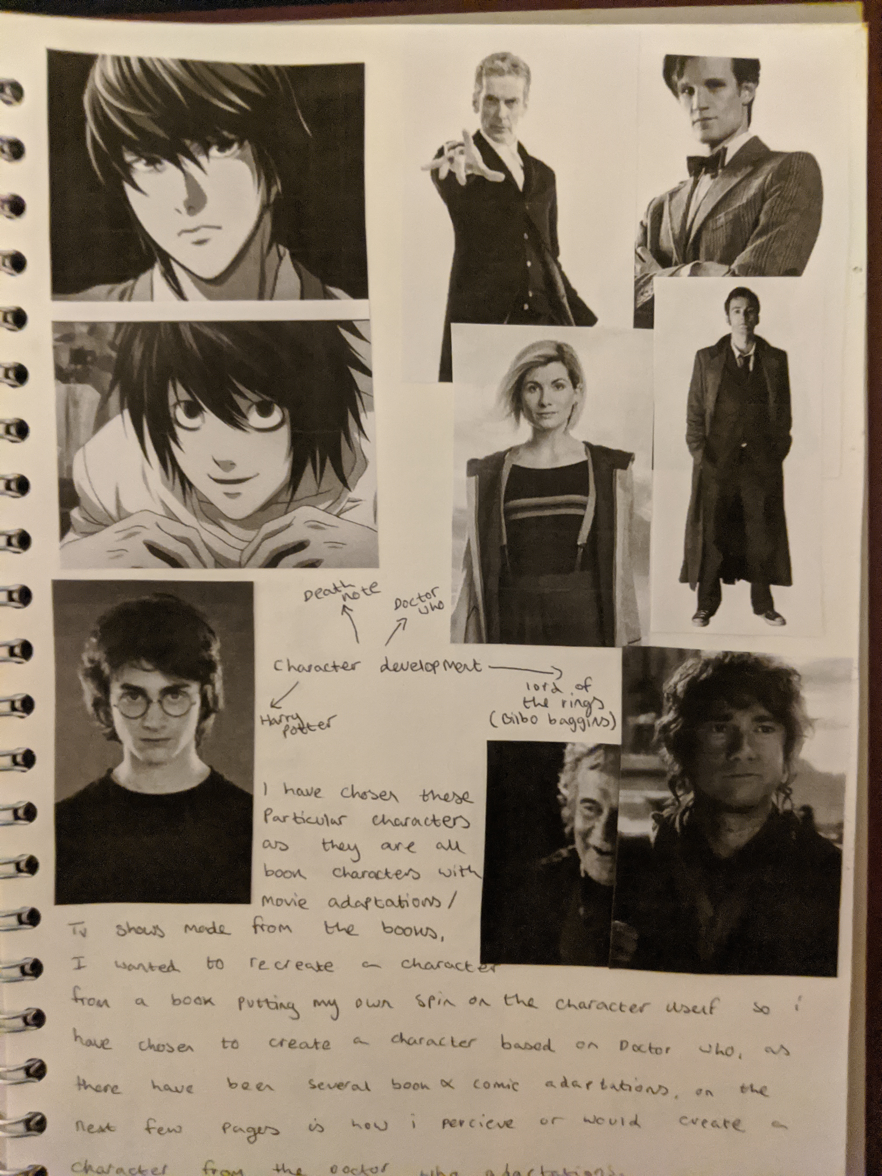
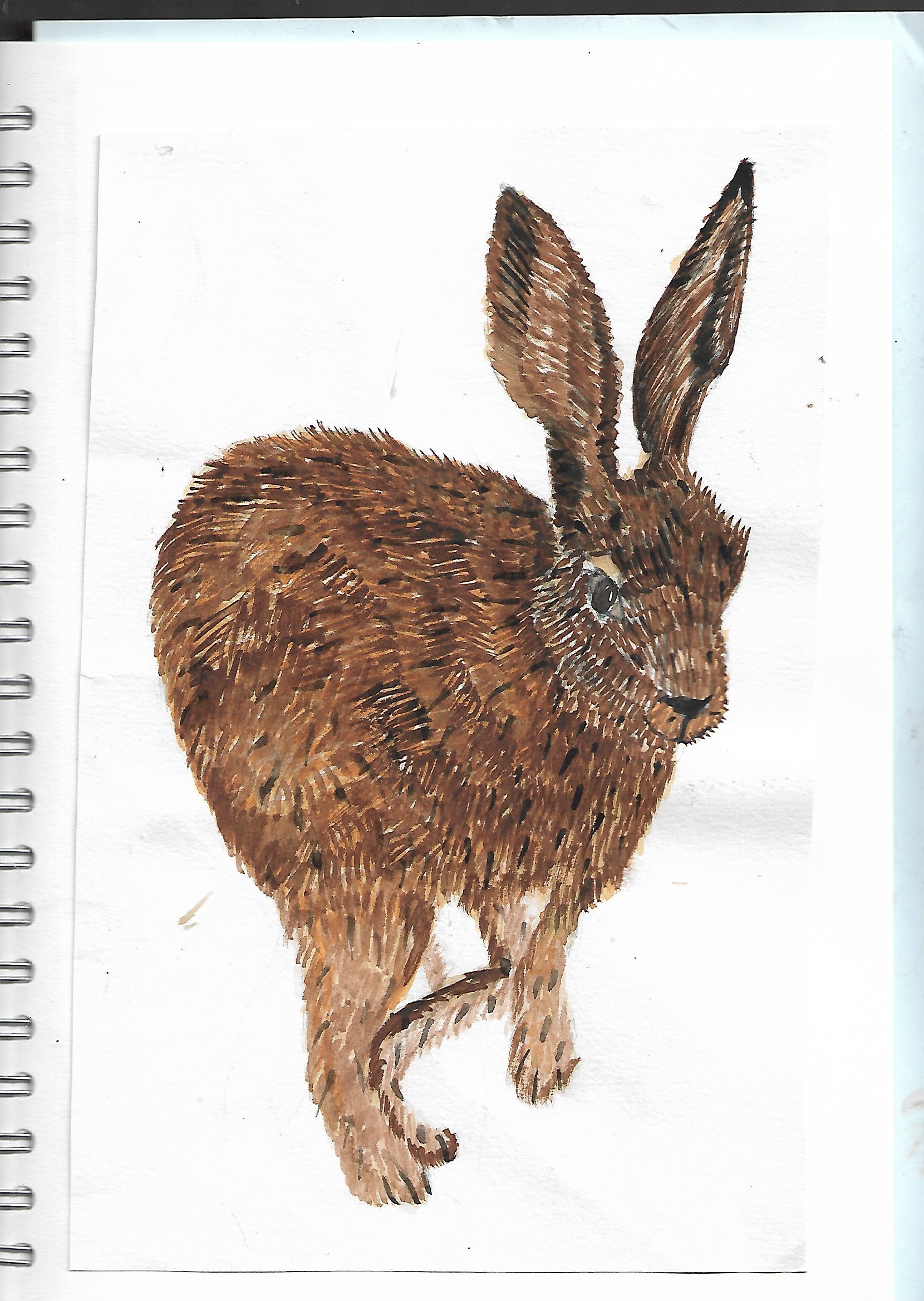
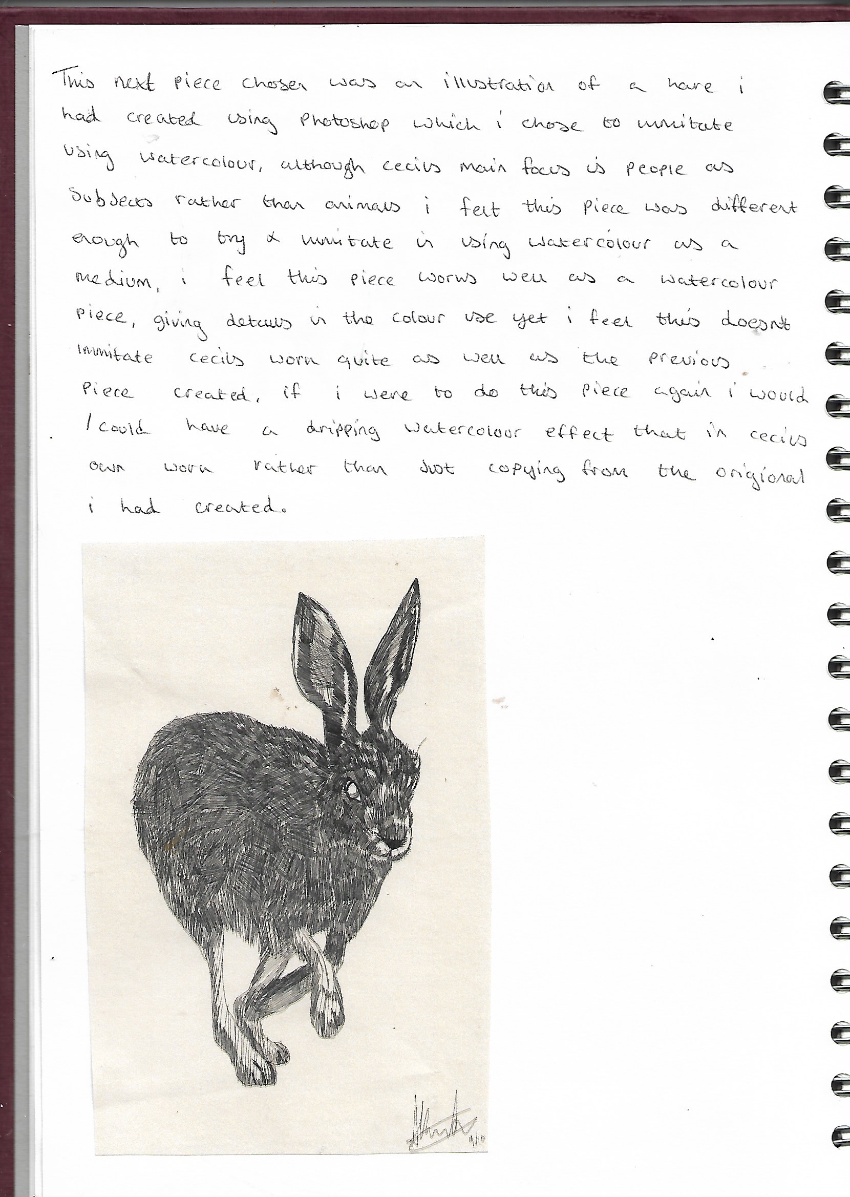
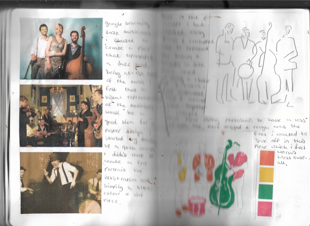
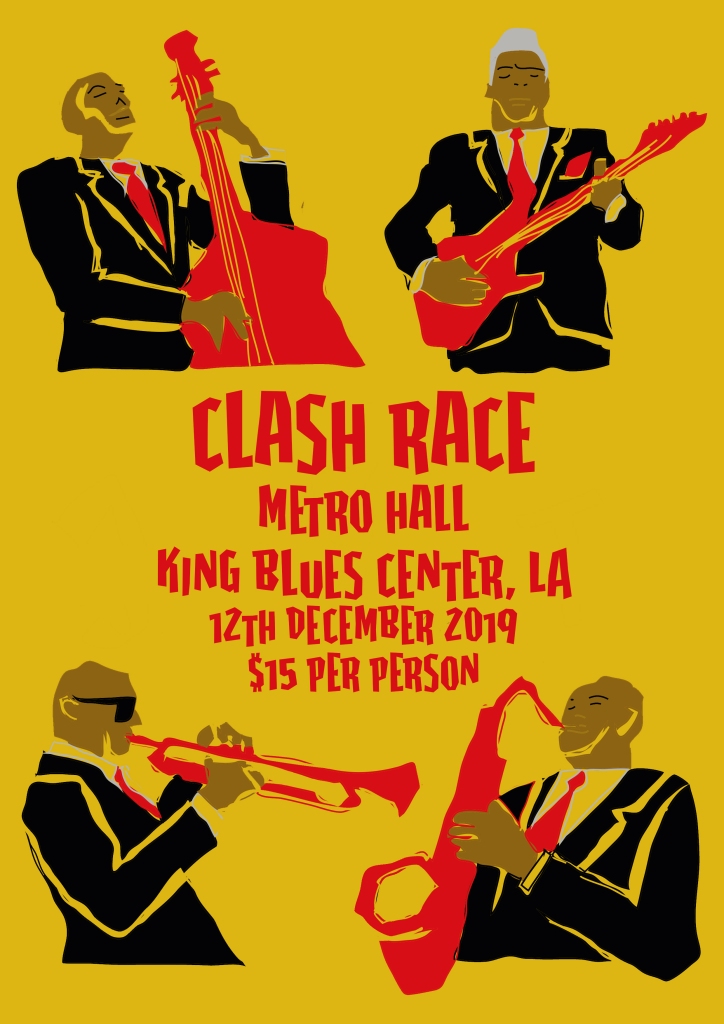
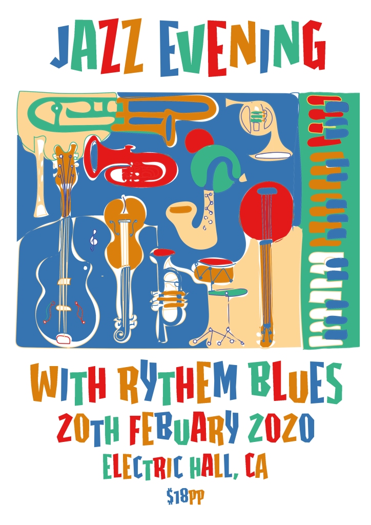
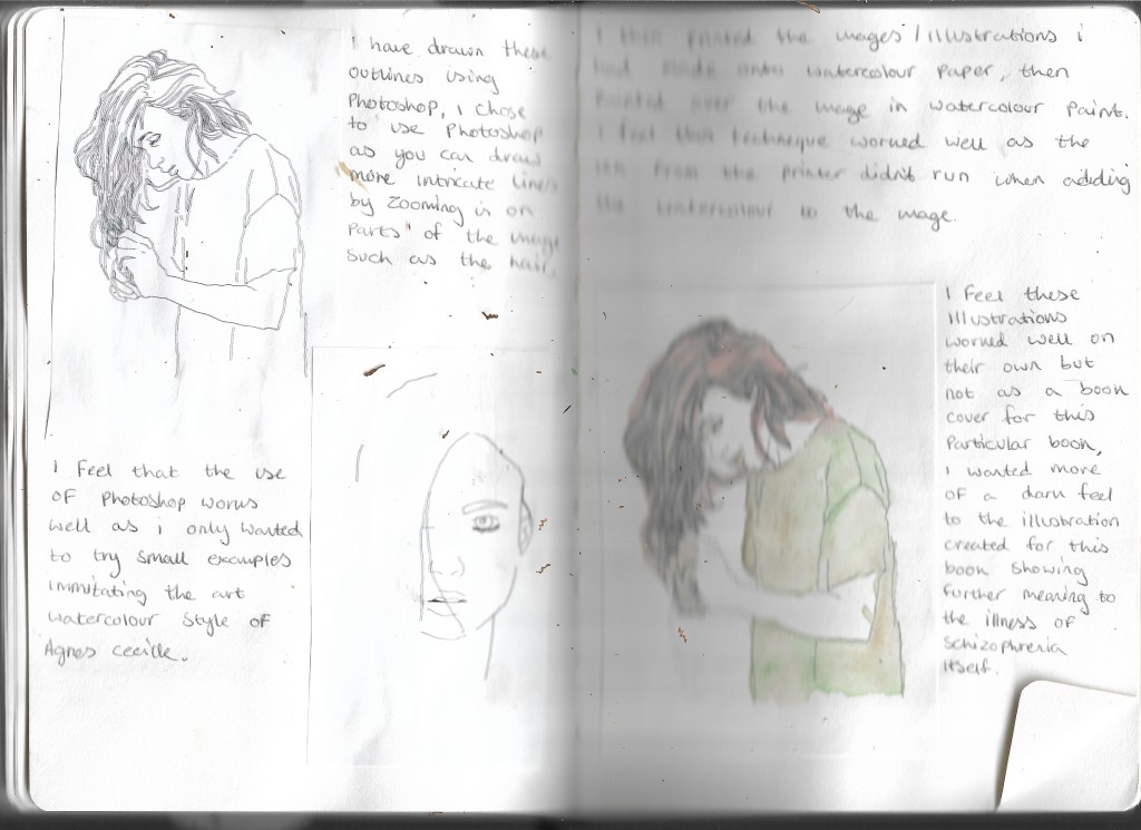
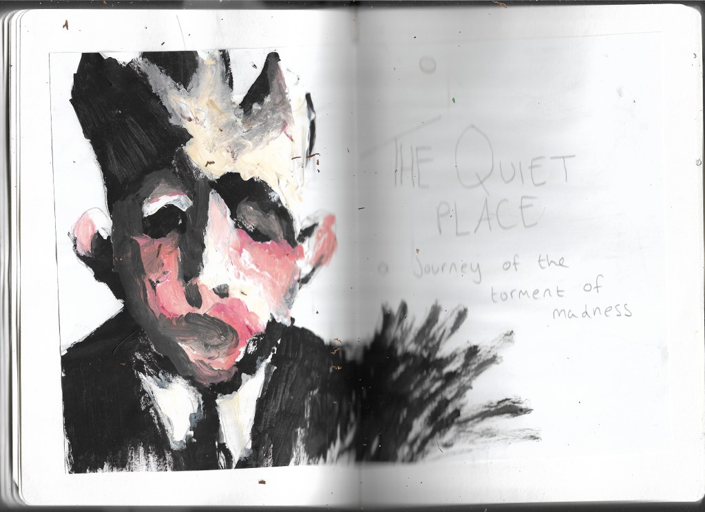
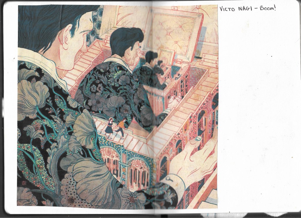
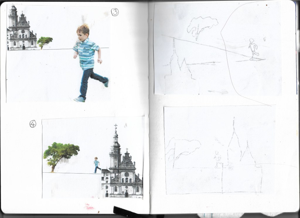
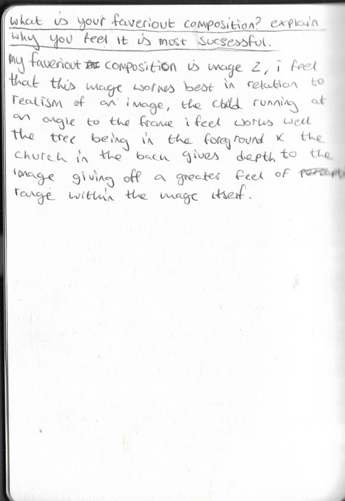
Here I have looked at my own pieces of work choosing from 8 different illustrations, comments on these illustrations can be seen here:
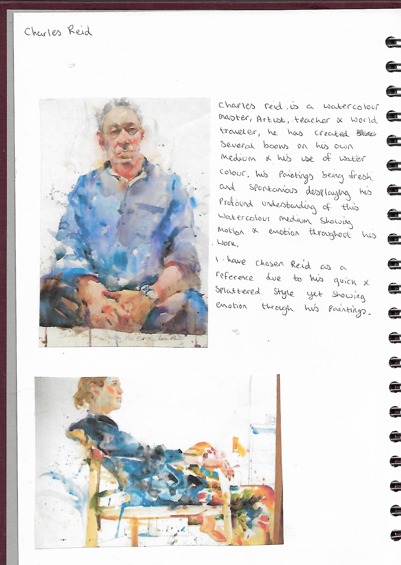
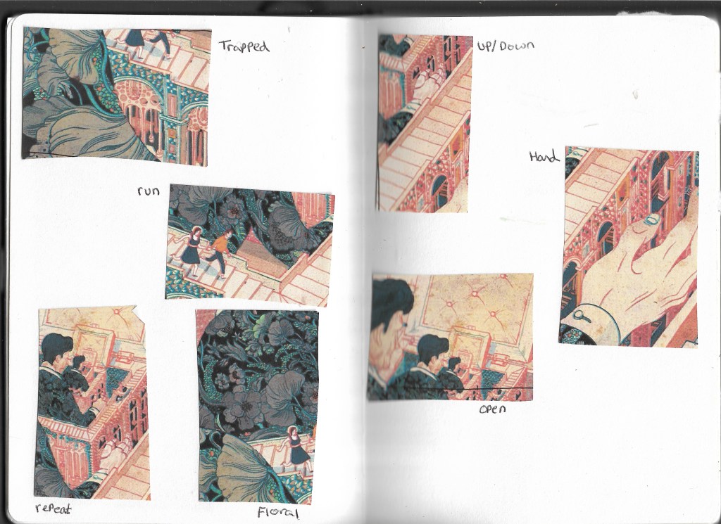
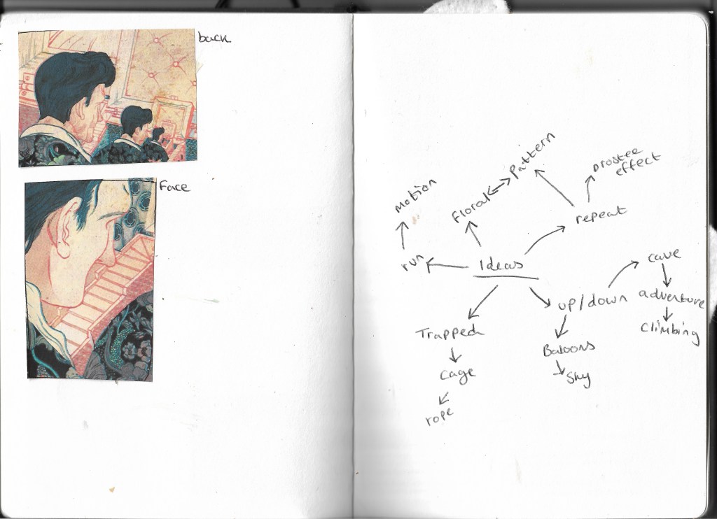
Next I chose one illustration I felt could work well when choosing from a particular authorial practice, here I explored many different avenues and different authorial practices which can be seen below:
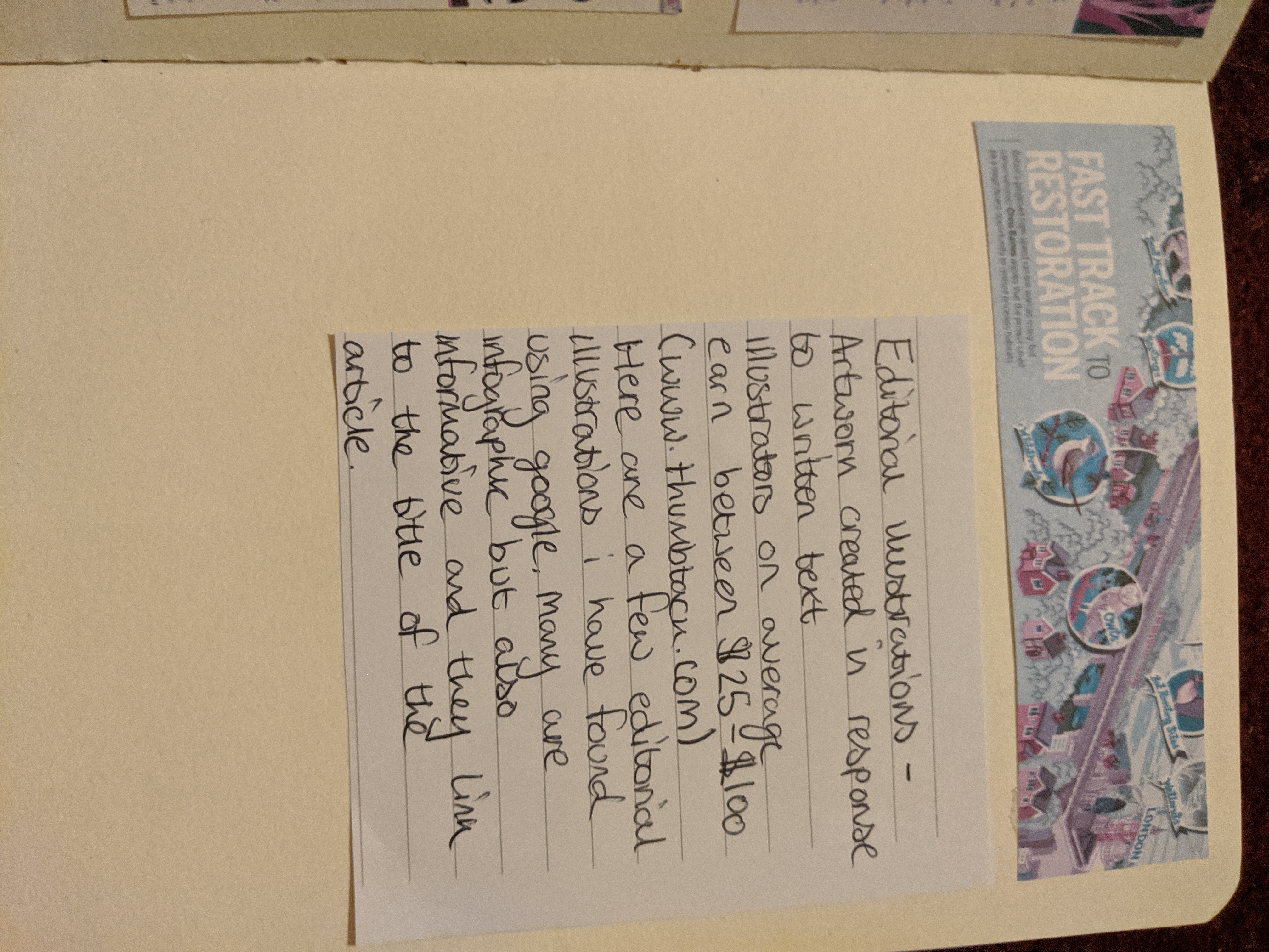
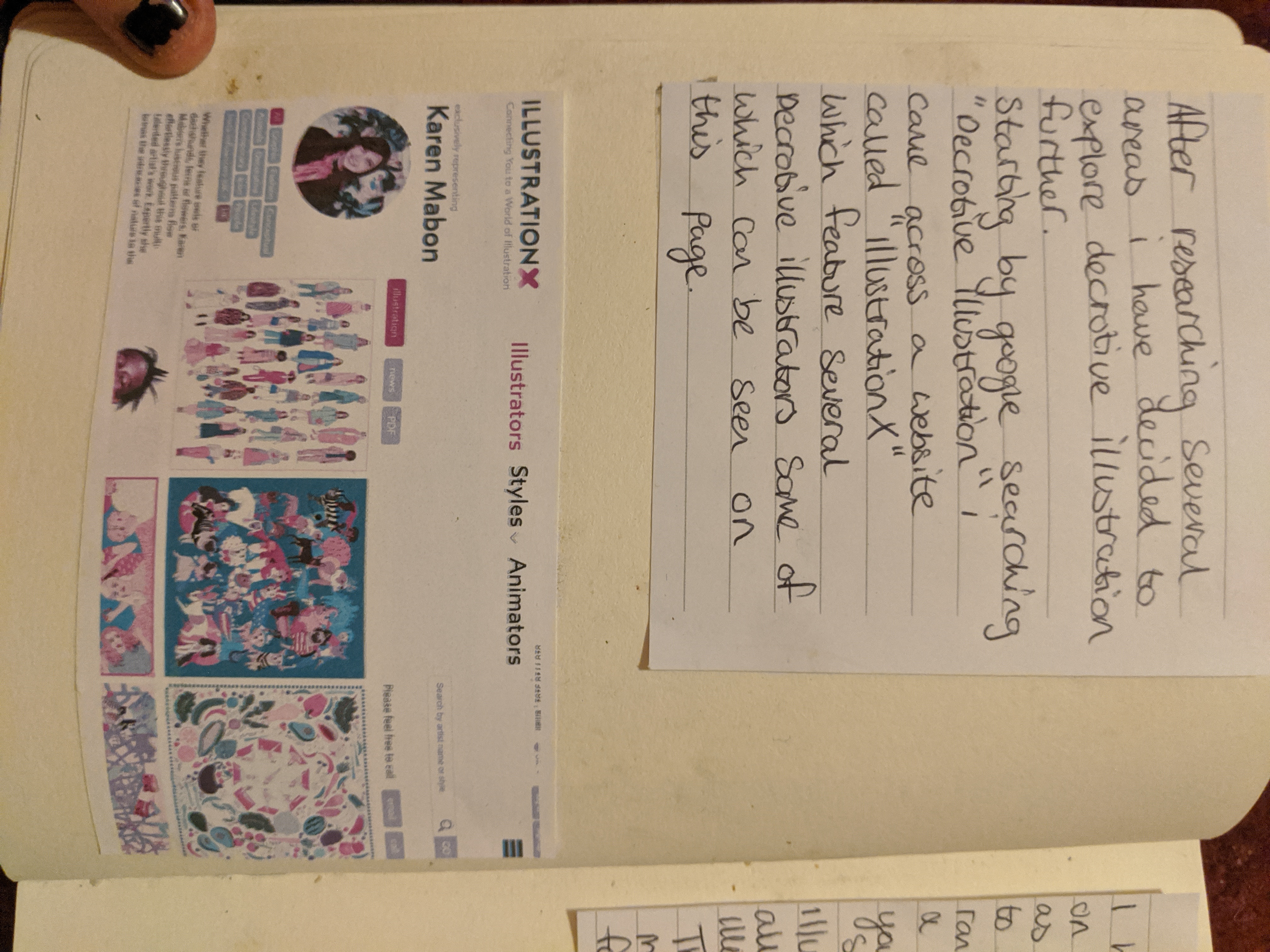
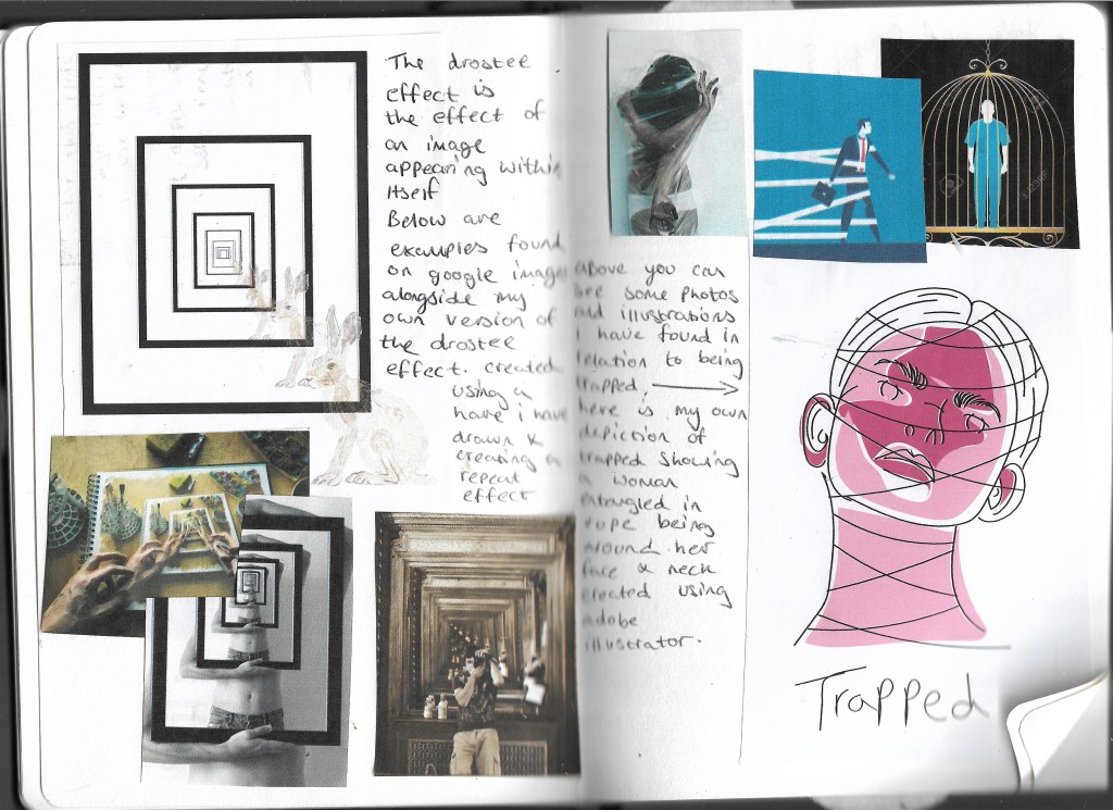
After researching these different avenues I chose to research further into decorative illustration, below are my findings:
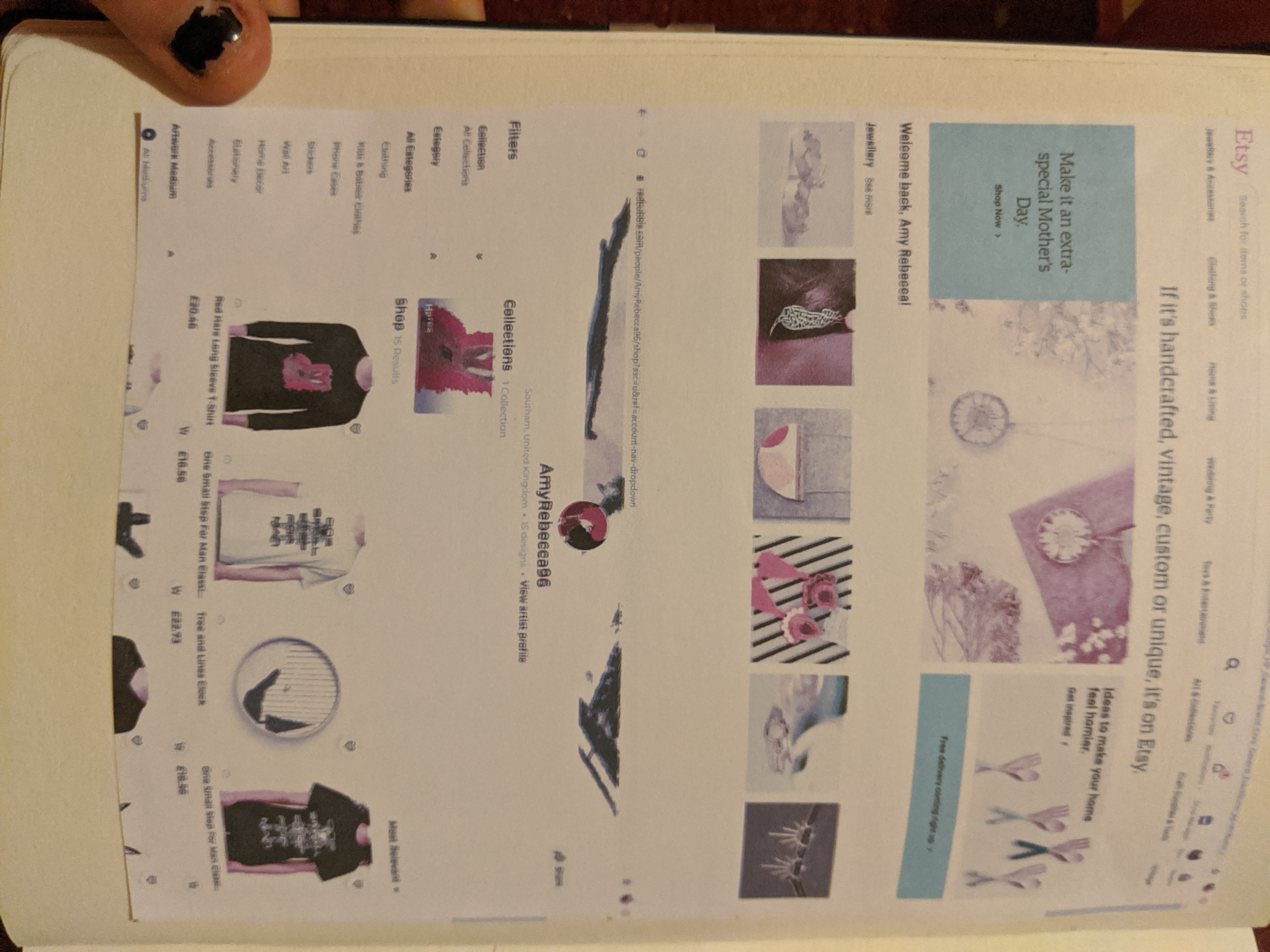
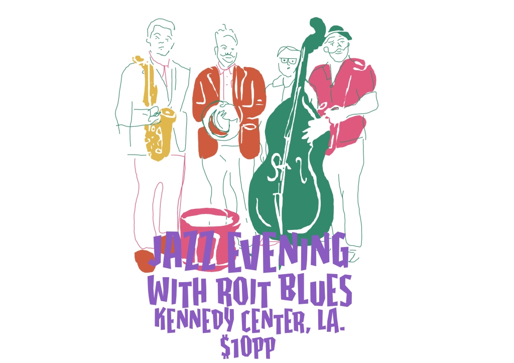
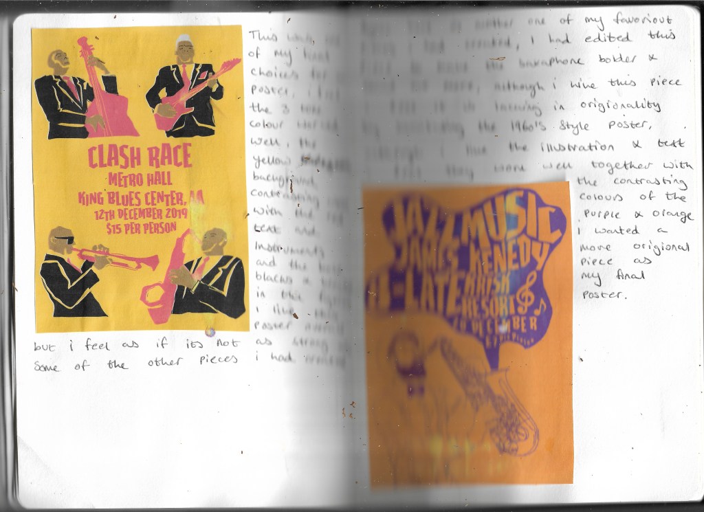
While researching deceptive illustration I found several different avenues to sell your own work that is explained in the above images.
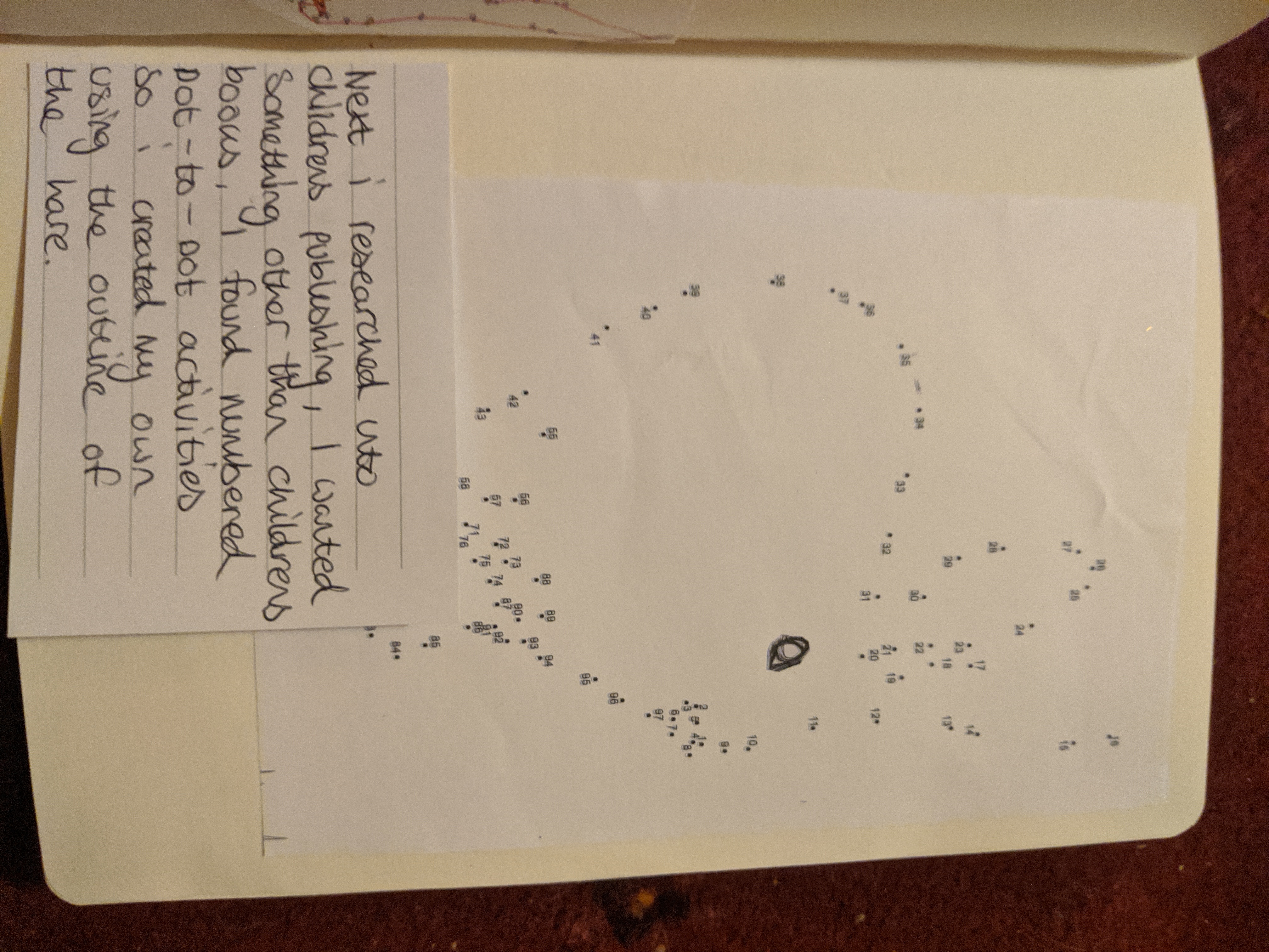
I feel if I had to do this project again I would like to have explored fashion illustration as this could work for the sites I had found and there is more to explore within the fashion industry, I would have also liked to explore children’s illustration much alike in part 4 and creating the children’s book covers I found this very interesting and would like to have explored this further but overall I feel this exploration has worked well and given me Insight into deceptive and fashion illustration and being able to sell your own works.
This is the final image created, I feel that this works well, I like the textures in the cat showing visual distortion yet it has the likeness of a cat, I feel the colours all balance well with eachother the green and blue background representing grass and the sky. Overall I feel this part of the unit has gone well given my anxiety around creating a mixed media piece to start with, I feel overall this piece as a final illustration works well in conveying visual Distortion along with a created narrative for the cat having just eaten the fish from the bowl.
If I was to do this project again I would concentrate more on the background textures of the piece, I felt I explored many avenues in choosing to created this mixed media piece by using everyday objects such as food in this piece not just magazine cut outs, maybe next time I could have used only magazine and newspaper clippings and explored how I would represent the glossy texture in an illustration but as seen in this current piece of work I feel the foil representation works rather well.
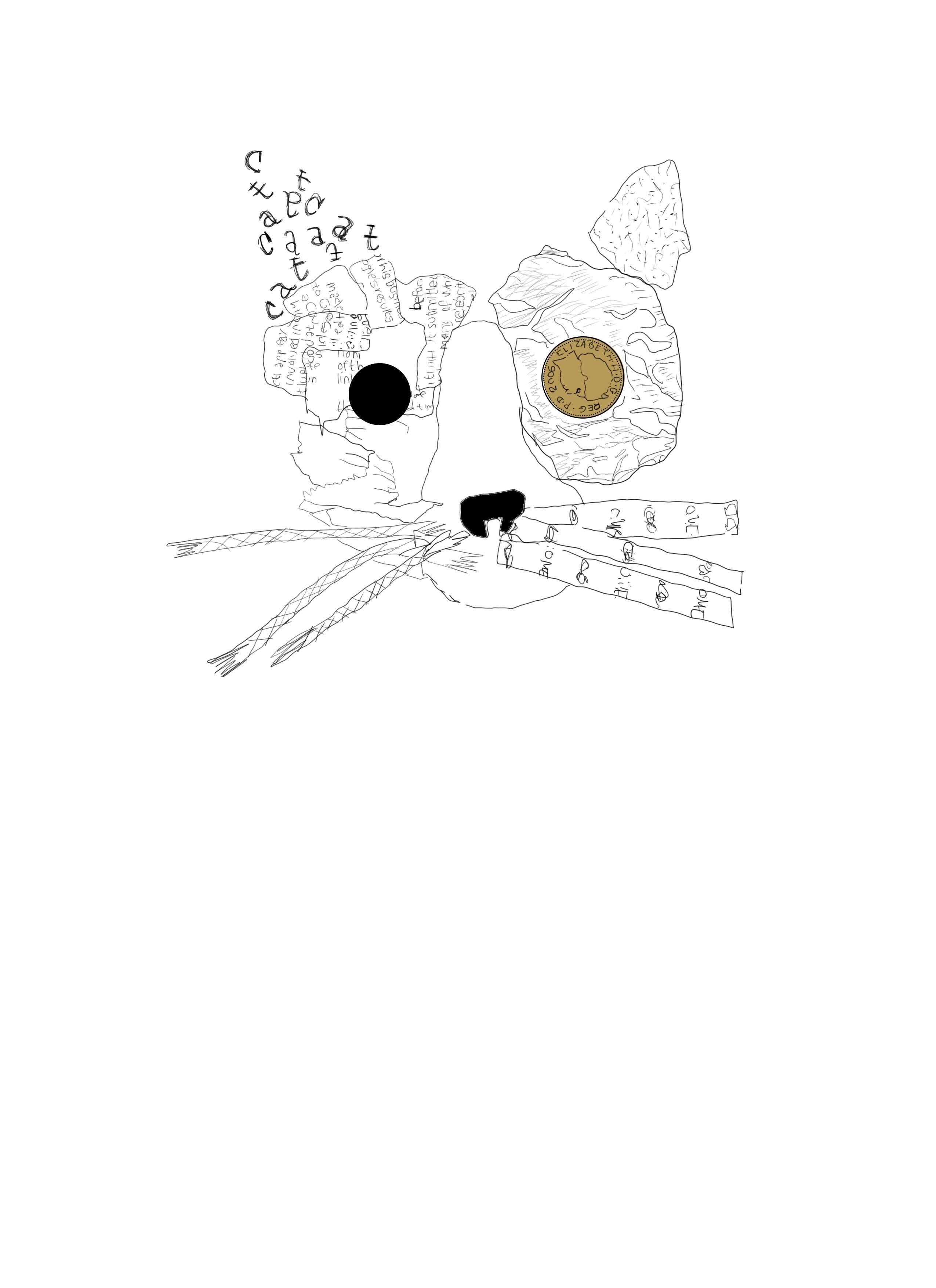
Adding another element to the image to introduce a narrative to the illustration, I chose to illustrate a cat food bowl with fish bones to represent the cat having a meal, I feel the bright red colour use of the bowl contrasts well with the line drawn illustration but I wanted to add colour and texture to the cat so I began to add colour to the cat starting with the coin in the eye.
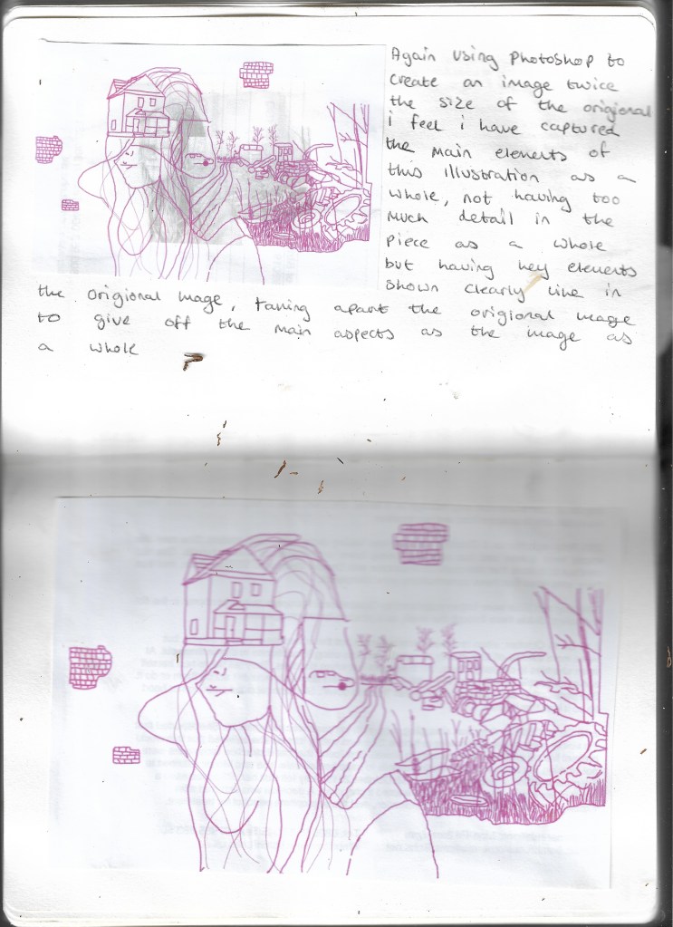
I next drew the college I had created using Adobe Photoshop to create the outline adding details into the foil and copying the text from the newspaper I feel this works effectively as a singular line drawing as the figure of the cat is not completely distorted you can still tell the image is a cat and I feel this illustration works well next I needed to add colour to the image.
After drawing this single line illustration I began to create a collage, I was nervous at first when creating this collage as mixed media isn’t something I am very comfortable with, I used daily objects that I have around my house including masking tape and filtersticks along with foil and a piece of tortilla, I wanted to use things to distort this image, I also used glitter glue with my glue gun and yarn along with stamps spelling out the word CAT using these individual letter and using different colours and newspaper, I decided to use a variety of different materials rather than just magazine and newspaper cut outs to really visually distort the image and I feel this has worked well.
Next I have drawn a similar image using the illustration below as a reference using one continuous line.
As directed by the brief I have drawn an illustration of my cat Kumi, using Adobe Photoshop using lines to represent her fur.
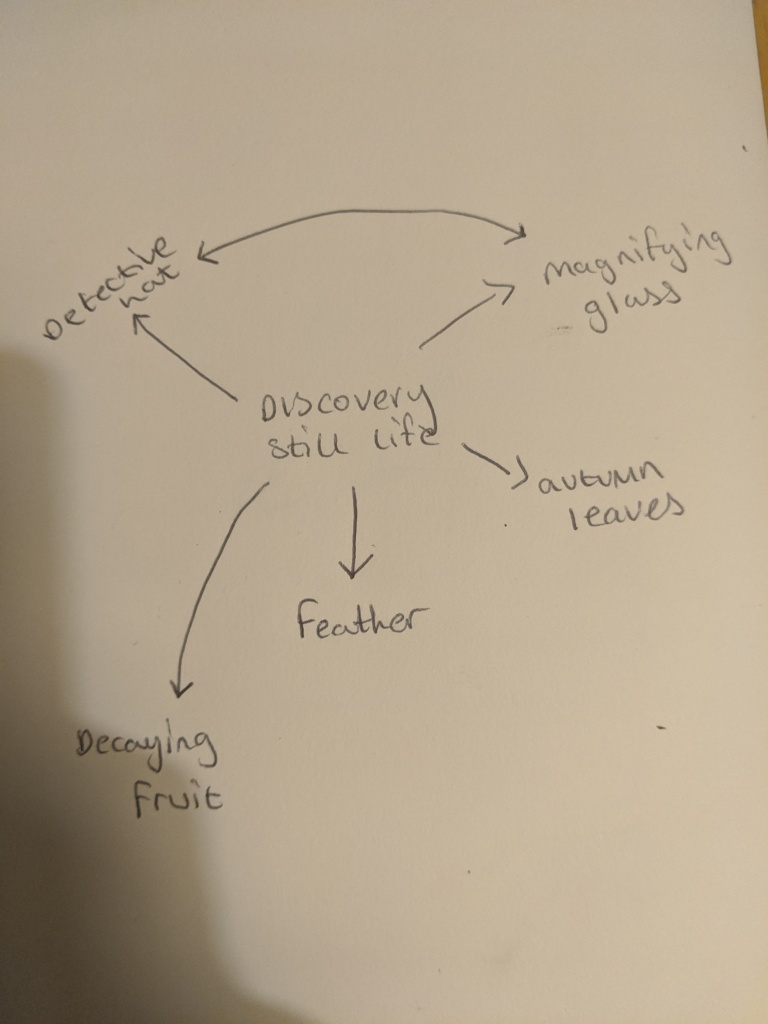
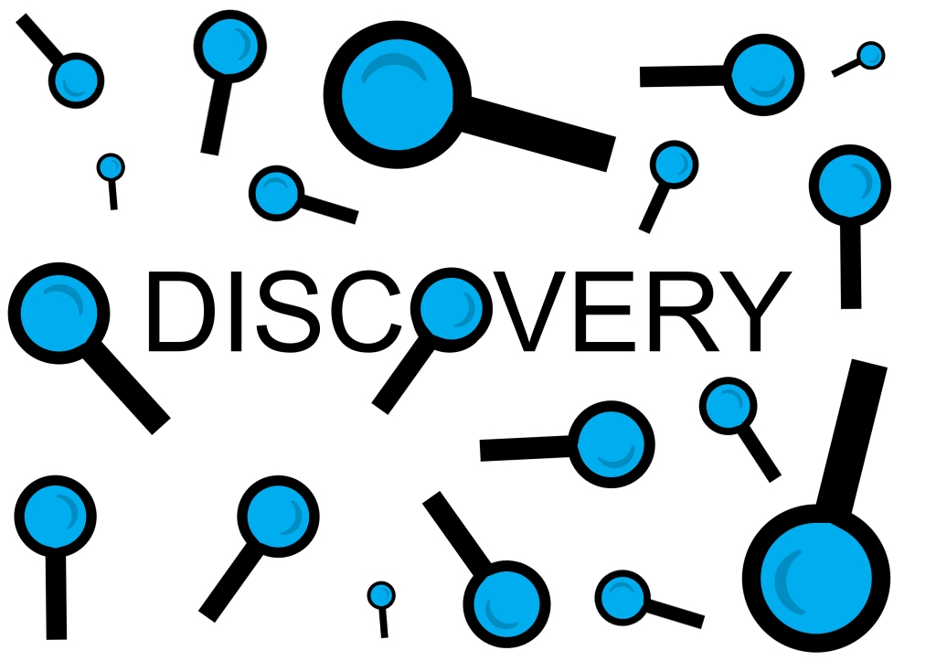
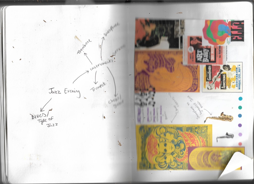
I Chose the word discovery for this final segment of Part Four, i started by drawing up a spider diagram thinking of still lifes that could represent discovery such as leaves or decaying fruit along with more literal things such as a detectives hat and a magnifying glass.
I chose a magnifying glass to be my main focal point for this area as i already had several ideas for magazine covers with this object in.
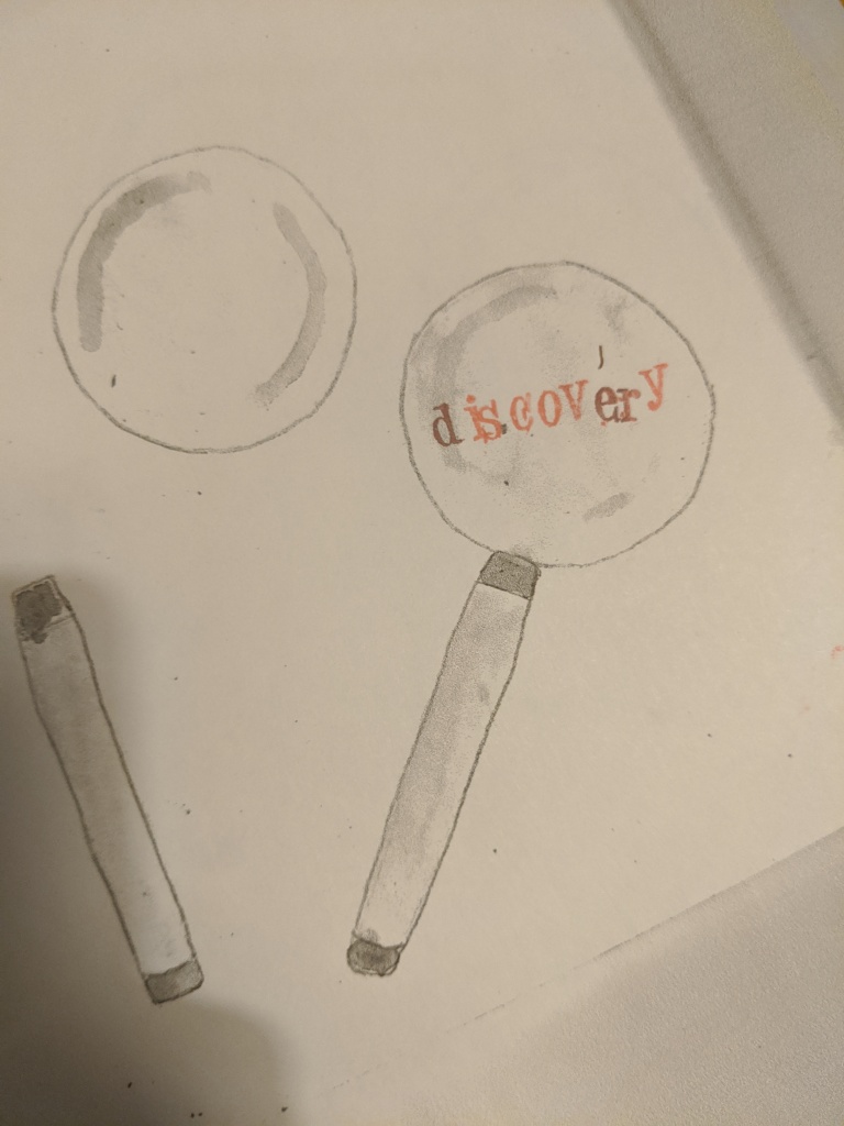
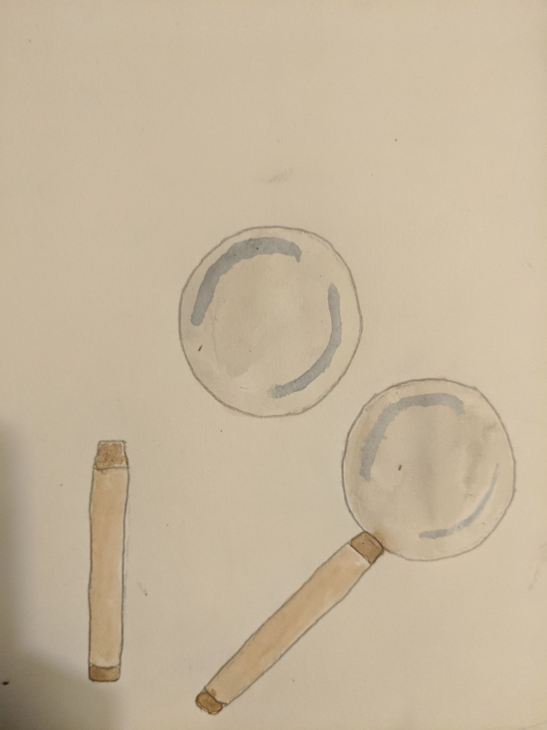
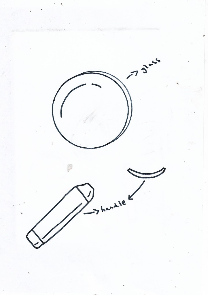
Below are some sketches of magnifying glasses:
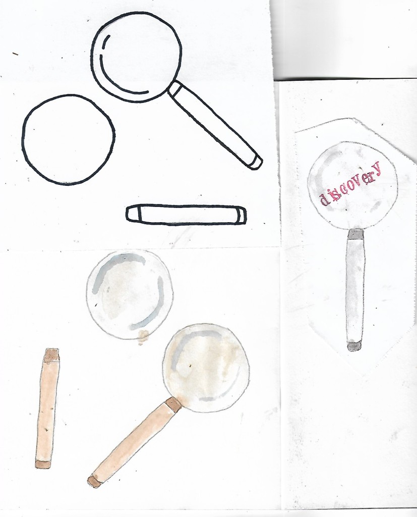
I started by drawing a magnifying glass in different positions along with taking apart the magnifying glass into several different parts showing the decronstuction of the glass itself.
I like these initital sketches and they have given me several ideas for a magnifying glass magazine concept some of my initial ideas and illustrations can be seen below:
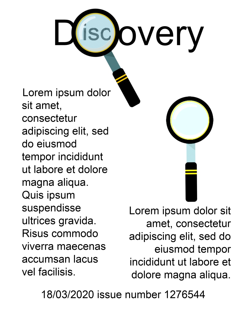
Here are two illustrations of 2 different magnifying glasses created using photoshop and below is these magnifying glasses with “Discovery” written around them as if they were on a magazine cover so below are the concepts and final images:
Here are just a few images i have created for the magazine cover, i like the firdt one especially replacing the “O” with the magnifying glass i feel works well in conveying disocovery the other two i feel are too cluttered, there is too much going on for it to be a magazine cover, i wanted simplicity in my designs conveying simple discovery rather than a clash of words and illustrations, below again are further expansions on illustrations of descovery using again the magnifying glass
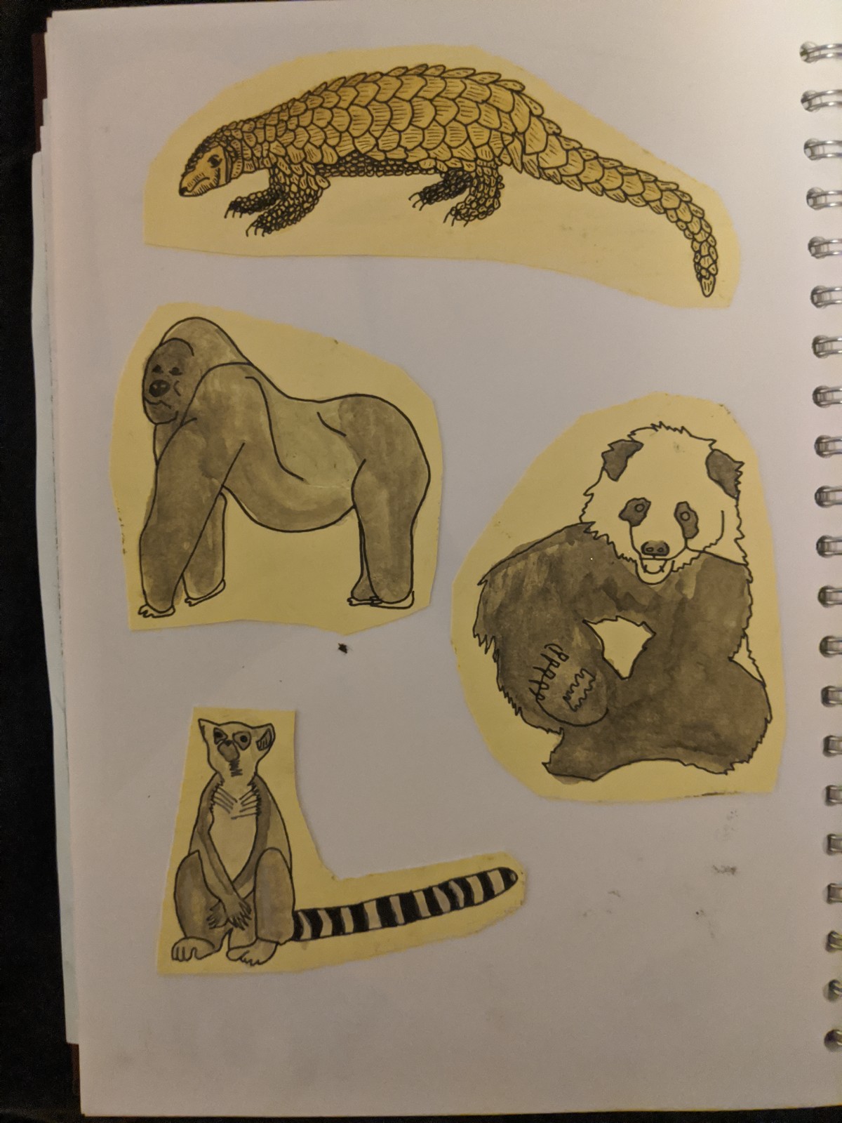
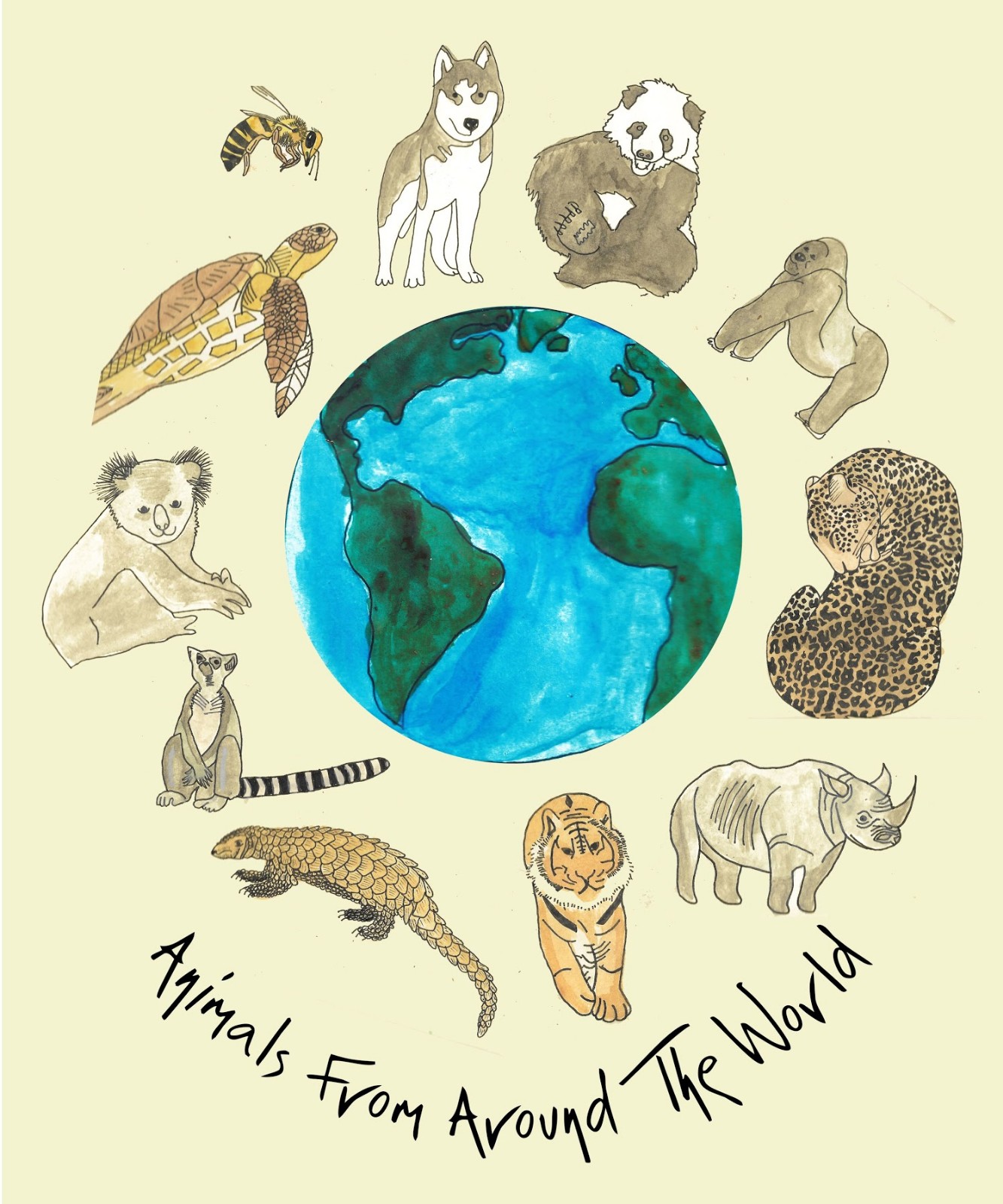
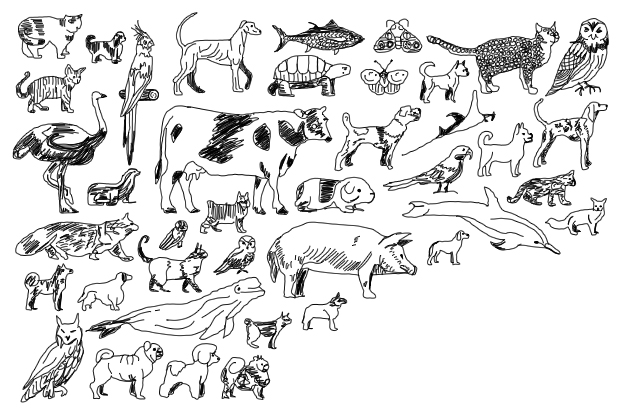
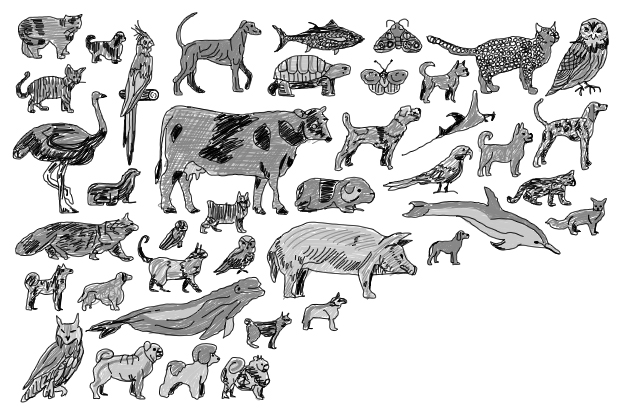
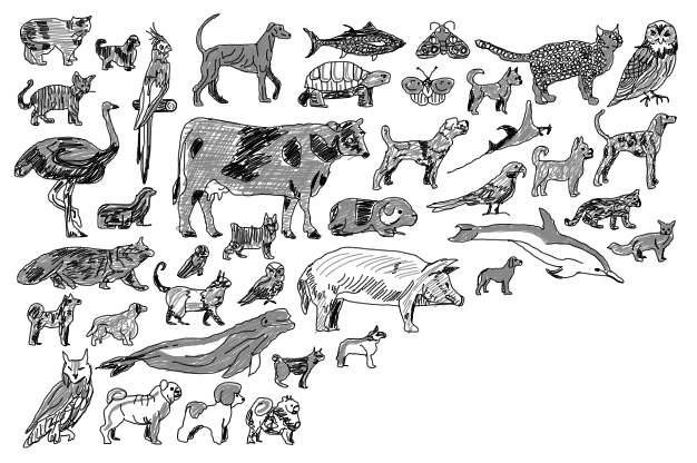
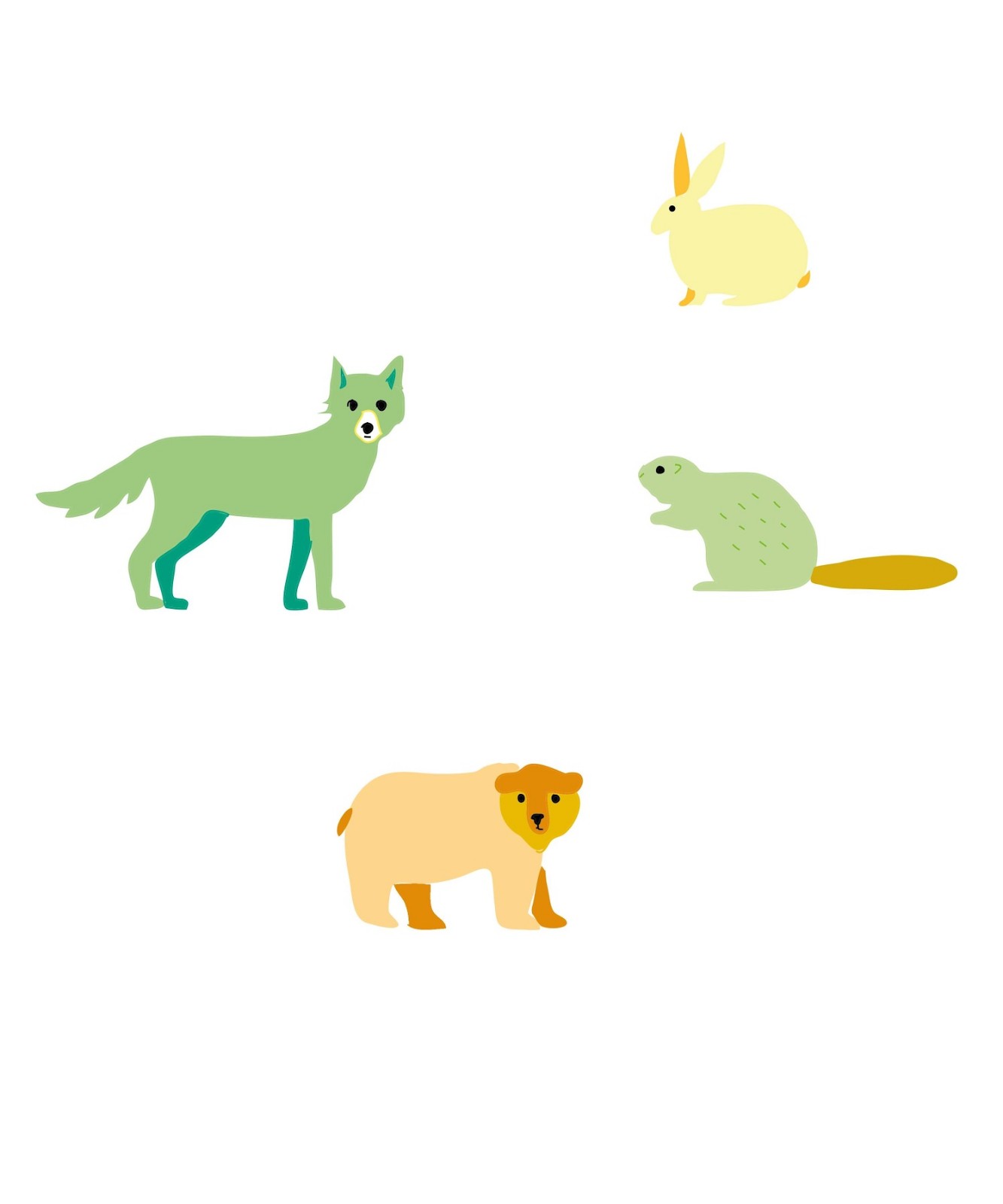
I feel overall that this book cover design works well, i like the use of watercolour for this design and i feel this gives off a good textural element and feel to the piece, i feel this book looks child friendy, using this traditional watercolour medium works well giving depth to the illustrations, i like how the animals are all circled and positioned around the globe, i feel this gives off an effect of animals being around the word in a litteral sense as well as a physical outlook.
I used several animals buy mainly endangered animals for this piece as i wanted to shine light on the endangered animals giving them the spotlight in this book cover design, overall i feel this piece works well in conveying the message of animals being arounf the world but as well would appeal to children given the style choice.
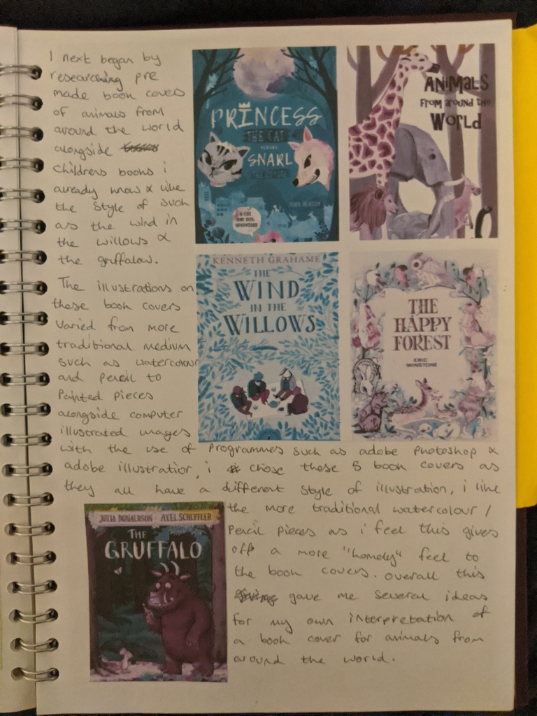
Next I began by researching into pre exsiting childrens books by various different illustrators, google searching “animals from around the world” along with other books i have already been farmiliar with such as the wind in the willows, the expansion and text to this research can be seen below:
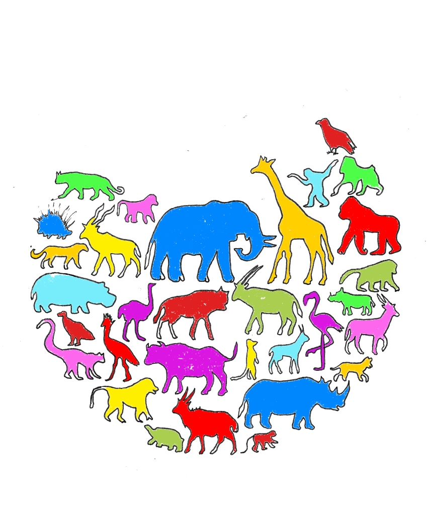
Here is my second finished piece for the childrens book cover, i wanted to combine traditional medium with technology so i used fineliner to create the initial illustration then filling in on photoshop, which the results can be seen above.
I feel that this piece doesn’t work as well as the first piece created, i like te positioning of the animals being in a globe shape with part cut off where the text is showing through but i dont feel that this illustration works well as a childrens book cover, although i initially liked the piece after time and looking back and reflecting on the piece i don’t like the way it is positioned i feel the illustration could be better and more traditional, although i feel the spash of bright colour works well and would appeal to children as a whole i dont think this piece works as well as the first one created.
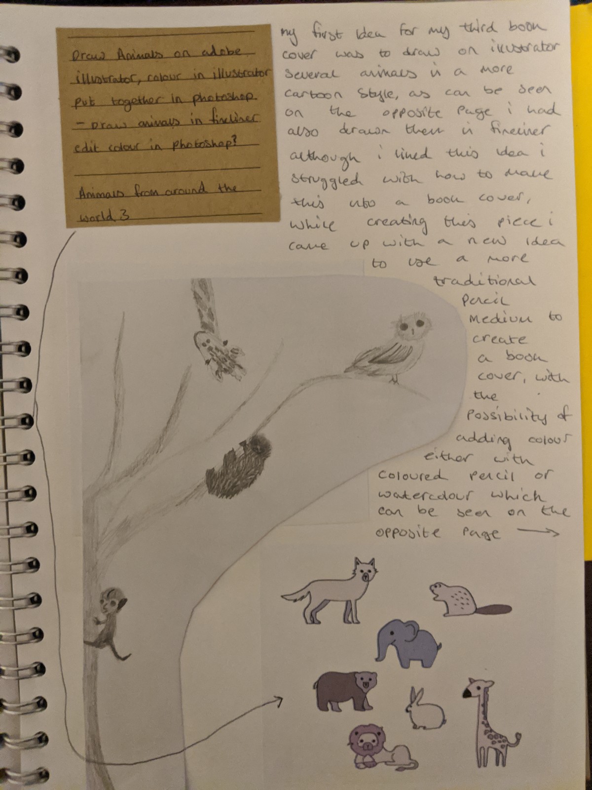
While working on my Third and final book cover i came up with several different ideas as i was developing this piece. my ideas and concepts can be seen below:
While creating these illustrations i came up with mock final book covers for one of the illustrations that can be seen below:
This is my Third and final illustration, although i did like some of the other illustrations i had created i felt that this one worked best with thte colour choice and illustration style being all photoshopped.
I like how this illustration works with there being several different animals on the page and several variations of the animals such a different dog and cat breeds as well as birds and owls showing different animals from around the world.
My personal favourite piece was the first piece I had created, I like the watercolour style combined with the text I felt this piece worked particularly well with depicting animals from around the world by showing several endangered animals being around a watercolour globe this was my favourite piece and I feel this worked better than the others due to the traditional medium use.
If I was to do this project again I would have liked to use illustrator to create a final piece although I did use illustrator to create some animals I felt stumped as to how to have them depicted being around the world as I had only created a few animals I did like these but maybe given more time I would have been able to come up with better ideas as to how to position them and come up with a background for them to be placed upon.
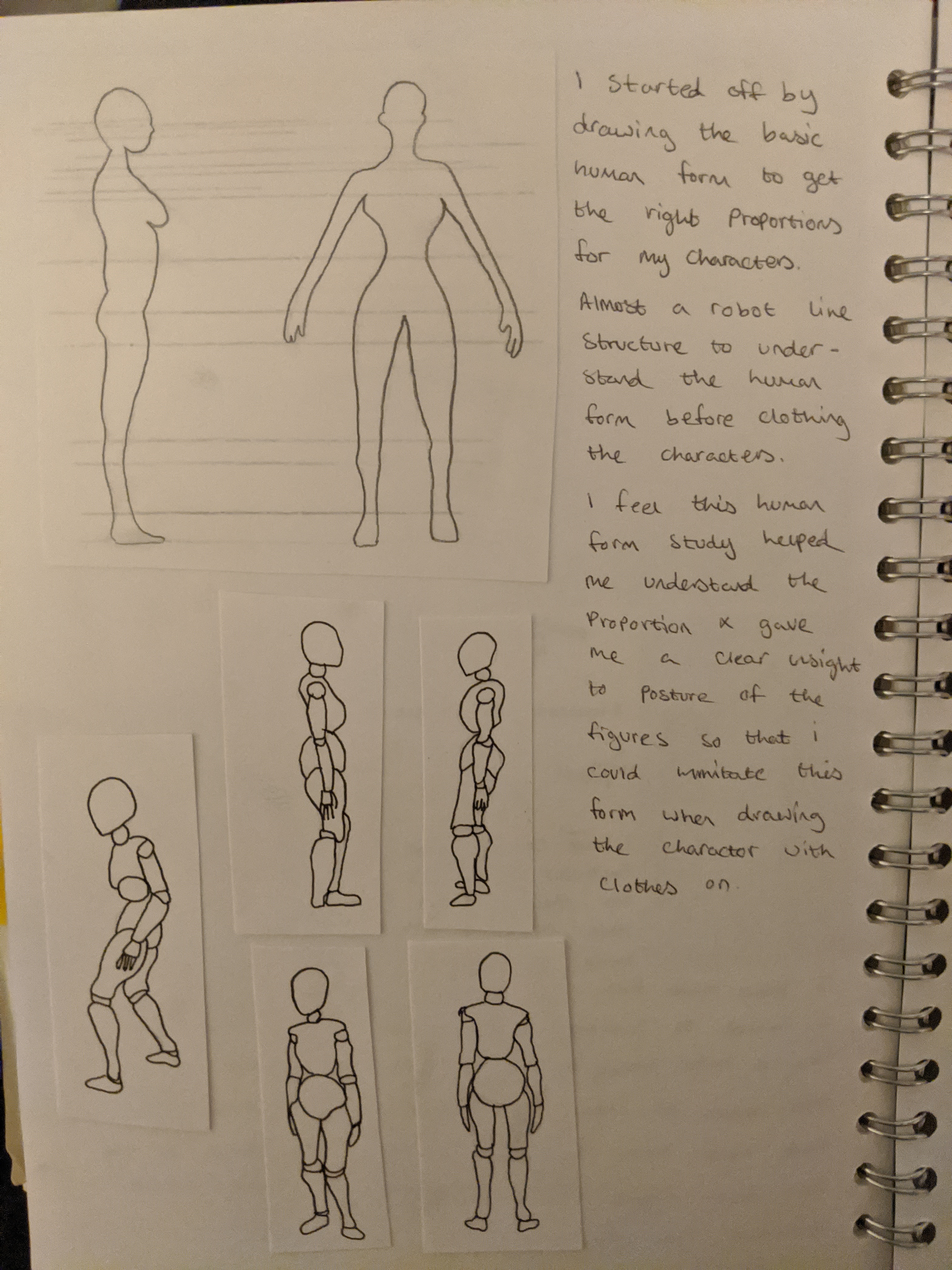
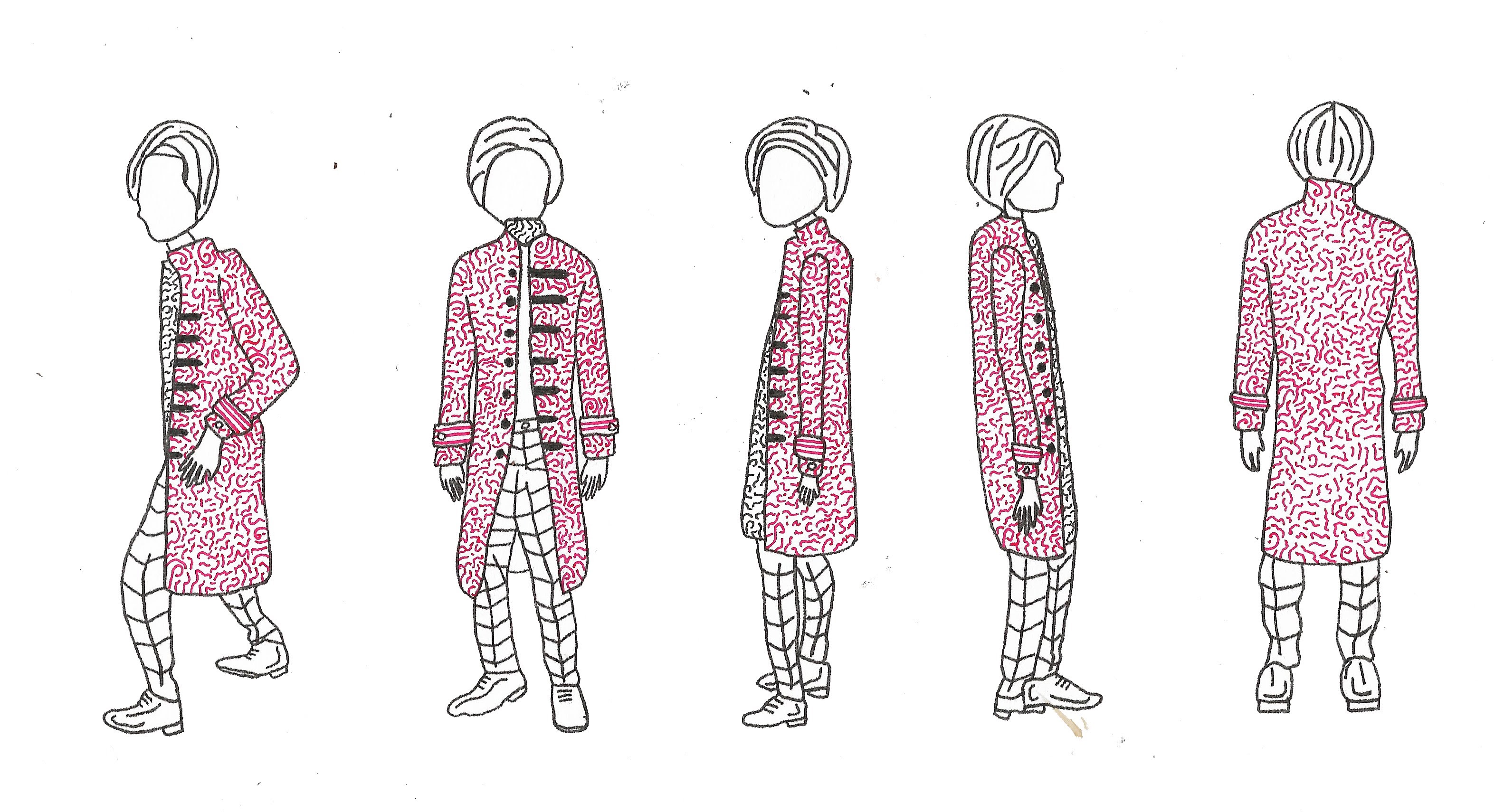
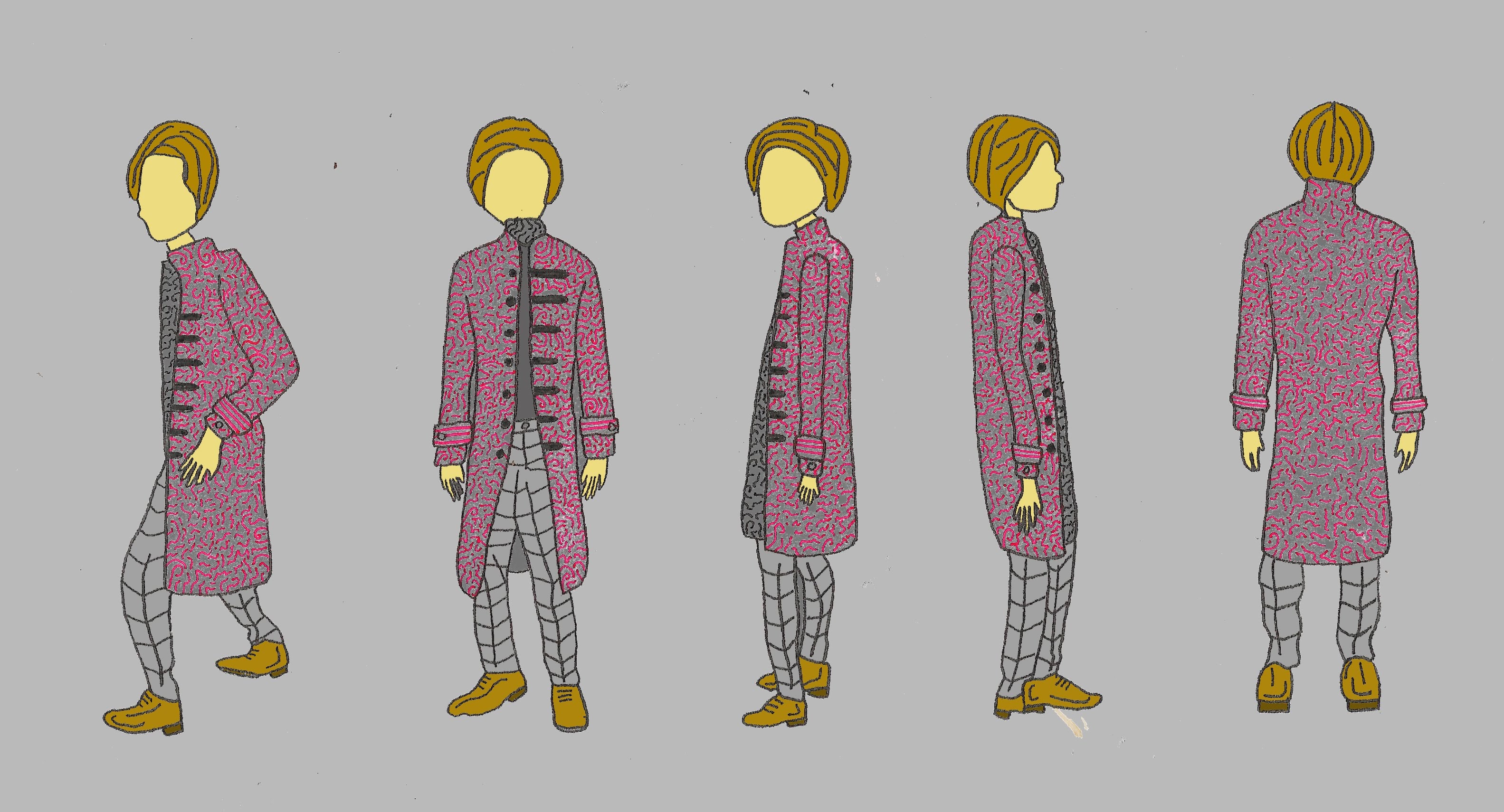
Here is a front and back view of my first character, wearing a trenchcoat and pleated trousers and boots.Here is a 360 profile view of my character based on the doctor Here is a work in progress of me colouring in with fineliner the doctor character“”Here are the characters as scanned into Photoshop Here is a Photoshop edit of the coloured.
I feel this image works well, i like the colour scheme used as i feel the colours contrast well together giving the character texture and personality through their clothing.
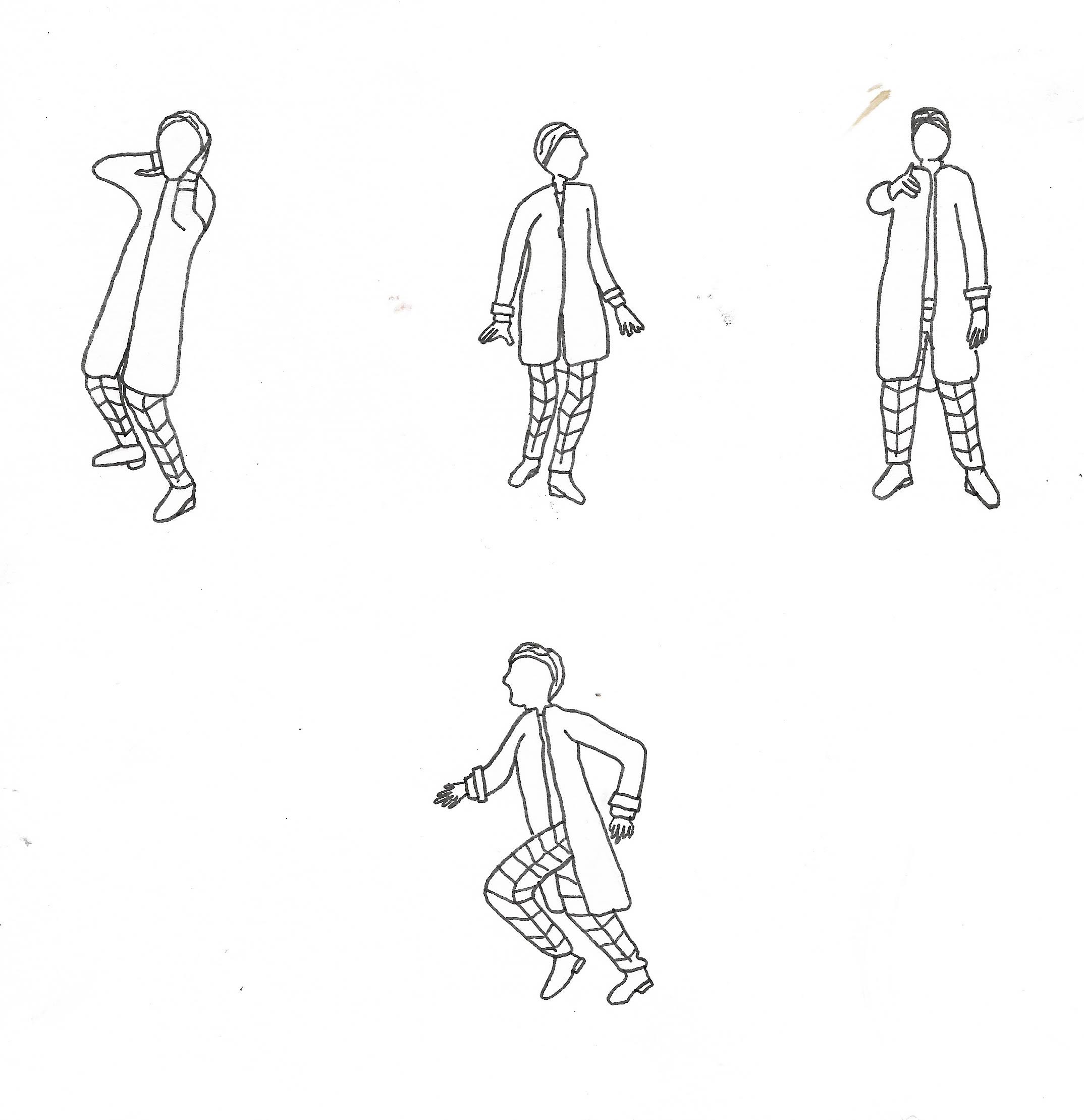
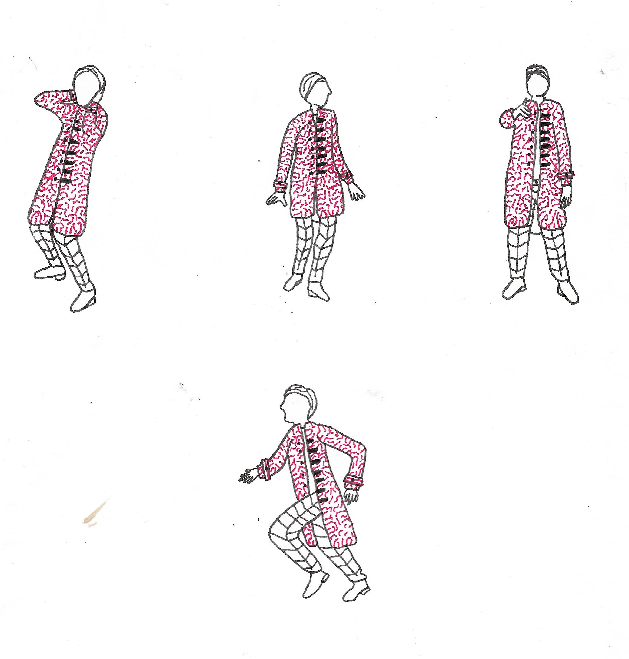
Here are some illustrations in motion Here is the coloured version as scanned into Photoshop.
I like the way this character turned out, from research into doctor who characters i chose positions based on words such as “run” and “you” with the pointing and running positions. I would like to expand further on facial expressions next so this is what i decided to do based on my character below are some facial expressions drawn in Photoshop.
Some facial expressions.
I like how these facual expressions turned out i think they work well in conveying the fun and bubbly but serious character the doctor can be.
Overall i like this character and think they work well as a whole, i like the combination of fineliner and digital illustration in these pieces and feel this medium works well together. I feel this combination of traditional and technology also work well with the character of the doctor as Si-Fi the doctor is futuristic like technogy but also wise and old like the more traditional drawing methods
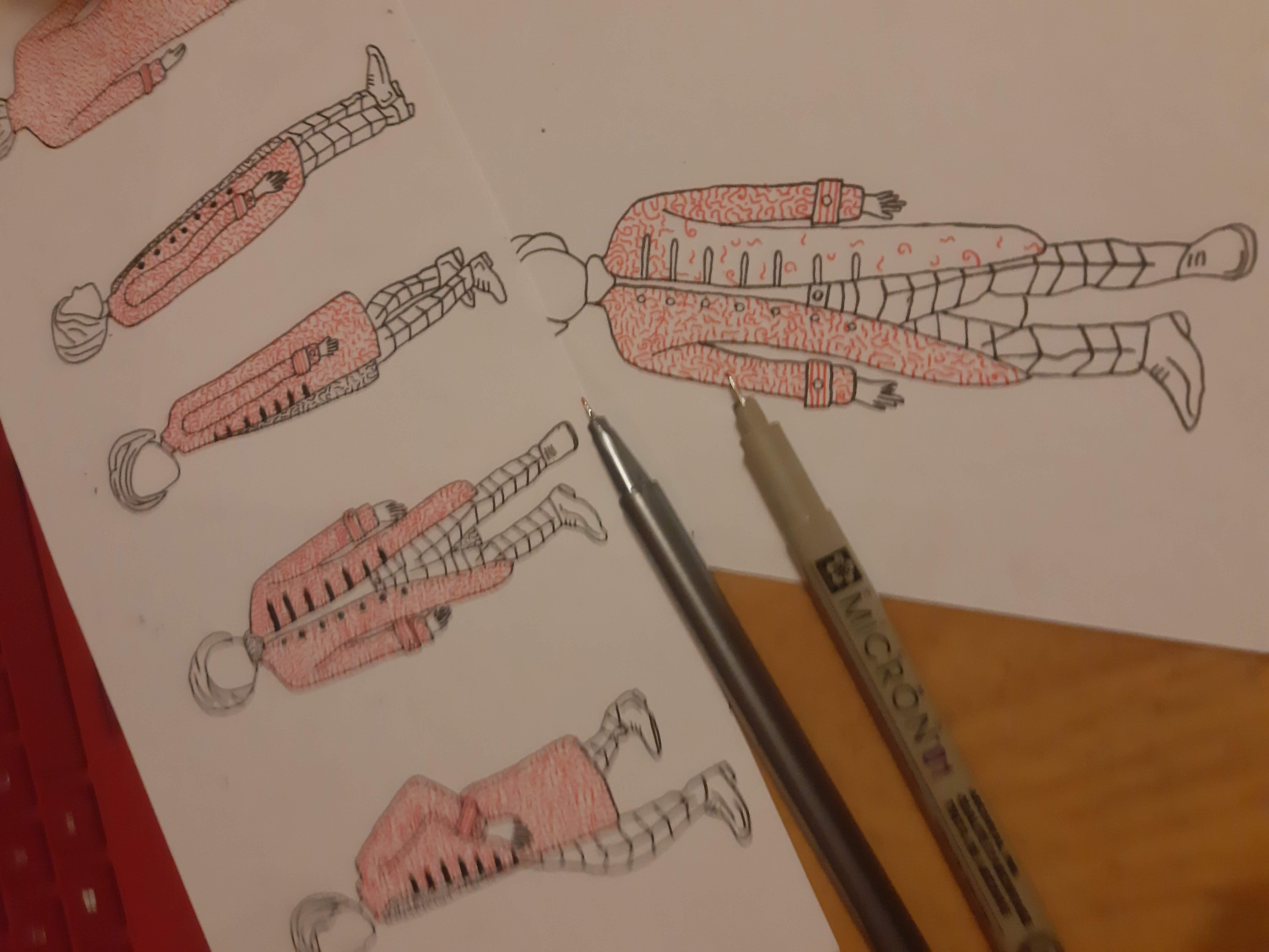
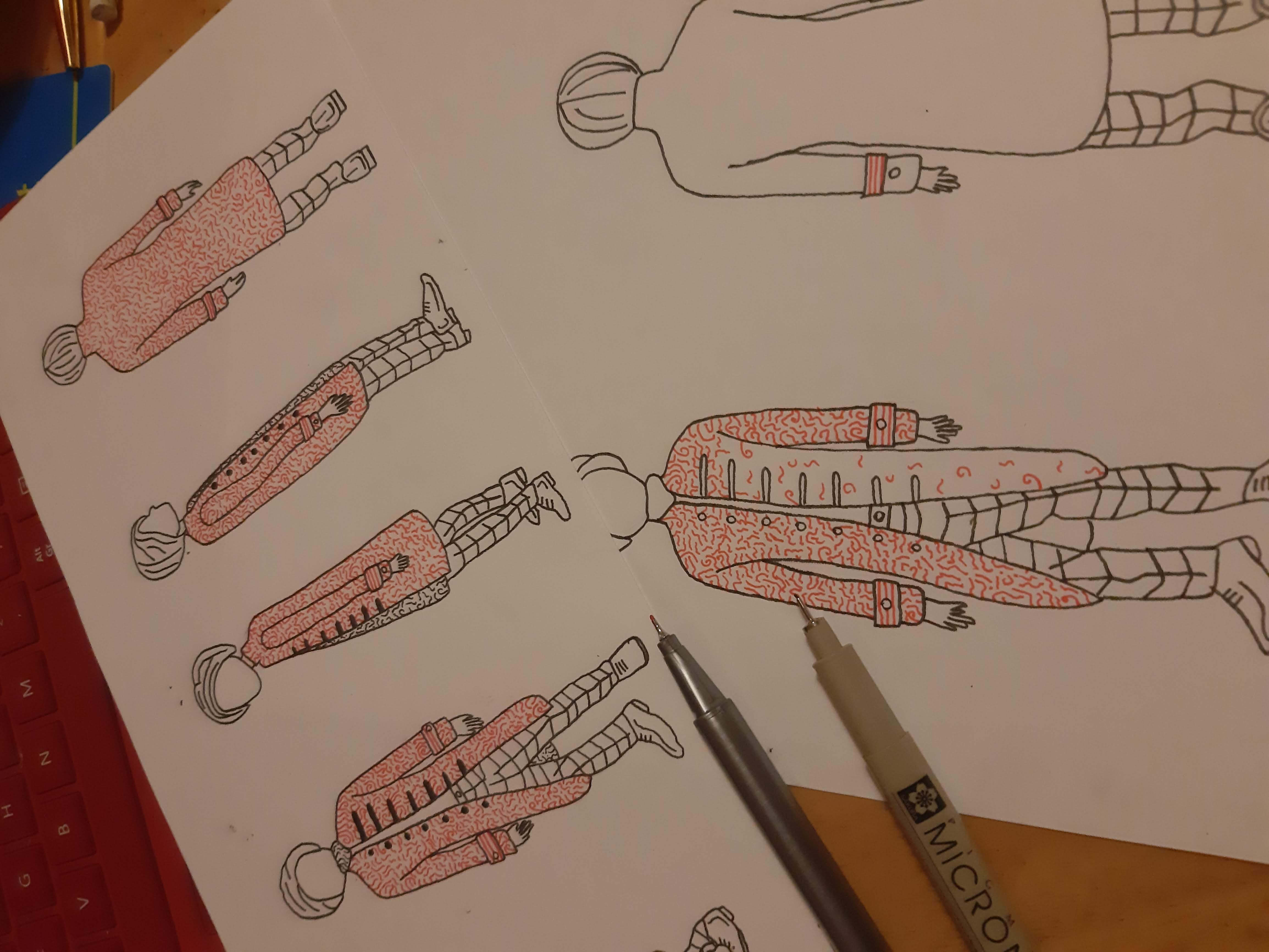
For my next character i chose Eric from the wasp factory to which i have found inserts of the book as can be seen below.
Here is a quick drawing of Eric
Next i decided to use Photoshop to draw Eric, the results can be seen below
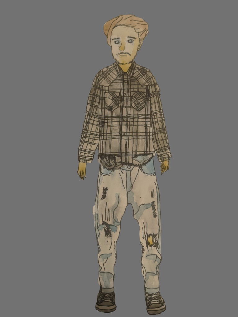
This ps drawing of Eric was the same as the pencil sketch but i wanted to expand further on his clothing and the details in his clothes as tattered as they seem to be in the book and how rough looking Eric is i wanted to depict this further so i decided to depict him wearing a shirt, using Google to find torn t-shirt ideas and jeans my results can be seen below.
This is my new further expanded illustration of Eric i prefer this image to the original sketch as i feel his clothes tell more of a story to him, giving him mystery and messyness reflecting upon his mental state also as he has just come from a psychiatric hospital not being very well in himself, next i decided to colour the image, again below are my results:
I feel this coloured version of Eric also works well giving more of a feel to the piece in terms of texture and depth, he looks very “pop art” from the style of filling in using Adobe Photoshop, i don’t like this style particularly so i am going to try and draw him again in fineliner much alike my drawing of the doctor the results can be seen below:
I feel the watercolour version gives more depth and texture to the character as a whole, giving more texture i feel works well he watercolour itself blending into one another i feel gives off a good effect and feel this watercolour piece works better than the photoshopped version due to the textual element given off by this particular medium
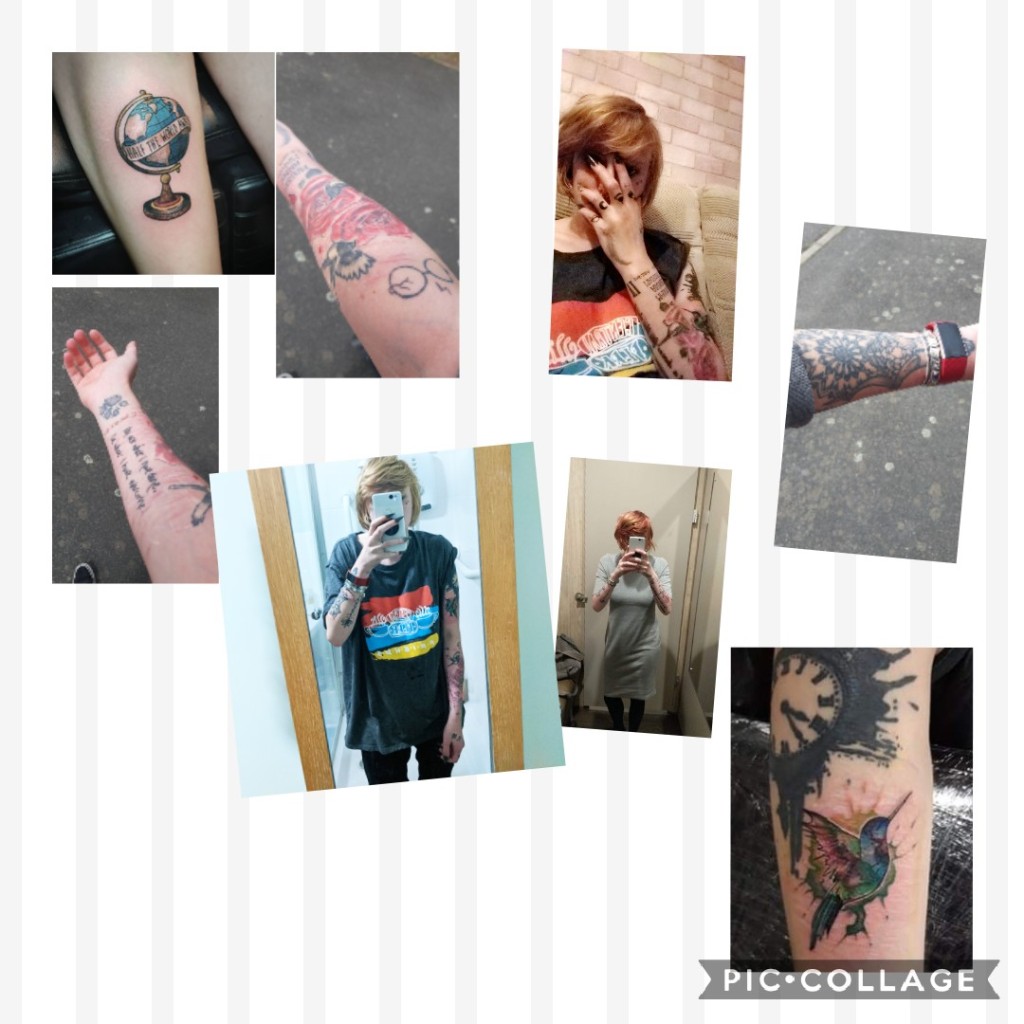
I started off by researching into different styles of tattoos, I already have a lot of knowledge in this area as I have many tattoos of different styles myself so a lot of my work came from my own tattoos.
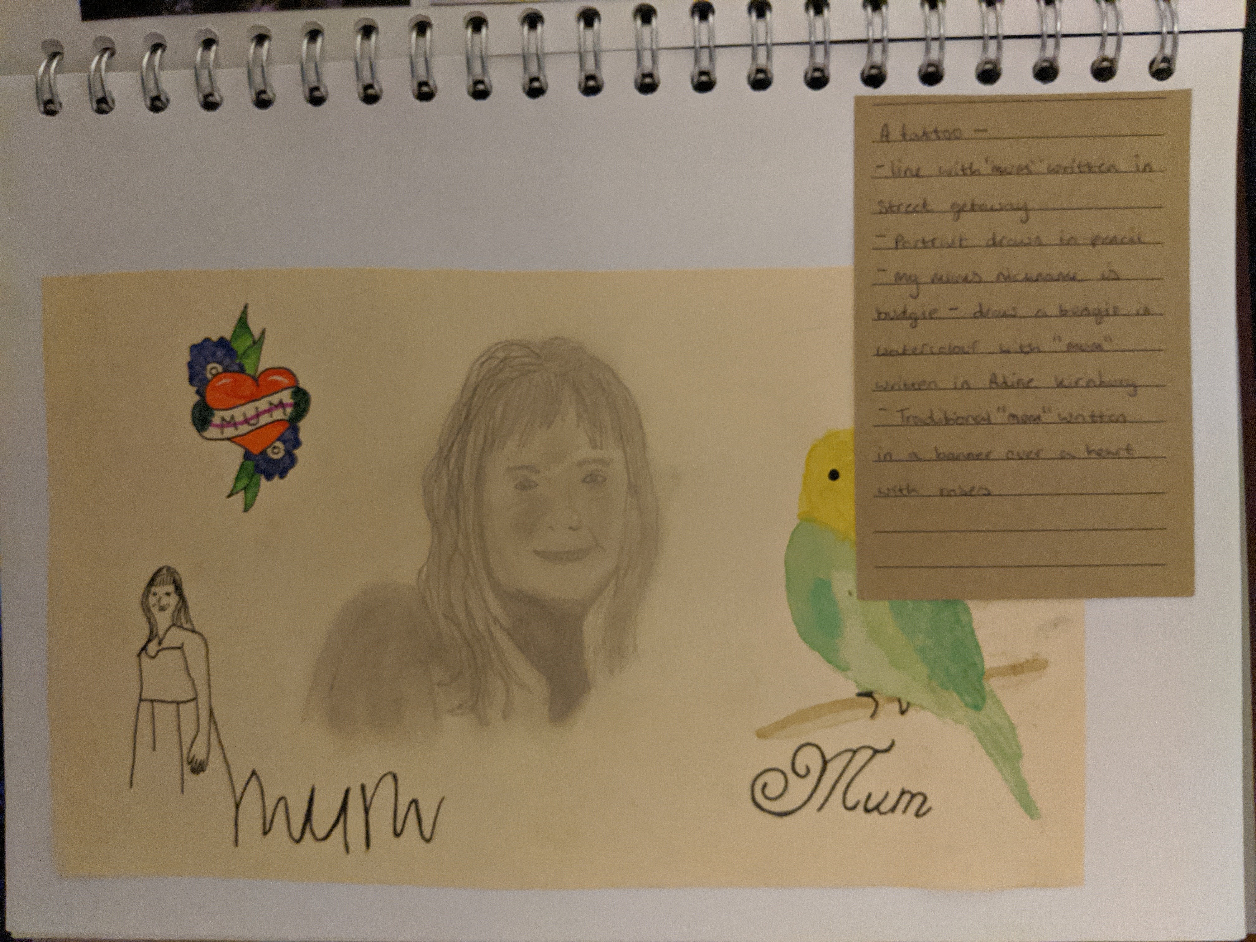
I started off my tattoo design by drawing up several different illustrations based on different styles of tattoo art, simple line drawing followed by pencil portraits and watercolour birds to represent my own mother.
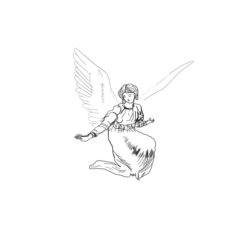
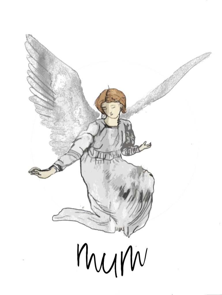
I felt this was a good starting point yet I wanted to progress this further with the depiction of an angel to represent my mum as she lives in Australia she always says she is watching over me like an angel would do so I felt this would be a good image for a tattoo design, I started by drawing a profile of a woman looking like my mother holding flowers with angel wings this can be seen below:
Although I like this image I wanted a full bodied profile rather than just a side profile although I feel this does work well as a tattoo design with the thick outline I wanted to use more colour in this tattoo piece depicting a watercolour tattoo with vibrant colours much alike my own bird watercolour tattoo.
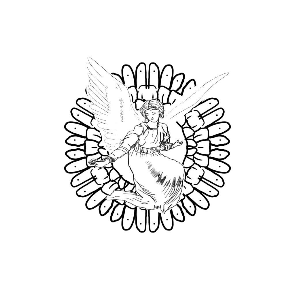
Next i began by drawing up another angel looking down as if from above as a more traditional approach to an angel as would be depicted in religious terms.
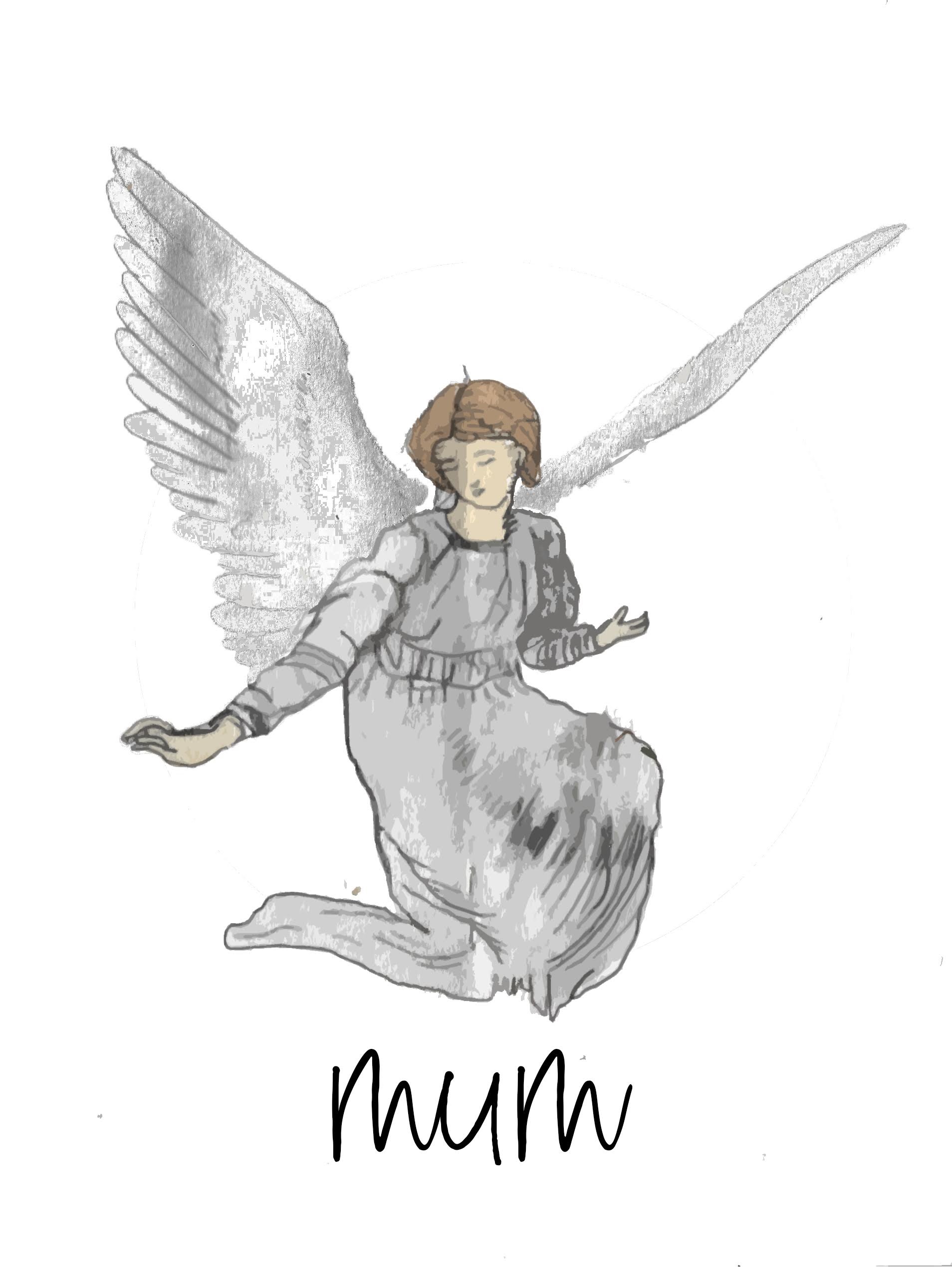
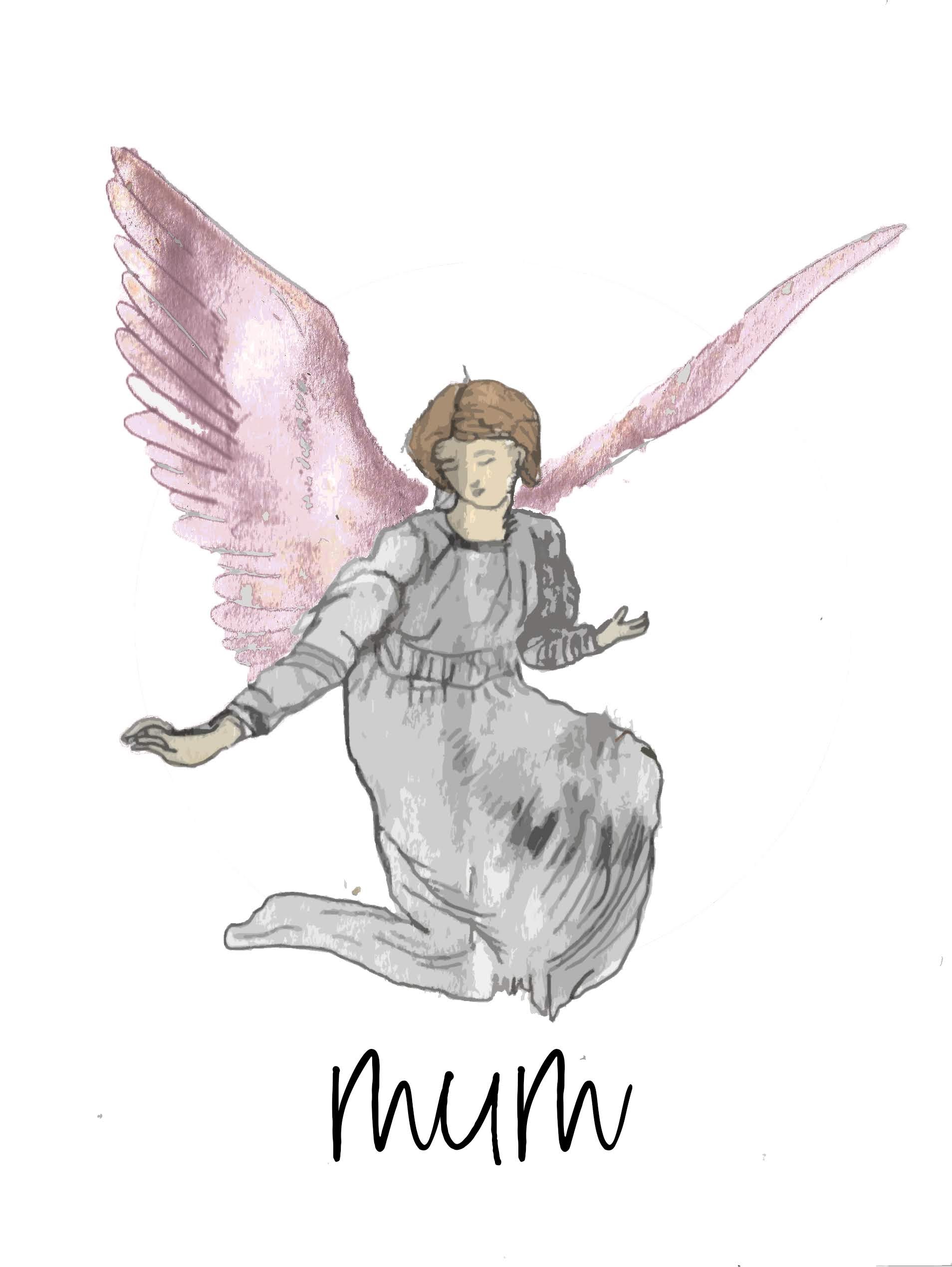
Feel this watercolour angel works well i tried and tested various different colours that can be seen in the gallery above of different coloured wings for the angel just to see what they would look like with a different tinted hue, I felt that the grey worked best adding to the main colour of the angel herself.
Finally adding the word “mum” below the angel I chose a cursive font to go with the elegant angel illustration as I felt this font worked the best giving the angel a more feminine feel. Below is my final result:
I like how this piece worked out, arching the text at the bottom to fit with the bottom curve of the illustration, I like this piece as a whole and as a watercolour tattoo I feel this would work very well as a tattoo, below I have attached an image of the illustration as it would be a tattoo on my own arm and feel this fits well with others I have of my own but would also work well as a bigger thigh piece too.
If I was to do this project again I would try different variations of budgies as this is my mum’s nickname the depiction of an angel is more used for terms of looking down once someone has passed away and this is not the case in my case, I have chosen the angel due to my mother saying she looks over me as being on the other side of the world she can see me from above.
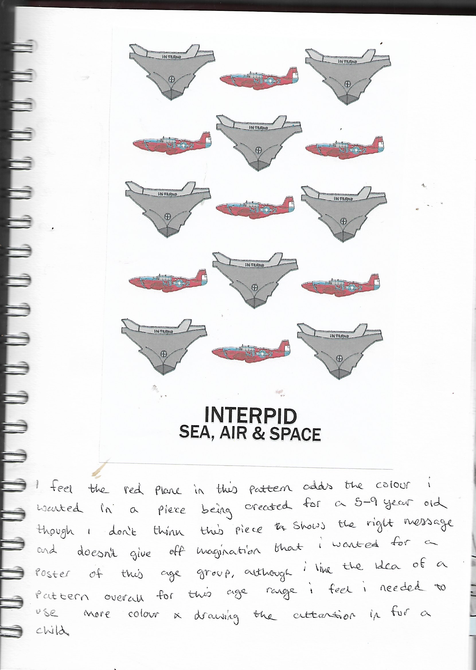
I feel these 3 final Posters work well together, starting with the age group of 5-9, I struggled a lot with this age group, researching into what children of ages 5-9 enjoy and are interested in, thinking back to my own childhood and what I enjoyed as a child of this age was difficult yet I feel this final piece works well, the combination of the primary colours works well with the simple hand drawn illustration of the astronaut, without being too lingual with the wording on this poster just it simply stating the “INTREPID sea, air and space museum” not being too “wordy” in my approach to this age group I feel works well and gives off a good effect drawing the child’s attention to the poster with the vibrant colours on show.
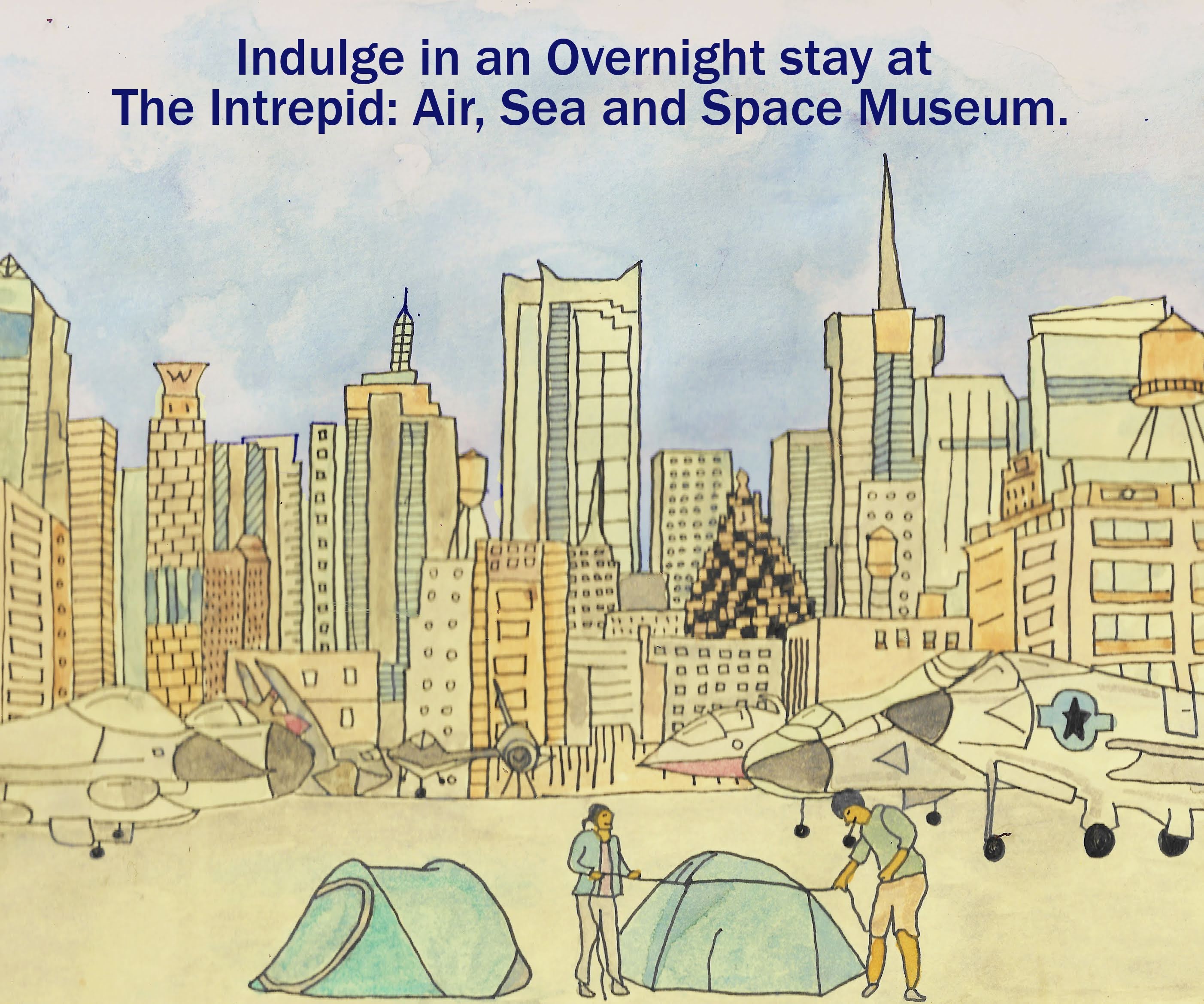
Next is the age group of 13-16 year olds, I found this age group the hardest as many teenagers have different interests as you are developing hormonally and emotionally I decided to incorporate a “sleepover” in this piece, working through a variety of designs at first such as the blue print yet I felt this piece appealed more to the male than the female population, having the NY skyline as a backdrop to being aboard the aircraft carrier that is the intrepid museum alongside tents to depict this upcoming sleepover event hosted by the real museum, I felt that simplifying the colour tones by using watercolour was a good way to go about this piece, although it doesn’t have the “pop” effect of the age group of 5-9 appealing more to teenagers using a more pastel feel to the piece alongside the dark bold edges of the fineliner I feel works well together and as a whole appeals to this age group of 13-16 year olds but could also appeal to family’s.
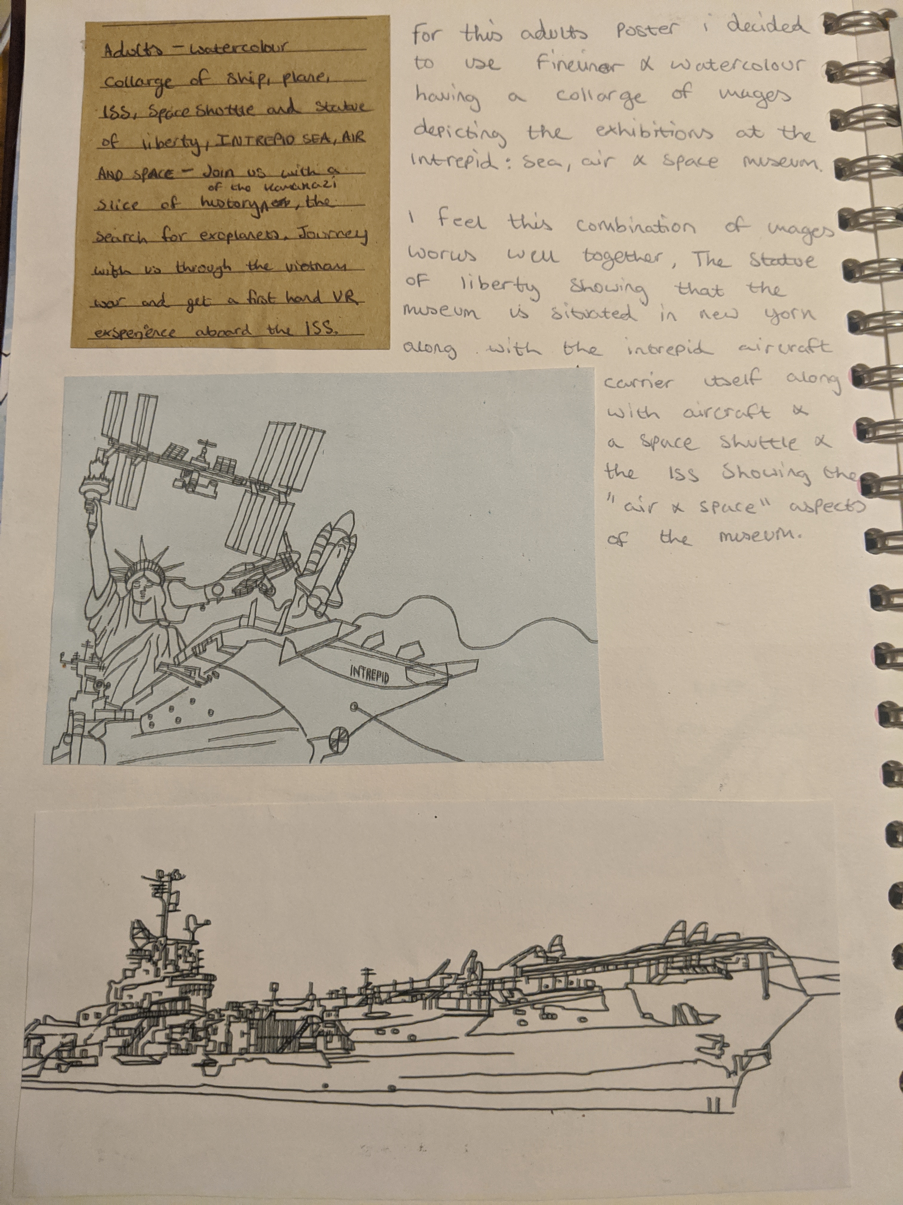
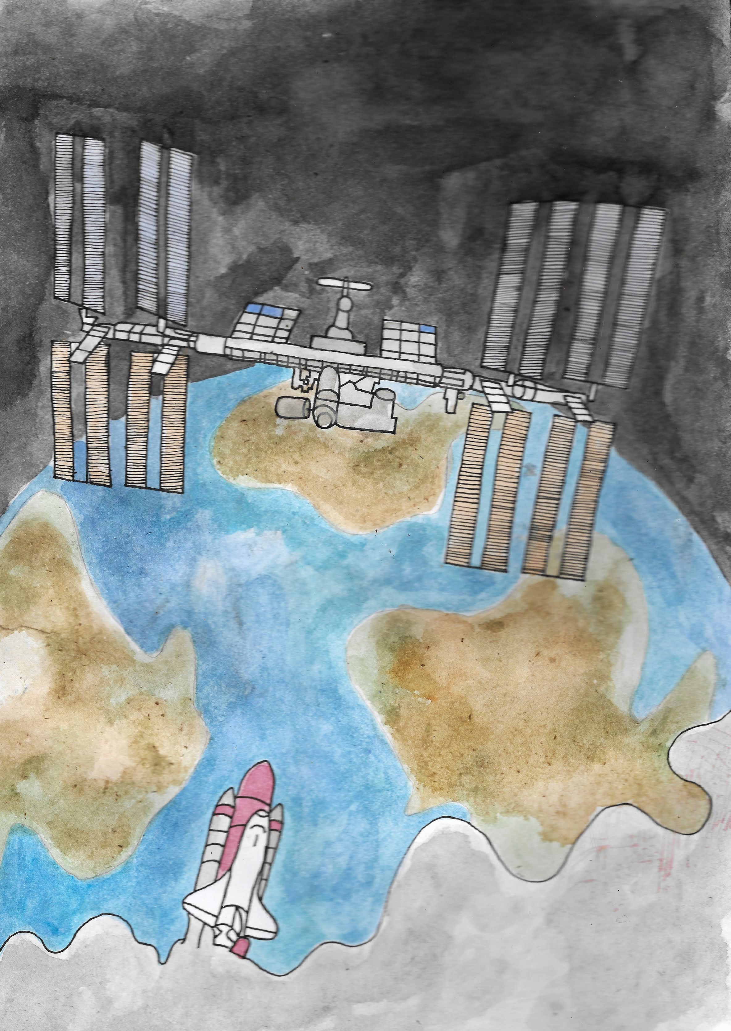
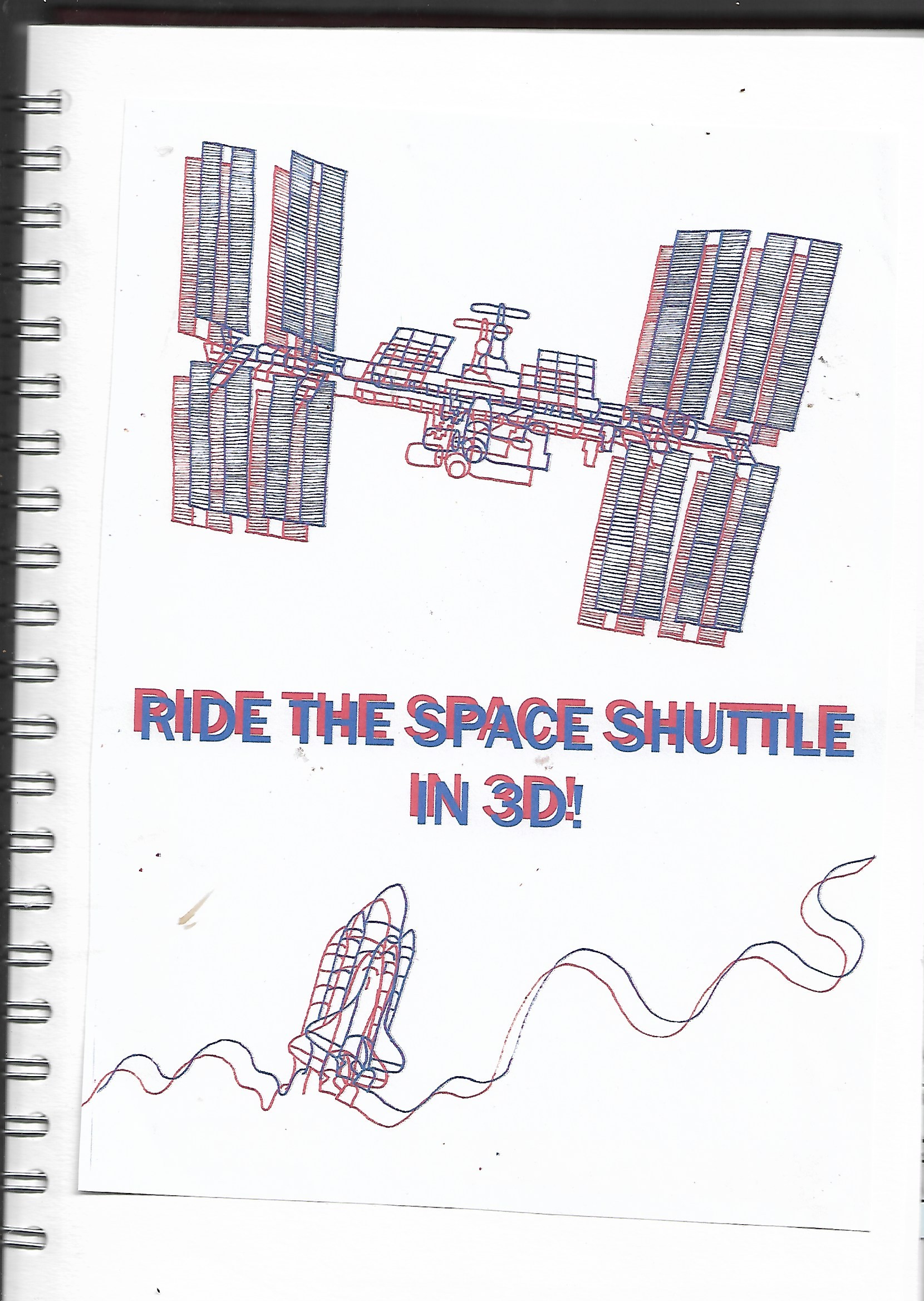
Finally is the adults poster, I found this the easiest age group to cater for when it came to creating a poster, I initially had a lot of ideas as adults may have had close connections to the wartime planes on show alongside having age experience and knowledge of the moon landing and such, I know my grandfather remembering the moon landing and my father briefly too, yet with all of these ideas in my head converting them to paper using a variety of medium i found a task in itself as all of my ideas used watercolour and fineliner, I feel as if I need to expand on my medium use and the final poster for this age group would have worked well in another medium such as acrylic or oil paint, yet unlike the age group of 13-16 I layered the watercolour on more giving depth to the image itself really giving off a feel of the space station and a rocket orbiting the earth.
I feel overall for this project that my final pieces worked well, I like the different variety of styles when it came to each poster not all being the same in terms of looking at them individually, they each have their own style and context to them.
If I could do this project again I would definitely expand more on my medium choice, using a variety of mediums as mentioned above such as acrylic and oil paint as an option rather than sticking to watercolour yet I feel this medium had worked well in the posters too.
To conclude I felt this project was difficult to start with having to research what appealed to children of the age 5-9 and 13-16 as I have passed this age and remember vaguely what it was like to be that age myself, but after research and while developing my own artwork and illustrations I came up with more new ideas that developed over the course of this project and can be seen throughout my work.
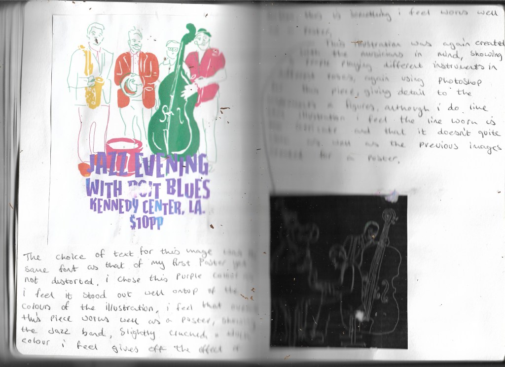
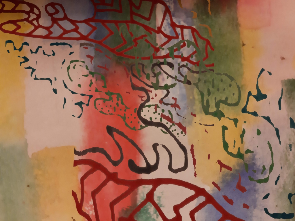
linking these two images together i feel works well, having a part of the abstract hand drawn pattern editied in photoshop taking away the background gave off a rough jagged look to the pattern along with the background i feel the contrast between these two images work well together, the colours from the pattern being clearer and brighter that that in the background i feel gives off a good abstract image that represents this piece of music, the sharp notes from the piano much alike the sharp colour in the foreground and the tone this gives off to the rest of the image i feel works well and that this image would also work well as a single cover for this song, which i have created and can be seen below.
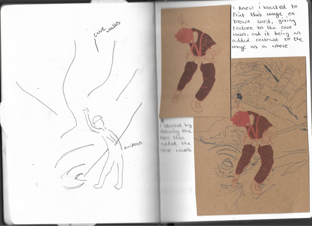
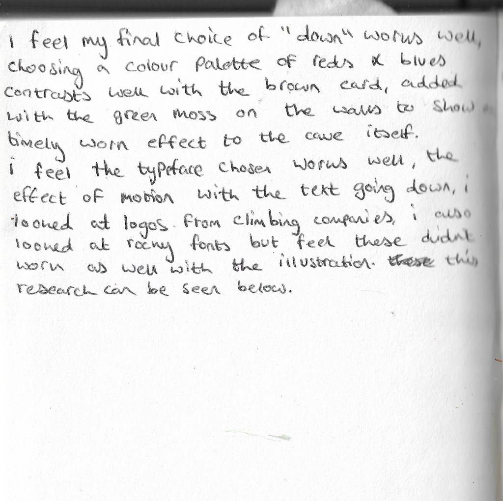
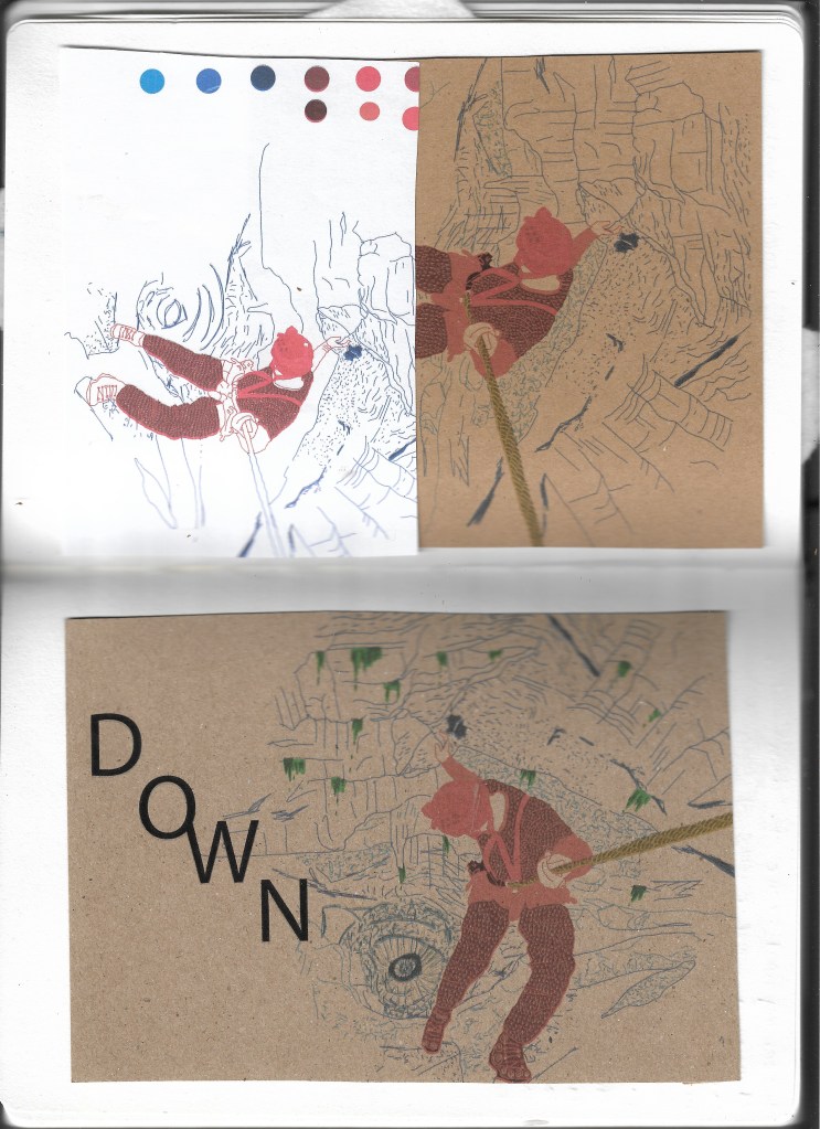
I feel that overall this image works well as a poster, the typeface i feel works well, linking the “O” and “W” gives off the effect of bring attached, in the case of the illustration this is the man and the rope, i feel overall thi sillustration works well when printed onto the brown card as this gives off the feel of tecture to the walls of the cave, having a warm and cold colour pallette contrasting the man and the cave walls behind him, i feel the use of single line work for the walls work well as the man being in colour with patterns on his clothes of arrows pointing down leads the eye to the center of the cave which is darker than the rest of the image.
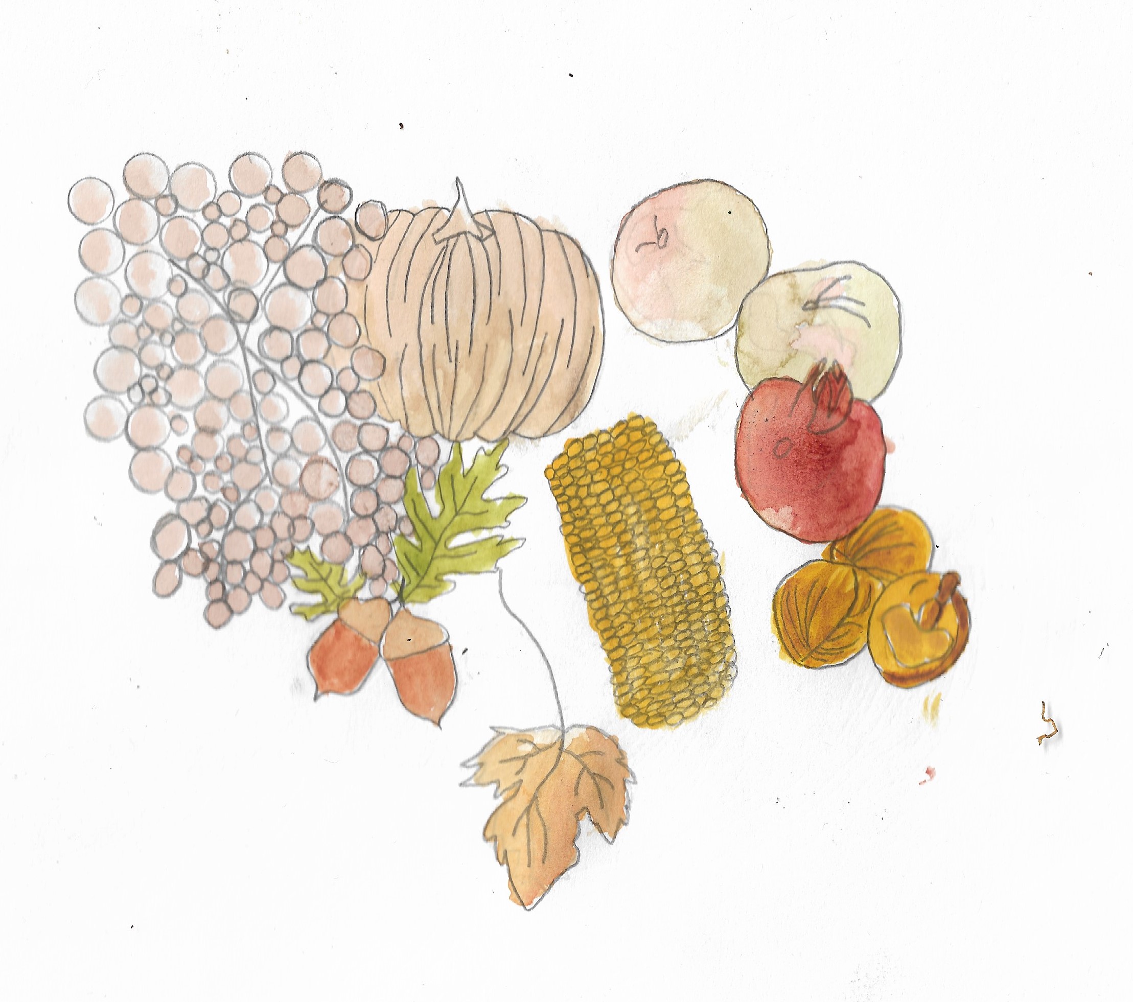
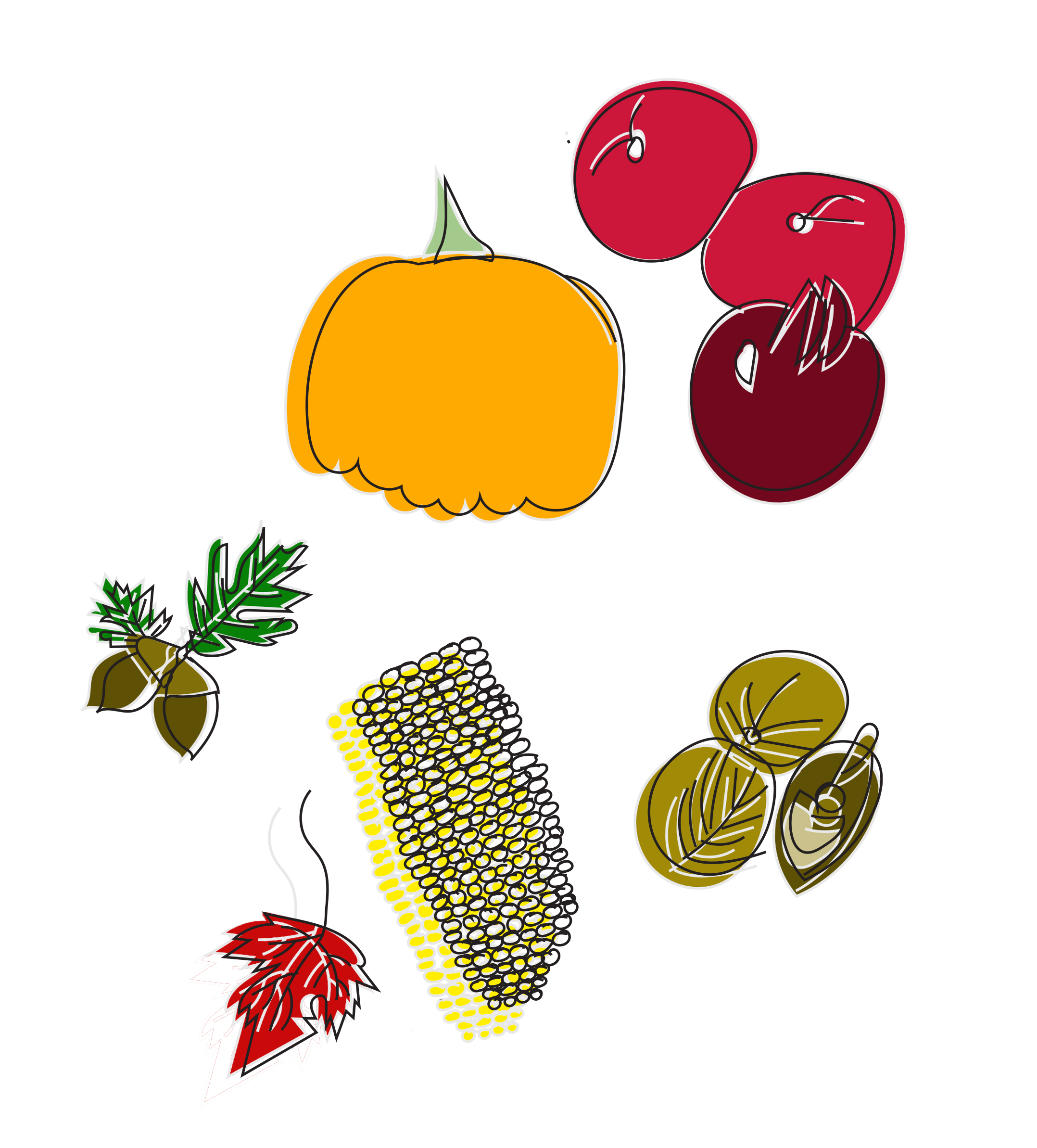
I started by creating an illustration of Autum Fruit and Vegetables which can be seen below:
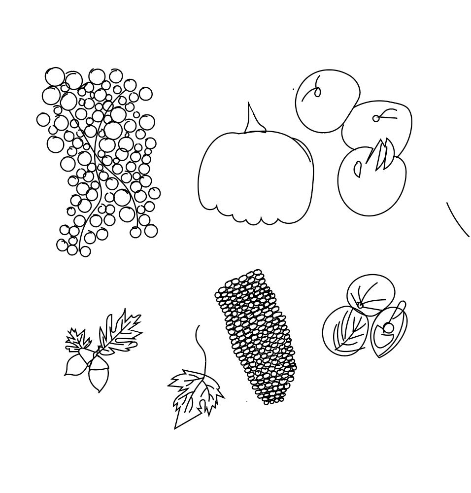
i decided to draw the same fruit and vegetables but in adobe illustrator:
next i put these images into photoshop and added colour to them:
i feel this worked better than the watercolour illustration as the fruit and vegetables look more appetising. I feel the use of block colour works well with this piece. I positioned the colour slightly outside of the black linework that gave depth to the whole piece.
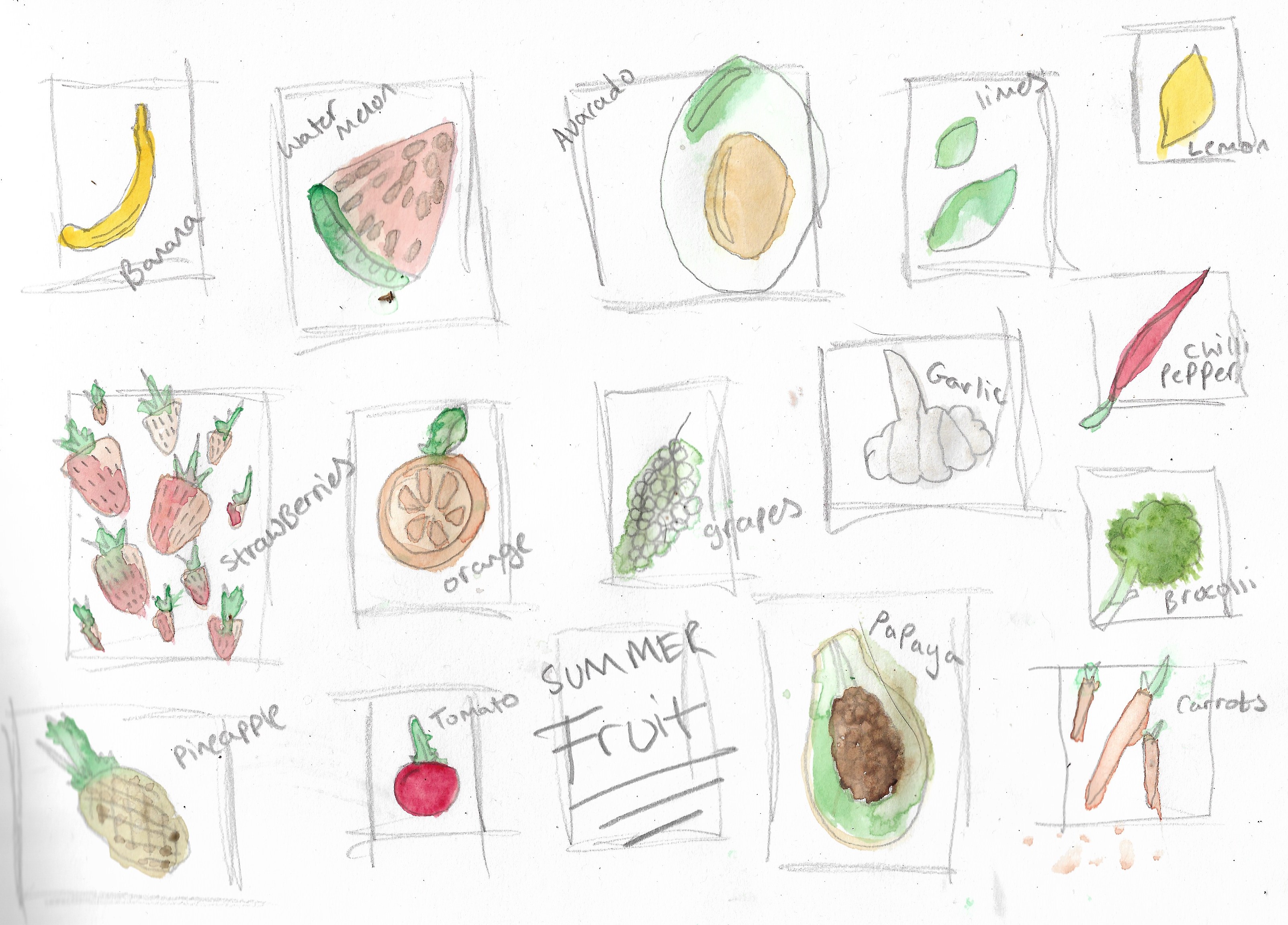
after creating this piece i decided to draw summer fruits using watercolour to draw a selection of fruit and vegetables, this helped me in choosing what fruit and vegetables i wanted to draw for a summer selection of fruits and vegetables below is my illustrations of this summer selection:
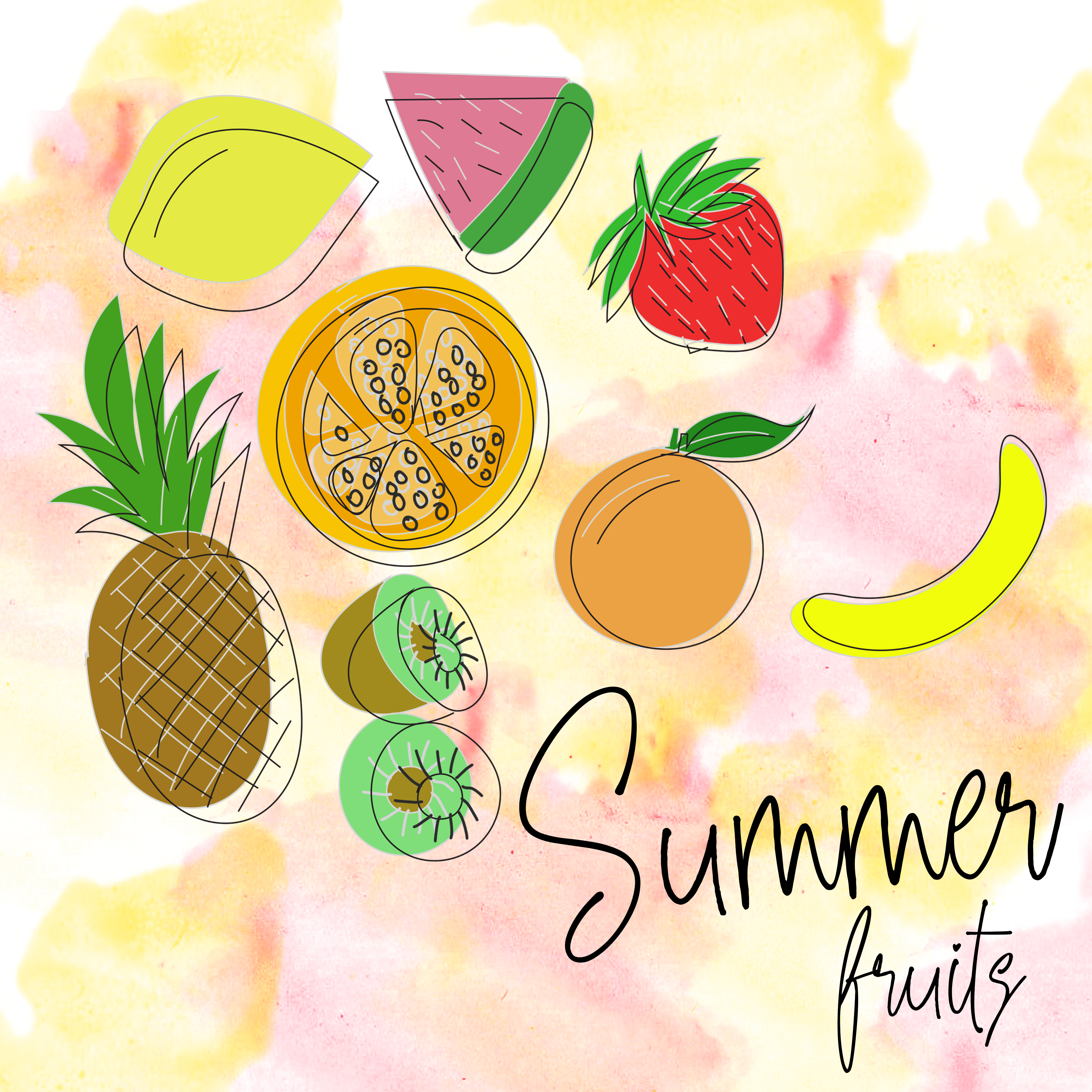
Next i started to draw summer fruits this time again using adobe illustrator to give the same feel and appearance as the autumn fruit and vegetables:
After creating this summer fruits drawing using illustrator and photoshop i decided to add text to the image and to see what it would look like on packaging along with adding a waterclour background to give the fruit more of a pop although i feel this didn’t work as well when converting the image onto packaging:
after creating this piece i didnt want to use plastic food packaging for fruit as fruit has no packaging instead i found a box containing apples as a place to store them when picking them up from a shop instead of putting them in a plastic bag, here are the results of what i have created:
I feel this summer fruits packaging works well on these boxes i had found, showing a variety of food on the box where you could possibly use this on the side of paper bags for the fruit instead of using the paper bags currently supplied by main supermarkets.
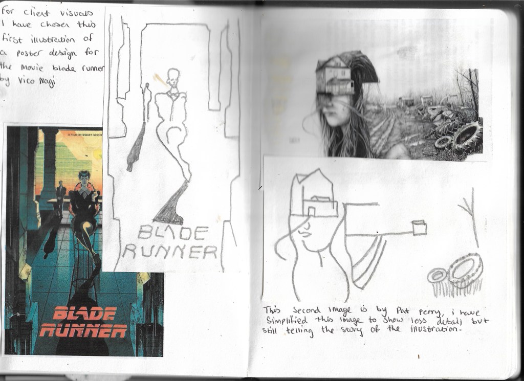
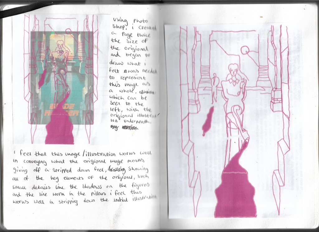
After reading the extract from “The Daffodil Affair” I answered the questions given in the brief that can be seen below:
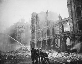
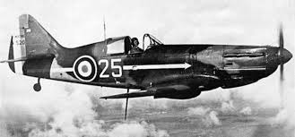
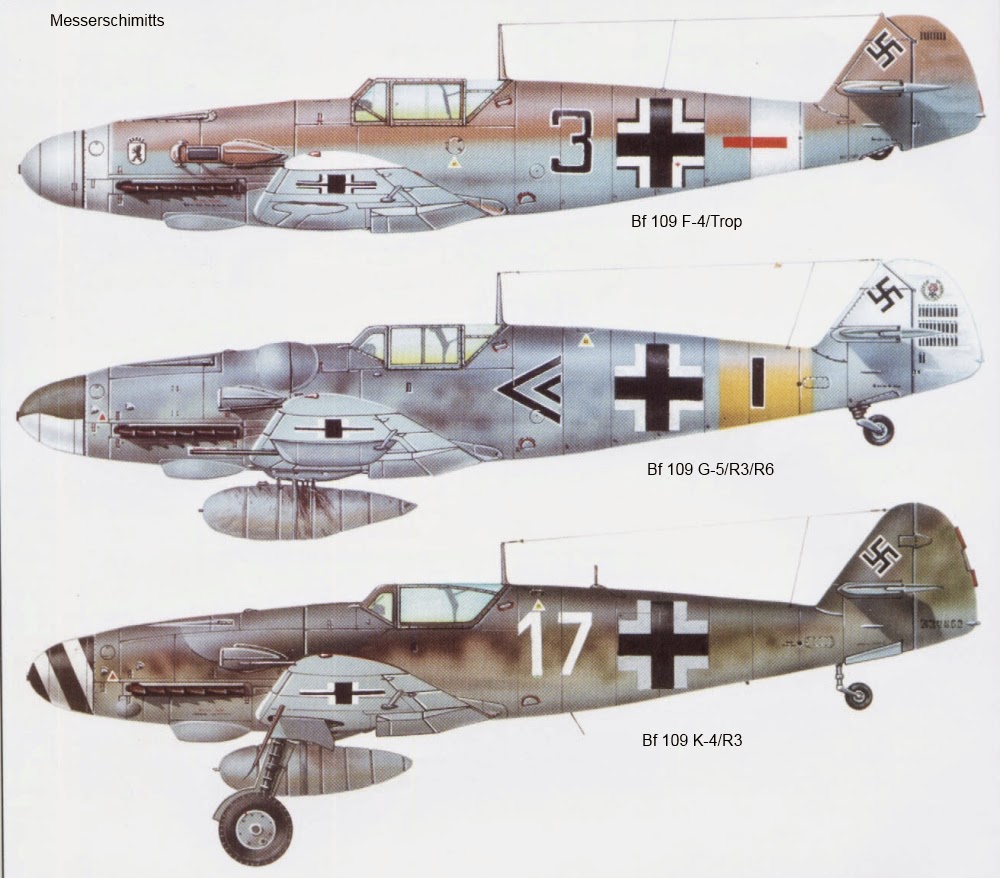
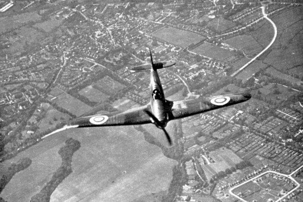
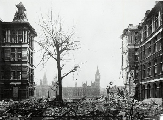
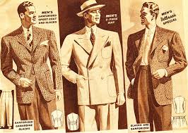
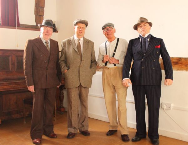
From here I decided to collect some visual references to this, which can all be seen below:
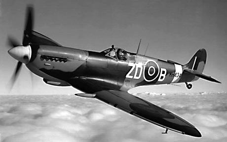
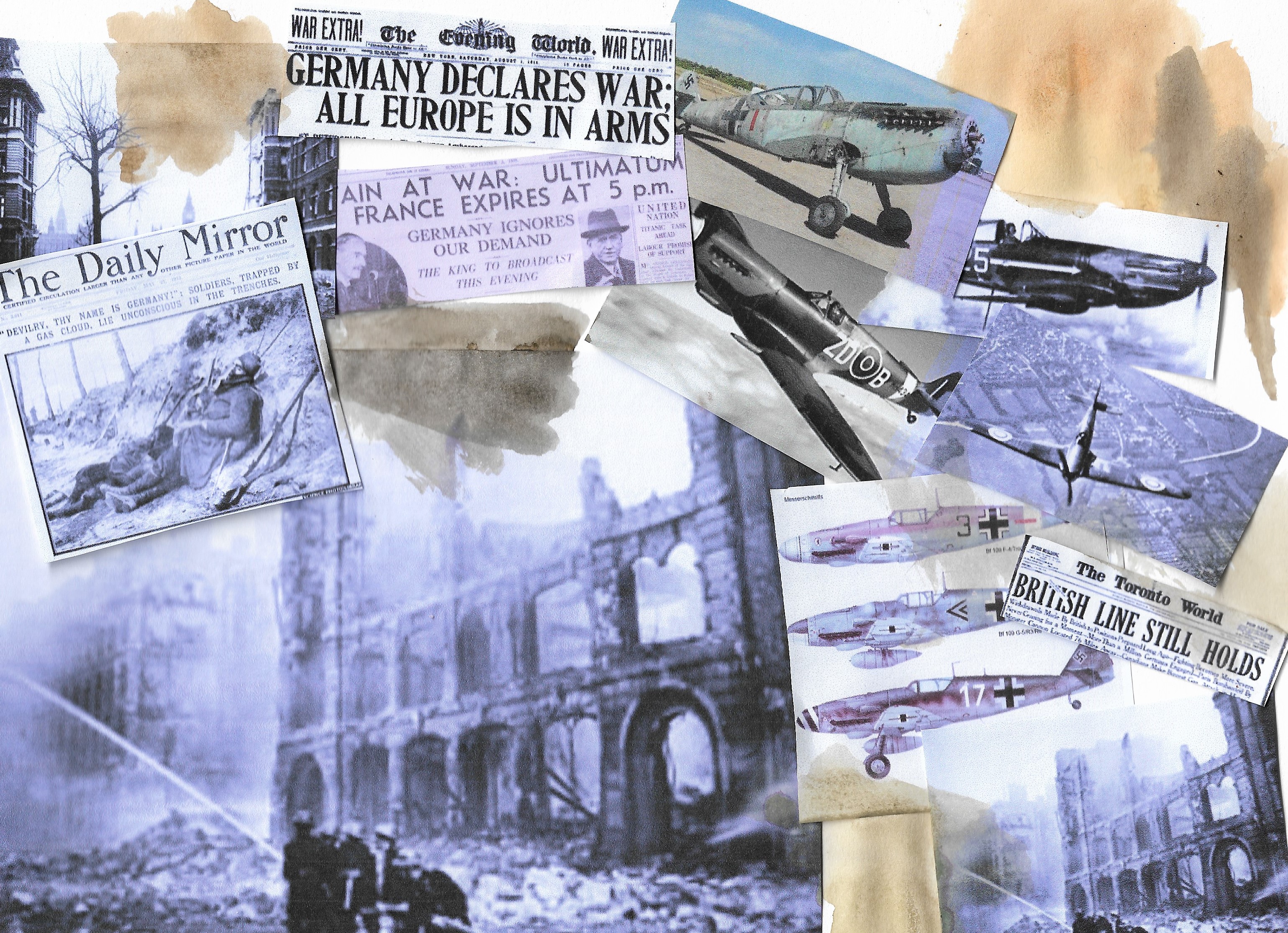
Hawker Hurricane in flight, Battle of Britain, World War II, 1940. A Hawker Hurricane of Fighter Command on its way to intercept German bombers as they crossed the south coast of England. Fought between 10 July and 31 October 1940, the Battle of Britain was the first major battle to be won in the air. The RAF’s victory in the battle effectively prevented the Germans from attempting an invasion. (Photo by Ann Ronan Pictures/Print Collector/Getty Images)
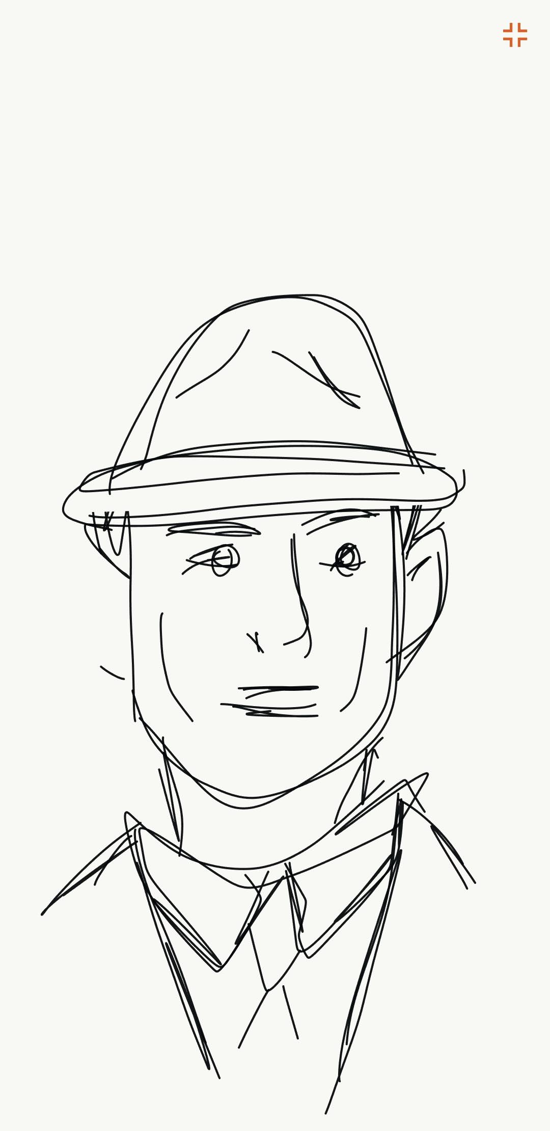
After researching and creating my moodboard I drew up 2 concepts using adobe illustrate on my phone, as using my finger on the phones screen gave an effect that I wouldn’t usually see using a laptop or pencil. Here are the 2 concepts created on my phone:After researching and making a moodboard i drew up 2 concepts using the adobe illustrate application on my mobile phone, just as a different way of drawing these concepts using just my finger on the mobile phone screen gave off an effect i wouldn’t get by using my laptop or a pencil. Here are the 2 concepts created on my phone:
I felt these concepts worked well, and that this was the portrait I wanted to go for, Imagining the main character to be wearing a suit and a hat, suggesting from Scotland yard and because this clothing was the main attire that males wore during the war as seen in images above.
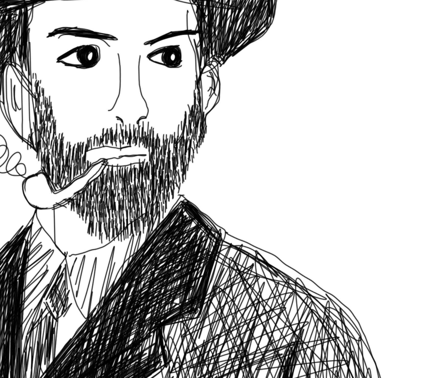
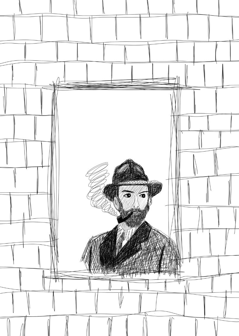
For this piece I wanted to use my surface pro to draw on using photoshop, with an idea for the main character in mind, much alike the concept drawing I began to draw in photoshop. I wanted to use black and grey for this piece to give a wartime feel as there were little to no colour cameras or television at the time, here is my process for drawing the main character:
As I went along, I decided to add a beard and a pipe as it became more of what I was envisioning for the main character.
Adding grey into the image gave more detail to the mans face and hat rather than leaving it white.
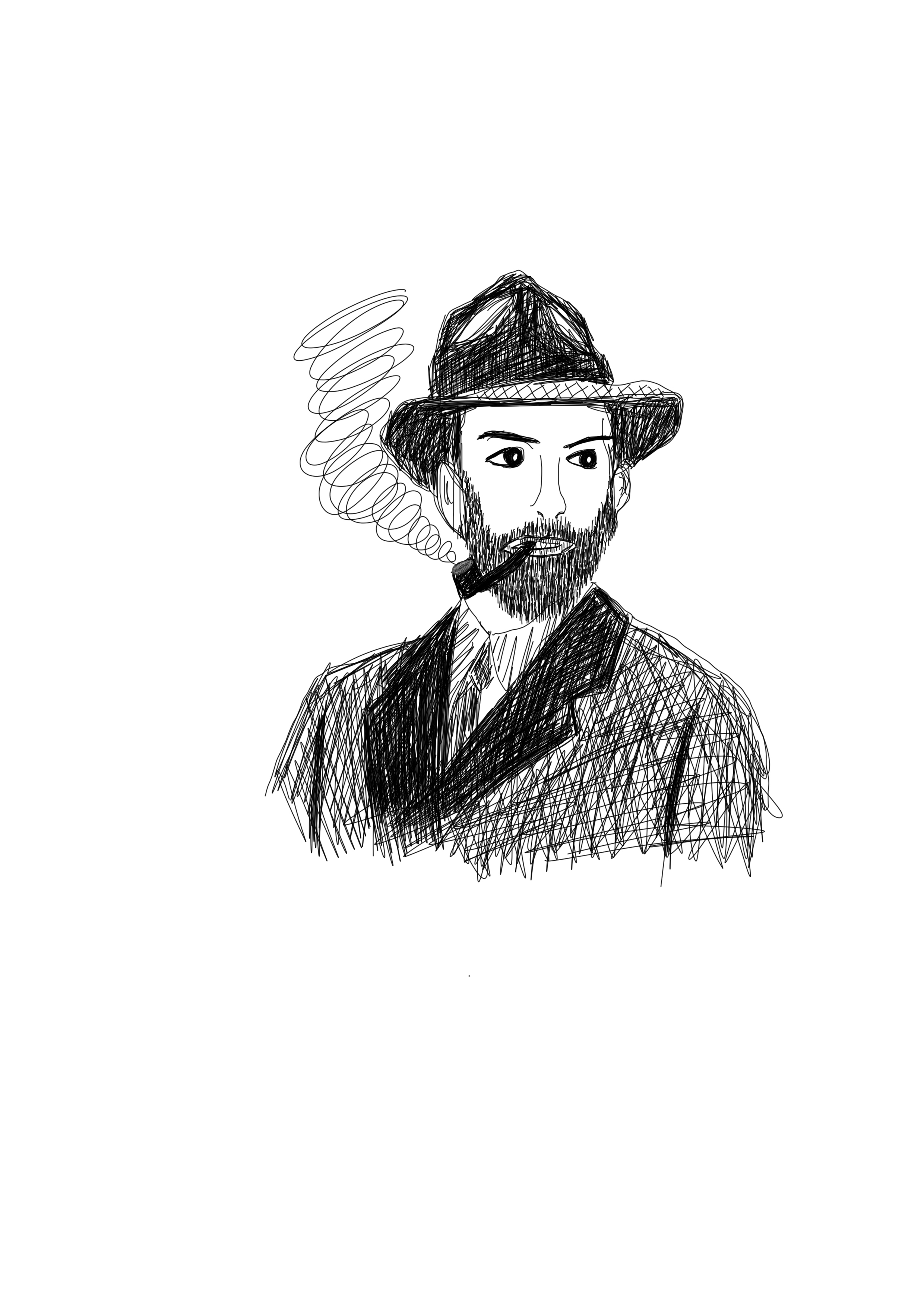
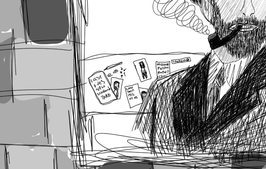
From there I decided to draw the man at a window as described in the brief’s passage.
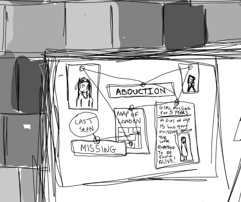
As the man was working on an abduction case, I chose to add a board showing case progress behind the man with maps and images of the missing girls all tied together using pins and string as seen in old detective cases. I also decided to include the desk as mentioned in the passage and I felt this all worked well to tie up the image showing what was described in the extract.
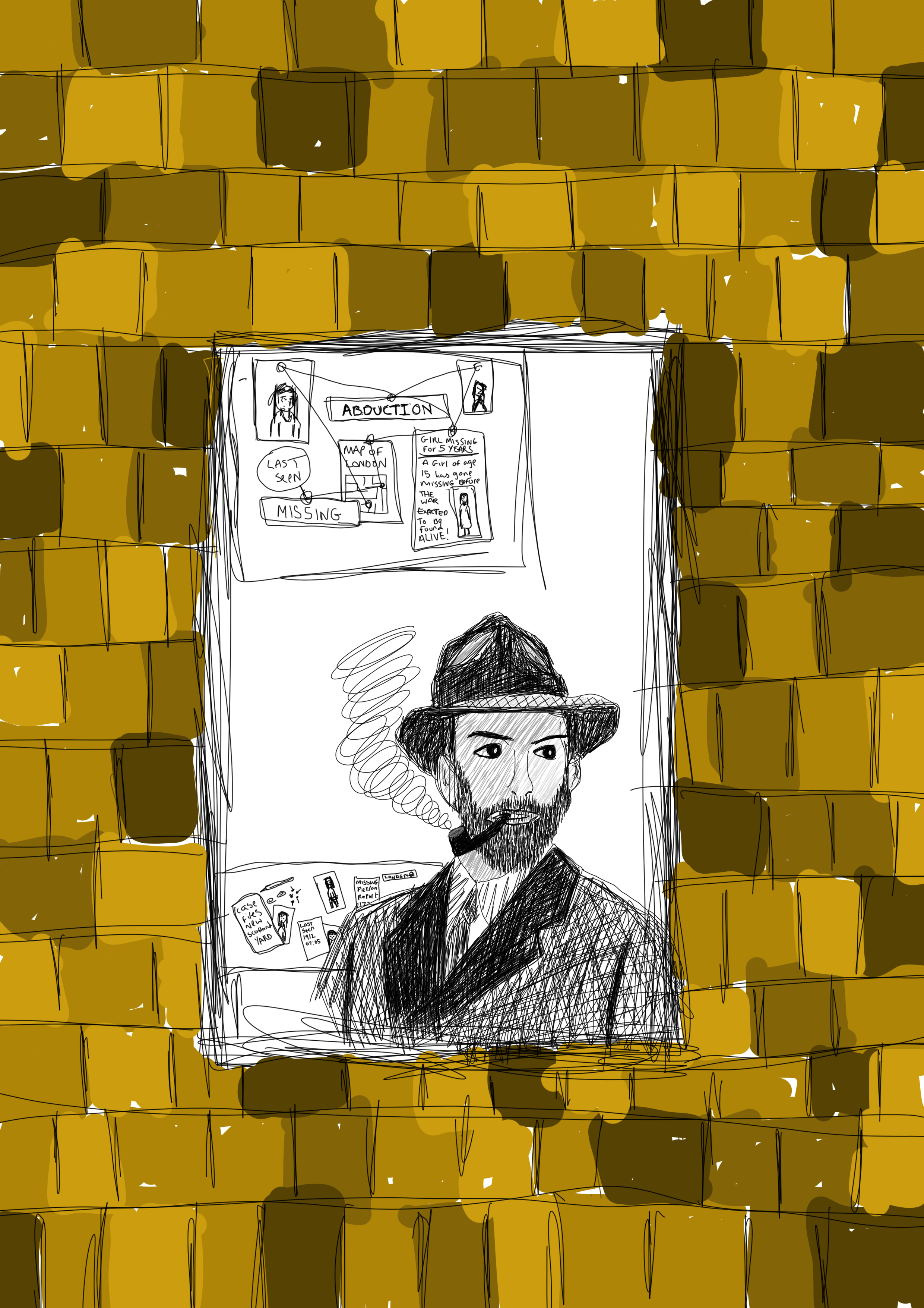
From there I moved onto filling in the brick’s colour as can be seen below:
i wanted the brick to be in black and grey to match the man in the window, so i decided to use the black and white edit option in photoshop to do this. I feel the use of black and grey works better than the use of colour due to the time zone that the extract mentions it being wartime I always think of black and white images rather than coloured as all of the photographs from this time were black and white. Here is the finished piece:
The use of digital illustration worked well for this piece, although i haven’t done many digital drawings i feel that this use of medium is a good choice as it is easy to manipulate an image and if you make a mistake you can undo it unlike if you were to use a more traditional medium you wouldnt get the same effect the lines are more uniform and you can zoom in on certian parts such as the abduction drawings and newspaper clipping that i had created to add more intricate details and text to these images which i feel adds to the detail of the piece that works well in responce to this part of the unit giving a real feel of the section of the story that is discribed in the breif, therefore i feel that this final piece works well as a whole in telling the story itself in one final illustration image.
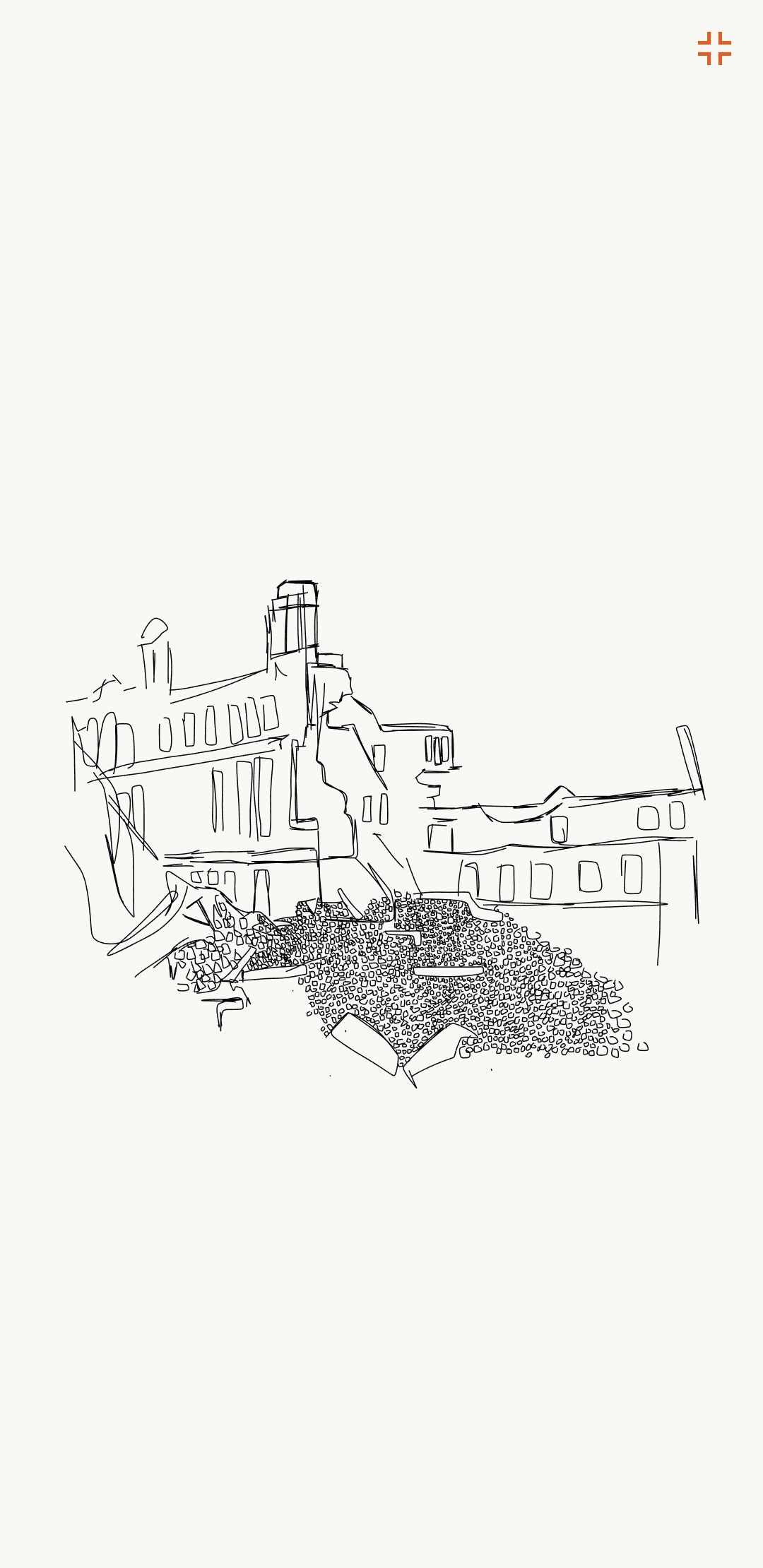
After creating the man along with him standing in the window I looked back upon the references I found, i wanted to do another drawing of the man in a physical war location, with knocked down building and bomber planes in the sky, I started by drawing a bombed building using the adobe draw application on my mobile phone, here is my process:
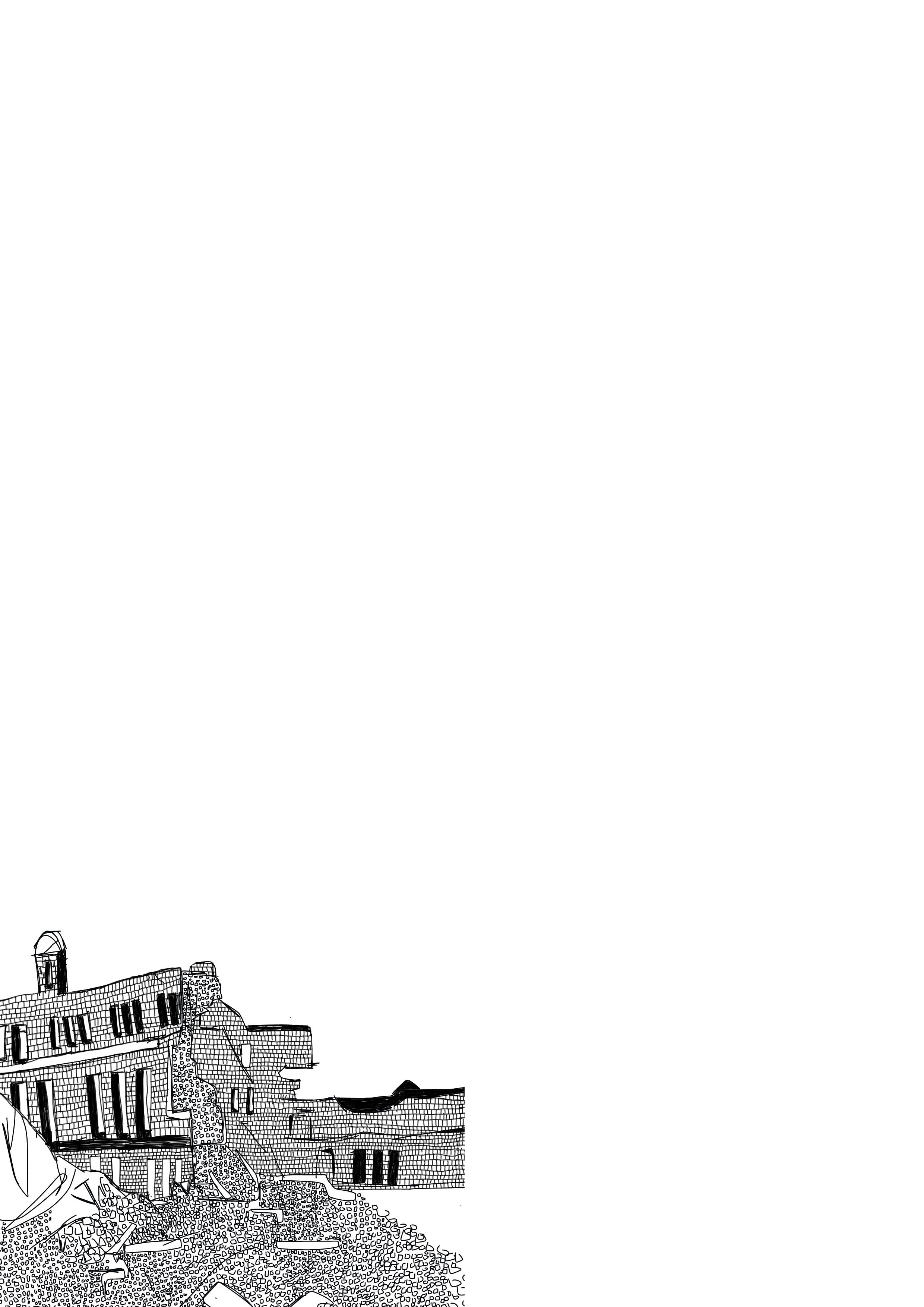
After creating this illustration I saved the file as a PNG and put the image into photoshop and began to add brick details into the white bits of the building again to add more depth and detail to this illustration, here is the final illustration of the bombed building:
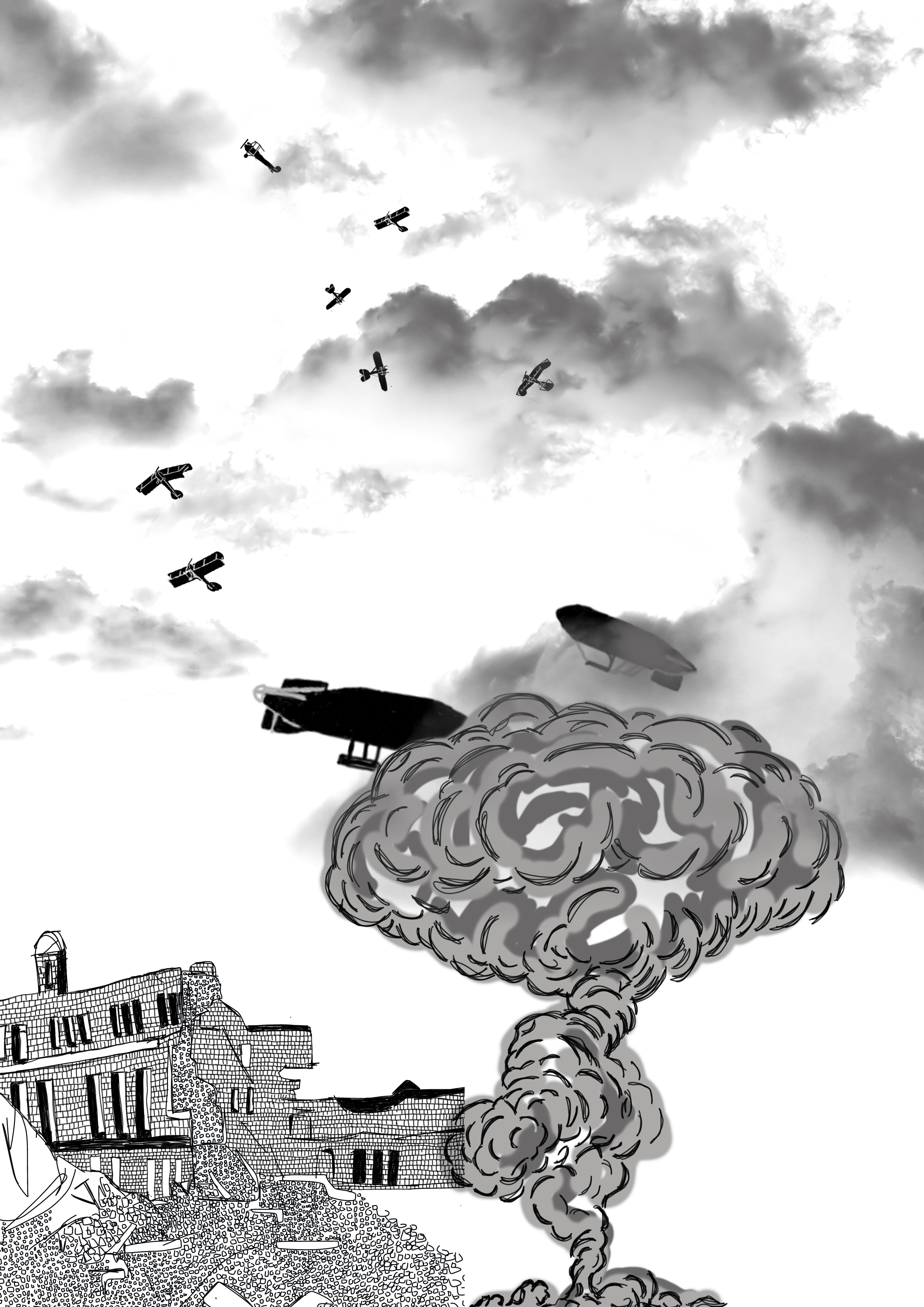
Next I wanted to add planes to the sky bomber planes from Germany and Britain, as this location is set in Britain I decided to have british fighter jets fighting off German warplanes along with british zepellins in the sky. Below is the image of the planes added to the illustration which I drew again using photoshop.
After this i wanted to add a bomb being dropped on the city so i decided to draw a smoke cloud next to the building and covering the zepellins slightly so show a large explotion adding the war effect to the illustration as well as adding glouds to the top of the illustration to show the skyline and the horizon line, i created the clouds using a brush tool found online, i decided to use fgrey clouds to give a darker feel to the final image as can be seen below:
Finally adding the man i had first created in photoshop to the bottom right of the image:
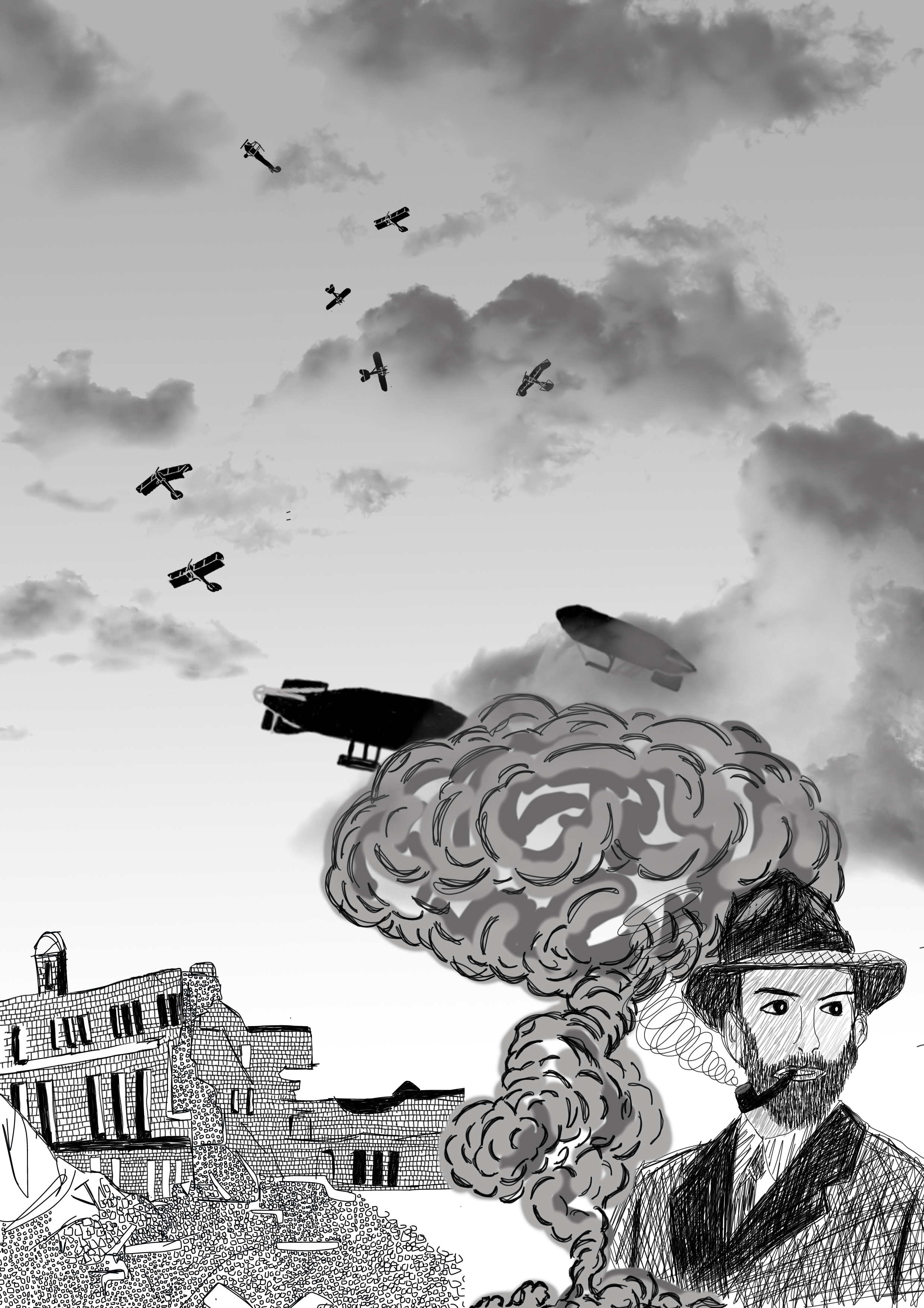
I decided to add a fade to the image having the top grey and fading to white nearer the horizon, i felt again that this gave the image depth. Having the man in the corner showing his location, i feel as a whole that this final illustration works well in conveying the idea of a detective in wartime london, i feel that if i did this image again i would have had the mans whole body caryinga breifcase or holding casefiles of abduction cases to really show that the man is a detective in wartime london, overall i feel the combined styles through using the photoshop platform to create this piece is beneficial and works well as you can easily manipulate the image to give more depth and higher detail than that of any other medium, maybe trying to do this image as an acrylic painting could be something for me to expand on and try or even as a watercolour image combining styles to create one whole piece.